Shop Products
Houzz Logo Print
lucretzia_gw

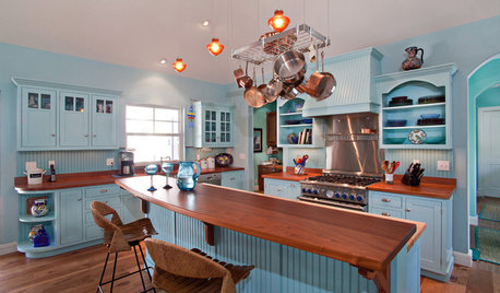
Please help with cabinet color - inspired by Elizpiz's kitchen

lucretzia
14 years ago

I was seeking help here with an island idea and Rhome kindly suggested I take a look at Elizpiz's island. Now I am very confused again as I thought her kitchen was beautiful and could possibly work in my home.

Elizpiz used a khaki type color that she thought was closest to BM Affinity Splendor. My adjoining rooms are a family room with abbington putty walls that will have a 6' opening to the kitchen, a dining room with philadelphia cream, and living room with monroe bisque. It looks to me like the splendor color will go nicely with these 3 colors.

I have been blogging here with questions about a honed green granite that looks like soapstone, and I also think that it looks pretty good next to the splendor color. By the way, my original idea has been a white or off white kitchen. I don't know if the white kitchen will just say "ouch" from all the other warm rooms, or if the splendor will be too dark in my kitchen.

The kitchen will have a south and west window, plus skylight. In the summer, trees will reduce some of the light. My floors will match the rest of the house: white oak with an oil finish, no stain. So it takes on a bit of an orangy look, which was probably a mistake with all my warm colors, but I think I've managed to get around it well enough with my oriental rugs, etc.

I'm not willing to redo the floors in the whole house as they are in great condition. Another mistake: I used superwhite trim with these warm colors. It's not horrible, but it's something that can be easily repainted.

Any suggestions on a good trim color with those 3 colors?

Any opinions on whether the white or splendor would look better in the kitchen or which white might work?

This is so difficult. As you can see, I have made color mistakes in the past, but they are not as potentially costly as the wrong choice of cabinet color. Your help would be so greatly appreciated!

Granite choices


Splendor AF-385


Dolls House


Interior


Comments (32)

  • rhome410
    14 years ago
    last modified: 9 years ago

    Am I guessing right that you're talking about the Splendor for the walls? Or do you mean for the cabinets? If you mean for the walls, I wouldn't worry about it being too dark (I don't think it will be...all our paint seemed to look lighter than I expected anyway)...But my original point was going to be that there isn't much kitchen wall showing.

    This is my opinion: Since you have white trim throughout and I believe in consistency through the house, I'd do white trim in the kitchen, too. Then I'd do a softer white/cream/ivory or even a light color on the cabinets. The Splendor sounds like it'd be great with the other room colors.

  • lucretzia
    Original Author
    14 years ago
    last modified: 9 years ago

    Thanks Rhome, I guess I wasn't clear. I meant splendor for the cabinets, which is similar to what Elizpiz's cabinets are.

  • rhome410
    14 years ago
    last modified: 9 years ago

    Well, I like it for the cabinets, too! (I guess I missed the TITLE of the post...Sorry.) I still vote for the white trim for the reasons I gave. Can't go wrong with a kitchen that looks anything like Eliz's! I love the colors in hers.

  • lucretzia
    Original Author
    14 years ago
    last modified: 9 years ago

    Thanks Rhome and Happy New Year to you and everyone on GW!

  • plllog
    14 years ago
    last modified: 9 years ago

    I know the screen I'm looking at isn't color acurate, but the color sample both in the chip and the rendering does look too dark, not for the house but for the granite. It seems to make it look muddy. You'll know better how they look in real life, but try them in a black shadowbox or something so that all you can see is the samples, in their correct relative proportions. I'd use a color that's lighter (perhaps a tint of this one) and/ or less green.

    And before you commit you cabinets, which can't easily be changed, audition great big swaths of it where you going to demo and make sure you're happy with it in all lights and in large proportions. The most common color mistakes come from choosing something that looks really good on a little chip surrounded by a lot of white. Good colors for big areas often look a little boring in the same size sample as all those exciting accent colors that make hideous walls. Oh, but don't think I'm saying I think the Splendor is hideous!!! I think it's probably a lovely color. The not quite right rendition I'm looking at is. Just some general advice on choosing right the first time.

  • lucretzia
    Original Author
    14 years ago
    last modified: 9 years ago

    Thanks Pillog. In Elizpiz's kitchen, the color looks so much lighter, but still rich, and I see that she's got big windows and a lot of sunlight on the cabinets. I want the color I see in her kitchen! I think you have a good point in trying to lighten up the color; I had the same thought, but not sure how to do it exactly right. I don't want it to end up looking washed out. The color chip I have is more pleasant looking with my granite sample than it shows on the screen, but still I am concerned about darkness. Tough stuff, these colors. Right now, DH is painting up a fairly large sample of the splendor and we'll see how it looks. Good idea you have to do several swaths of the color. I never thought of doing more than one sample. I may just chicken out at the end of the day and go with white, and then start a new wave of obsession. Thanks so much for your feedback!

  • elizpiz
    14 years ago
    last modified: 9 years ago

    Hi Lucreztia, and Happy New Year! (and to plllog and RHome too :-) I have been away from GW these past few days with family and firends so I haven't seen your other posts. In the meantime, though, here's some info on our colours.

    When we did the house reno, we repainted the entire house and it's all in shades of warm green, deep taupe-y brown, and reds. I tried to photograph the swatches to give you an idea of the colours and how they all flow together (bearing in mind plllog's point about computer monitors and how colour "reads").

    Reading the photo from left to right, the red swatch at the left is the TurboChef oven door. Next to it at the the top is the island colour, Cartier - IRL it looks the same as the cabs. Below it is the cab colour, labelled Tapestry. Next is Plaster, the colours of our foyer, kitchen and half the stairwell going down to the basement (plus the basement is painted Plaster throughout). Those three colours are from Homestead Paints. BM Buckhorn is on the stairwell going upstairs and half the stairwell going to the basement. BM Coastal Path is the living room and the upstairs hallway. For fun, I threw in the colours of our master bedroom (BM Covered Bridge - the small red swatch) and the guest bedroom, called, appropriately enough, BM Bonne Nuit. Third BD/office painted Coastal Path. Upstairs bathroom very old-fashioned black/white with clawfoot tub, in keeping with age of our house.

    The only swatch I don't have pictured is the dining room, which is BM Dinner Party. It's also the colour we painted the front door.

    I am assuming you saw my kitchen pix, but just in case below is a direct link to the slideshow. If you click on the first one you should get larger size pix. The last photo also shows the kitchen floorplan so you can see where the DR is in relation to the kitchen as well as stairwells.

    Funny thing about our colours (and you will see this in the photos) - they change continually! Sometime the cabs look creamy yellow, sometimes light sage green. I love the way the colour changes depending on time of day and type of light.

    And, BTW - I originally and for the longest time thought I wanted a white kitchen. Slowly after collecting many inspiration photos, the first one a gorgeous white kitchen, I started noticing that colour was my thing! (search for plllog's great post called Color Musings to read an enjoyable discussion about color).

    HTH!
    Eliz

    Here is a link that might be useful: Elizpiz's Kitchen

  • elizpiz
    14 years ago
    last modified: 9 years ago

    Oops - forgot to add that we have traditional white trim throughout the house, on the crown moldings and baseboards (with the exception of the crowns on the kitchen windows). Ceilings also painted white throughout the house.

    Eliz

  • lucretzia
    Original Author
    14 years ago
    last modified: 9 years ago

    Elizpiz, thank you so much for sharing of all of this. I DID see your kitchen and that is why it was so inspiring. What is the exposure in your kitchen? How did you determine that the tapestry color was close to the Benjamin Moore splendor? Do you know your white trim? I'm having my cabinets made by the Amish in Lancaster, Pa (from info I got here on GW). I was hoping to keep things as simple as possible for them color wise, so I thought at least keeping with BM paints would help. Since my room is not that huge, I thought it would be okay to just use the splendor (tapestry) on all cabinetry.

  • lmfoodie
    14 years ago
    last modified: 9 years ago

    I thought I would post because our house seems to have some of the same colors and finishes, and I also debated about whether to have white or colored kitchen cabinets. We have a semi-open floor plan, with red-oak floors everywhere, natural color. The wall colors around the house are in the putty/taupe/off-white range (I think Abingdon Putty is actually in our foyer.) The counters are a mix of marble and granite that looks a bit like soapstone, called Verde Antiqua by the local tone yard.

    We ended up doing cream cabinets in the kitchen and an off-white color with putty undertones elsewhere on the first floor. I can't remember the paint olor name on the spot but can look it up. You can see from one room to the next and it all seems to blend well. (Our house is under construction, or I would take a picture.) I think if you pick a blend of neutral colors, you will be fine!

  • lucretzia
    Original Author
    14 years ago
    last modified: 9 years ago

    Hi lmfoodie, Thanks for sharing. I would love to know the colors you chose. I wonder if your granite is something like what I found. Is yours honed?

    I have a traditional side hall colonial built in 1936, so the rooms are all defined, but the kitchen will be separated by 6' of french doors to the family room, which is abbington putty. I have lots of red accents everywhere and do love color. Originally thought something like abbington putty on the kitchen cabs would tie in well with the house, but then thought maybe it would be a bit ho-hum. Have always loved the white christopher peacock look. But when I saw elizpz's kitchen, I found her color very rich and much more interesting than other similar color cabinets I have seen.

    Elizpiz, another thought when I look at your cabinets: are they distressed or glazed? They don't look like a flat color.

  • lucretzia
    Original Author
    14 years ago
    last modified: 9 years ago

    I looked again at Elizpiz's album and see that her cabinets were stained, painted, glazed and distressed. Just gorgeous. I tried the splendor on two large samples and think it's just way too dark. Have no idea how to lighten the whole thing up to look like the ones in her kitchen pics. But of course, the various processes will achieve a different look as well. Oh well, I think I'm back to the white look. Yikes!

  • plllog
    14 years ago
    last modified: 9 years ago

    Lucretzia,

    I think cream might be a very good cabinet color with the rest of your house and the granite.

    If you want to stay with a greener tone, try mixing the Splendor with white base paint. Use a spoon to measure. It doesn't have to be 100% accurate, but it's useful to know things like 1 Splendor to 4 base, and that kind of thing.

    I'm away from home and have no tools, but one thing that can be done is to choose the part of the picture of Eliz's cabinets that's just right, and get the formula, and have it made into paint. It could flop entirely, but it might be worth a try. If you want to circle the right area (it can be a very small circle) and e-mail it to me, I'll see if I can give you a useful formula.

    I don't know if the computer I'm on today is any better calibrated than yesterday's, but I'm still seeing the Splendor as very green. That's why I was also thinking cream would be a good choice. It has a yellow undertone, and green (granite) and orange (floor) both have yellow in their make-ups. I think it would tie them together. A true cream is also not warm like the Philadelphia cream, so would advance your spectrum towards the coolness of the green granite without being a big leap into a cold pond. (Not that Splendor is cold. It's a very complex color with warm elements as well as the green. Just looking at alternatives.)

    What Eliz was saying about how different her cabinets look in different lights was what I was getting at last night when I said to look at your big swaths in different lights. Some colors are much more changeable in others. This kind of very complex color is going to change most with the light. It can be exciting and fun. But you should be aware of all the different colors it will be. Look at it with electric lights (of the type you will be installing), sunny day, overcast, rainy, early, late, etc. A story I always tell on myself is that I was all set to use this fabulous pale butterscotch historical color in my living room until I saw the swatch in overcast. The color itself didn't change, but it made me want to cry. With that gray light it was just really depressing.

    BTW, when you're sure you like the swatches, do a sample on a door or at least on the same kind of wood (with the same primer, etc., you'll be using). Sometimes that really matters. Sometimes it looks exactly the same.

  • lucretzia
    Original Author
    14 years ago
    last modified: 9 years ago

    Wow Pillog, You are unbelievablly knowledgable about these things. What would be considered a cream? I have samples of mayonnaise, acadia white, simply white, spanish white, SW summer white, bavarian creme. If left to my own devices, I will end up buying as many more. By cream, do you mean something darker than most of those? What also becomes difficult is looking at the paint swatches against a 5x5" granite sample. I think I should give up on Elizpiz's idea. Sounds too trying and risky to try to get it right. How kind of you to offer to look at it.

  • elizpiz
    14 years ago
    last modified: 9 years ago

    Hi Lucretzia -

    As always, plllog has given you some great advice on colour. I don't have my Aura paint chip fan, so really can't remember what Splendor looks like, or how close it is to the Tapestry. But I did take a look at some other chips I had, and took a photo of one against the Tapestry to pick up on plllog's idea of going with a cream with some depth. Check out BM Spa (pale creamy green) and BM Grasshopper (decidedly green but still pale) as well - my camera could just not capture these properly.

    Of course my camera and your computer screen will be variables, but do pick up these chips and see what you think. They could be good solutoins for you and I think are lighter than Splendor. And for sure follow plllog's advice about the big swatches. I had several different paint colours in about four places in the kitchen and foyer to help me decide.

    Tapestry and BM Richmond Grey (left chip)

    And the white trim is Para Paint Bleach Bone - #1833-4.

    HTH!
    Eliz

  • lucretzia
    Original Author
    14 years ago
    last modified: 9 years ago

    Thank you so much for helping me out Eliz. I did pick up the two samples, spa and grasshopper. Though pretty, I find them too green and not creamy. So, I went to Sherwin Williams and have a sample of something that looks a bit lighter than splendor, called straw harvest. While there I also picked up up two others that look like they could be possibilities, toasted pine nut and biltmore buff, (not that anyone can help me if they haven't seen the colors). Will try swatches of these and if they don't work, I may have to give up on your kitchen. Also pickup up SW 7556 Creme. Wondering if Pillog thinks this is a creme that could go, again, if familiar with the color.

  • lucretzia
    Original Author
    14 years ago
    last modified: 9 years ago

    Eliz, after looking at spa and grasshopper in different light, I think I should go have samples made! They change dramatically just moving around the room, but seem interesting.

  • plllog
    14 years ago
    last modified: 9 years ago

    Okay, I'm home now with a better calibrated monitor! The Creme looks pink on the swatch block I found, but the Summer White looks pretty creamy.

    IRL (in real life) is often very different from any monitor colors when we're talking about these kind of minute difference that make them so totally different! I'll give you words: By cream I mean a color where if a guy walks in he'll tell you it's white. But it's yellower than real white (think grass fed cow's cream, not Rediwhip). It's not as dark as ecru. And it's not really yellow (though could be in some lights). And it's not beigish like ivory. Like a dilute, milky version of that really pale butter that doesn't have any coloring in it. Cream.

    Grrr! Ink colors aren't 100% accurate either, but right now I wish I had some fandecks!

    But anything on the yellowy white spectrum that pleases you will be fine. It doesn't have to be the creamiest cream! :-)

    Bavarian Cream looks to be a little warmer online. That is, a little oranger. Might be great! Mayonnaise is a fantastic color, but looks more like the Bavarian Cream online, which makes me worry about the online swatchbook. OTOH, the Acadia White looks like it has some of that khaki look you liked without the green in it. The others seem to have more of that warm look you mentioned. I really don't think I'm seeing good representations, and light matters so much with whites!!

    What part of the country are you in? What color is your daylight?

  • lucretzia
    Original Author
    14 years ago
    last modified: 9 years ago

    Hi, Pillog
    We are in New Jersey. Don't know what you mean by what color is my daylight, but the exposure will be south and west with skylight, northern New Jersey latitude, and lots of shading from trees in summer. I love creamy white, I just didn't know if that was too light because of the rest of the house. I also did samples tonight of the 3 SW colors slightly different than the splendor. I THINK they're nice - wish you could see. Just in case you come across a fandeck they are: SW straw harvest 7698; toasted pine nut 7696; and biltmore buff 7691. Probably part of what makes Elizpiz's cabinets so pretty is a the varying processes used on it. Also Eliz suggested an affinity color, grasshopper, which is close to SW lemongrass, but I think too green at the end of the day (maybe beginning of the day too :-). Just thinking about what you asked about the color of the daylight. On my last house, the exterior was navaho white and the shutters were painted a really dark dark almost black green. The house faced west, and when the sun shone on it, the navaho looked pink to me and it turned me off to that color. Doest that help to know the color of the daylight? Thanks to you and to everyone for the help - I feel guilty because I don't think I can offer much help to others on here.

  • lmfoodie
    14 years ago
    last modified: 9 years ago

    To the best of my recollection, we chose MAB "Beethoven" on our kitchen cabinets simply because our trim throughout the house is that color (which was recommended by the painter who did our house right after we bought it, at which time I hadn't the foggiest idea of which colors to use.)

    The new kitchen walls are going to be a color match for a paint chip I found by Muralo, called "African Safari." I couldn't find an exact match for it on the Benjamin Moore color chips. To my eyes, it's a slightly more saturated, slightly darker version of "Abingdon Putty". Other cabinetry on our first floor is either "Beethoven" or Benjamin Moore's "Ballet White".

    The granite on our perimeter cabinet run is honed, black with medium green splotchiness throughout. I found it at Tropical Stone in Malvern, PA, already honed, and I *love* it.

    I ended up choosing creamy white cabinets in the kitchen for two reasons: the light there is indirect northern light which does funny things to colors; I felt white was a safer bet. Also, I figured it would be much easier and cheaper down the road to play with wall colors than with cabinet colors.

    Our house also has a center-hall Colonial layout, though it's a stone Tudor-style exterior, so it has an old feel. The new kitchen is completely open to the dining room, and we're juxtaposing a mix of Shaker-style cream and walnut cabinetry with an antique carved dining table. I think it works.

    Hope this helps, not confuses...

  • lucretzia
    Original Author
    14 years ago
    last modified: 9 years ago

    lmfoodie, It does help. What are MAB paints? Though you may have already said, I am not clear on what color you have on your dining room wall. Is that the putty color akin to Abbington putty? It does sound like we have similar things going on, i.e. floors, granite (abbington putty in my fam rm. You have a very good point about the safety of creamy white, which is what I have been thinking as well. It's always tempting to try something different, but maybe the place for that is the wall. (I just don't have much wall in the kitchen, though). But before I give up entirely on Elizpiz's kitchen, I am going to stare at the khaki type SW swatches on and off today and pick up SW cream. I know they think I'm crazy at the paint store. Thanks to lmfoodie, Pillog and Elizpiz. You are helping me alot!

  • plllog
    14 years ago
    last modified: 9 years ago

    Lucretzia,

    Don't worry about paying back the help. Pay it forward. You're learning a lot in this process. You might be a great resource for a newbie in no time! And if you can't pay forward in the forum, you can elsewhere in real life. It all goes around. And we're all glad to help!

    So...warm, northern light. I think it's probably because of the puzzle of the states that I associate green light with New Jersey. That is, I think NJ was green in the puzzle. :) But there are the trees that go green. And the winter light, which couldn't be too different from NY and Phila., which is a blue gray, and the warm westering sun. No particular inspiration there, but it does sound like you're going to have lots of changing light so definitely should see it in all lights in the places in the house where you'll be seeing it. Indeed, all the layers of detail in Eliz's cabinets give them a depth that a single application can't, but light is light. Complex colors (ones that combine different parts of the colorwheel) especially, but all colors, even a sheet of printer paper, look different, in different lights.

    Looking online at the three most recent colors you mentioned, being as I won't be anywhere near a fandeck, and considering that since they're less white, they do show up better, I do think you're on the right track for the kind of color you've been describing. They're that kind of khaki color without the green. Online, the Biltmore Buff is a bit warmer and richer.

    As to the cabinets vs. walls thing, you're right. Walls are easy to repaint. Cabinets aren't. I'd go for something classic and enduring in the cabinets. And I really think that going back to the original question, the khaki colors aren't going to do justice to the granite. It would make a great outfit! Any of those colors, and the greens, with a granite green blouse. But unified colors on a person focus attention on the face. In a house, it can look...muddy. Best word I have. Opposite of sharp. In kitchens, most people want a crisp look. So if you did a cream on the cabinets (which you love!) and do a darker color on the wall, maybe even Splendor, as an accent, it'll make everything pop, and tone down the white on white on white thing.

    OR, go for a darker stone or a more different color. Basically, the problem is that the non-white colors you've been looking at for cabinets are light-medium in value (light vs. dark), and the stone is medium-medium to dark-medium. A cream cabinet will set off the green of your stone samples. The Splendor would look great with a stone that has more contrast, as would the khakis. It's a balancing act.

    I'm not trying to push you into choosing cream. I get it about Elizpiz's cabinets, which are gorgeous. But I don't think her cabinets go with the green stone in your samples. Look at Eliz's other surfaces. The stone is dark oiled (I presume) soapstone. The island is medium wood, darker than the cabinets and warm to their cool. The backsplash reads as ashy, blending with the stainless hood, and setting off the lighter wood windows. The whole room is a skillful balance of light, dark and medium, warm and cool, and a shot of bright red. This a look you can recreate (in concept if not in specifics), but that doesn't sound like your taste. Are you trying to change it up in your kitchen because you're not liking your previous choices? Daring yourself to go bolder? Just love Eliz's cabinets and want them?


    Here's a bad photo of my in progress kitchen with light cabinets, and medium dark paint. It's extreme. But it might give you an idea of the kind of balance we're talking about with the cream cabinets and more interesting wall paint.

  • lucretzia
    Original Author
    14 years ago
    last modified: 9 years ago

    Thanks so much Pillog for the feedback and the philosophy. Saying to DH last night, wouldn't it be nice if the world worked more like the gardenweb? :-) Everybody helping everybody else...

    I really like Eliz's kitchen, because it seems countryish, and at the same time, sophisticated and somewhat eclectic. The cabinet choice is similar to mine; the soapstone was my first choice but thought the green granite a practical substitute; and it looked like the colors would work well in my house. However, there's alot going on in her kitchen that would be difficult and/or impossible to acheive in mine and you articulated many of these things very well.

    Though a white kitchen is what I envisioned being "authentic" in my 1936 home, I guess my biggest fear was that the white (even cream) wouldn't flow with the colors in the rest of my house. Thankfully, you've eased my mind about that.

    However, when you say my stone is medium to medium dark, are you looking at the actual samples I have shown? The two on top are the granite, and the one below soapstone that was oiled, sanded, and left kind of a mixed bag. To me and DH, the soapstone seems pretty close in color to the blackish green granite samples. If my granite is darker that you seem to see it, I assume it goes with creamy white?

    If so, creamy white it is and on to obsess about other choices!

    Grazie!

  • allison0704
    14 years ago
    last modified: 9 years ago

    I looked again at Elizpiz's album and see that her cabinets were stained, painted, glazed and distressed.

    Mine are also. Two different types of glazes were used. Both oil based. One was black based and one brown based. The brown was used on the cream cabinetry. I don't recall which was used on the stained. The island was black based.

    Can't wait to see your kitchen!

  • lucretzia
    Original Author
    14 years ago
    last modified: 9 years ago

    I saw your kitchen elswhere today Allison and loved it. I don't know how people do these sorts of things without a designer. It does not look at all contrived, or mish-mashy as it could if one didn't know what they were doing. Perfect!

    I think I've chickend out on getting too complicated. In fact, it will be complicated enough for me to keep it simple!

  • elizpiz
    14 years ago
    last modified: 9 years ago

    Hi Lucreztia! (ps love your GW name :-)

    I really like plllog's idea of using the darker shades for the walls and keeping the cabs lighter. And, it will still resonate with the spirit of your 1936 house. The best advice I can repeat is - paint those swatches of colour! Live with them, see them in different lights. Once I moved past having a white kicthen, I (thought I) was dead set on yellow walls. Here were some of the options at one stage...it was driving me crazy!

    You will get there! and it sounds like you're closer to eliminating options, which is a very good thing :-)

    Eliz

  • allison0704
    14 years ago
    last modified: 9 years ago

    Thank you, Lucreztia. It's better than I imaged!

    I second Eliz's repeated "paint those swatches of colour." The first color I selected for most of our home was yellow on the walls with the sun! I 'bout died. Luckily, the painter said it was only the primer coat and wasn't a big deal to change. I painted fairly large squares (about 2x2) on the wall behind where the fridge was going. Although you can look at Eliz's kitchen and LOVE it, the colors on the monitor are not real life. Even if you get quart samples made and put in your home, they are going to be different. Fact of life!

    I painted at least 6 different whites on my wall. Look at only ONE at a time - block out the rest. Hold up your hand and make a circle so you are only seeing ONE color at at time. Then you'll know. I went with SW Moderate White. On my laptop, the color looks brownish. In pictures it washes out to white in the daytime or when flash is used. It's a warm white, with slight slight yellow undertones (but not strong) at night... which is when I love it the most.

    fwiw, in our last home we had maple cabinets. We were there 20 years and the walls changed 3 or 4 times. The last time, I painted them a dark color and did a glaze. Wasn't a lot of wall and we had a lot of light. Also painted the ceiling a different color. Loved it.

    You'll get there!

  • lucretzia
    Original Author
    14 years ago
    last modified: 9 years ago

    Hi Eliz,

    Glad to know I'm not the only one with samples everywhere!!

    After reading Pillog's reply to this post, and before reading yours, I saw another post Will dark countertops make an 8' ceiling room look small & dark?, where Pillog commented "If you do dark counters with white cabinets, it should end up reading light, especially if you don't have black appliances or a dark floor. Light ceilings recede, but light/white ceilings with dark walls actually make the ceiling look lower because the eye stops rising at the end of the walls. Light walls with the same color ceiling, or a tint of the wall color ceiling (i.e., mixed with white) will make the ceiling look highest.".

    So, I'm a bit concerned about darker walls for contrast, as my ceilings in half the room are 8' and 9' in the other half. However, I think I have several other issues to resolve first, unless it is best to have the whole concept in mind from the beginning.

  • lucretzia
    Original Author
    14 years ago
    last modified: 9 years ago

    Hi Allison,
    Thanks for the input. Where do you have the SW moderate white? It looks like just on the frig? It looks pretty, and if I must say, like Eliz's color! (Elizpiz kitchen on the brain - like a rorschach test)

    I can just see me tomorrow going into the SW store - two more colors please! (I've lost count)

  • allison0704
    14 years ago
    last modified: 9 years ago

    Sorry to have confused you. The fridge section is Farrow & Ball Cream with a brown based glaze. The walls in most of the house are SW Moderate White.

  • plllog
    14 years ago
    last modified: 9 years ago

    Bad fairies just ate my long reply and I have to go to bed. Gist: your granite samples didn't look that dark on my screens. That's why I always disclaim. Cream will go with medium-dark or dark counters. If they're reAlly dark the can take a little darker cabinet before the muddy sets in. Dark is burgundy, navy, pine, violet, chocolate. Medium-dark is caramel, cranberry, clover, purple. Your samples looked more jade on my end.

    Don't worry about the ceilings. You can paint them wall color or a tint of wall color. Wall color will probably swallow the height change best. The quote was said about dark and narrow. Your kitchen is open and square.

  • lucretzia
    Original Author
    14 years ago
    last modified: 9 years ago

    Pillog, you're the best and your clarifications help. I would say the granite is more in the pine family. Thanks alot!