


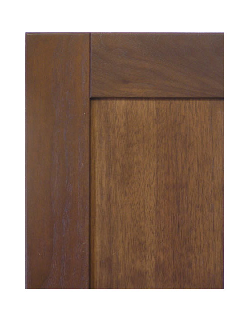
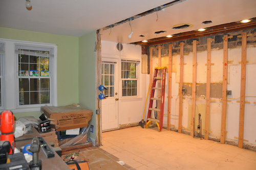
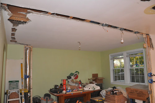
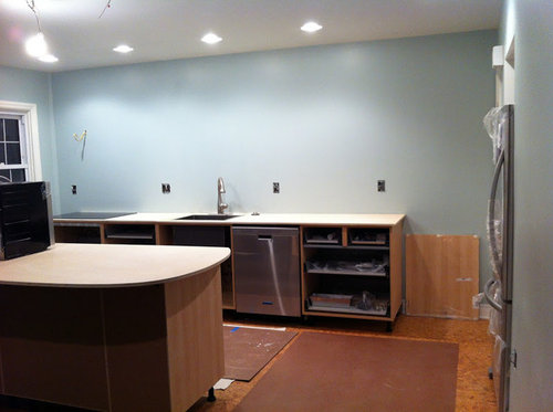
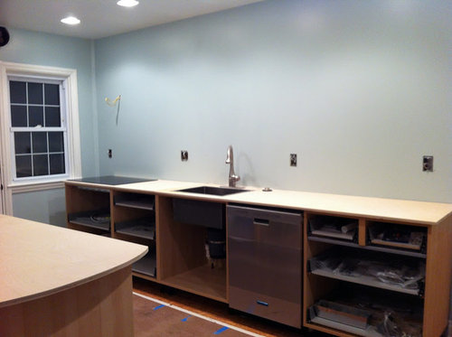
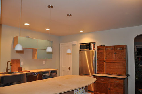
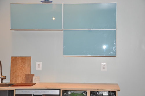
In Progress with lots-o-pics. What say you??
BalTra
12 years ago


Sort by:Oldest
Comments (45)
Related Stories
BEDROOMSGuessing Game: What Might Our Bedrooms Say About Us?
For entertainment only; actual accuracy may vary. Always don fun goggles and engage your imagination before playing!
Full Story
LIFE10 Steps for Saying Goodbye to Sentimental Objects
Are keepsakes cluttering your space and your life? Consider this approach for letting go and moving on
Full Story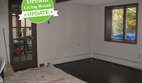
DECORATING GUIDESDream Living Room Makeover Progress Report
See how our sweepstakes winner is handling life in a construction zone — and get a peek at the remodel's progress
Full Story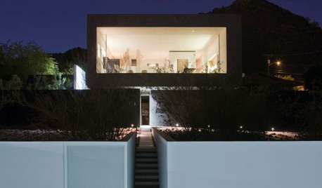
MODERN ARCHITECTUREHouzz Tour: Arizona's Dialogue House Has Something New to Say
Get in on the conversation about this minimalist masterpiece in the Phoenix desert, remodeled by its original award-winning architect
Full Story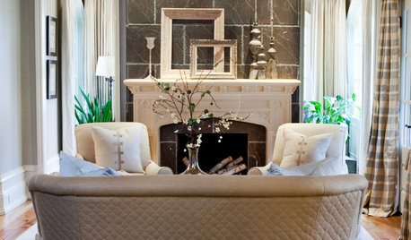
FUN HOUZZGuessing Game: What Might Our Living Rooms Say About Us?
Take a shot on your own or go straight to just-for-fun speculations about whose homes these could be
Full Story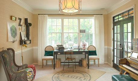
KIDS’ SPACESWho Says a Dining Room Has to Be a Dining Room?
Chucking the builder’s floor plan, a family reassigns rooms to work better for their needs
Full Story
ECLECTIC STYLEBeautiful Clutter? These 13 Rooms Say Go for It
No need to haul cartons to Goodwill for a picture-perfect room. You can have a well-decorated home and all your stuff too
Full Story
COLORSay Hello to Minion Yellow, Pantone’s Newest (and Happiest) Color
This Hollywood-inspired shade is anything but despicable. Here’s how to work the cheerful and cheeky color into your home
Full Story
STUDIOS AND WORKSHOPS8 Rooms That Say 'Let's Make Something'
Stock up on ideas for craft room storage and workspaces from deluxe home workshops
Full Story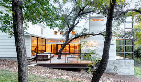
ECLECTIC HOMESHouzz Tour: Problem Solving on a Sloped Lot in Austin
A tricky lot and a big oak tree make building a family’s new home a Texas-size adventure
Full StoryMore Discussions

remodelfla
blfenton
Related Professionals
Albany Kitchen & Bathroom Designers · Henderson Kitchen & Bathroom Designers · Ramsey Kitchen & Bathroom Designers · Saratoga Springs Kitchen & Bathroom Designers · Schaumburg Kitchen & Bathroom Designers · Sunrise Manor Kitchen & Bathroom Remodelers · Cloverly Kitchen & Bathroom Remodelers · Glade Hill Kitchen & Bathroom Remodelers · Auburn Kitchen & Bathroom Remodelers · Tempe Kitchen & Bathroom Remodelers · South Gate Cabinets & Cabinetry · Tinton Falls Cabinets & Cabinetry · Ardmore Tile and Stone Contractors · Brookline Tile and Stone Contractors · Davidson Tile and Stone Contractorsplllog
User
marcolo
petra66_gw
amysrq
rococogurl
advanced
catbuilder
BalTraOriginal Author
User
joaniepoanie
Kode
petra66_gw
boxerpups
sabjimata
remodelfla
BalTraOriginal Author
enduring
CEFreeman
rococogurl
bmorepanic
User
User
User
User
blfenton
dianalo
suzanne_sl
enduring
BalTraOriginal Author
bmorepanic
mtnrdredux_gw
BalTraOriginal Author
BalTraOriginal Author
User
sochi
BalTraOriginal Author
BalTraOriginal Author
User
sochi
purplepansies
CEFreeman
BalTraOriginal Author