


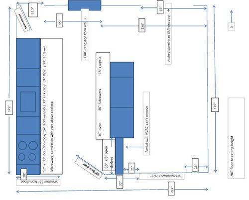
Wild backsplash. Inspired, or Delerious? pic heavy
BalTra
12 years ago

Sort by:Oldest
Comments (36)
Related Stories
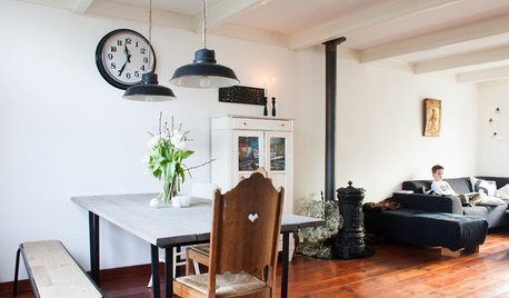
HOUZZ TOURSMy Houzz: Going Heavy on the Metal for Industrial-Style Beauty
Steel and iron pieces mix with antiques and heirlooms in an eclectic Netherlands home
Full Story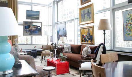
DECORATING GUIDESDesign Risks From Mild to Wild
These interiors aren’t afraid to stand out — in fact, they embrace their distinctive features
Full Story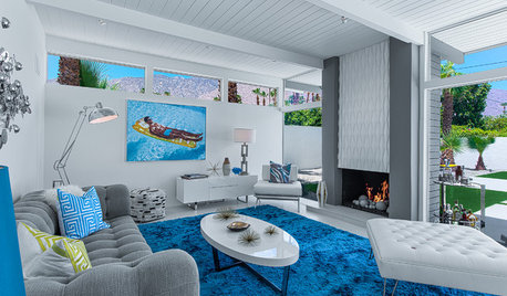
MIDCENTURY HOMESHouzz Tour: Pools and Martinis Inspire a Palm Springs Remodel
Weighed down by black-heavy ’80s style, a California desert home gets a fun and lighthearted look just right for its midcentury roots
Full Story
KITCHEN DESIGNCountertop and Backsplash: Making the Perfect Match
Zero in on a kitchen combo you'll love with these strategies and great countertop-backsplash mixes for inspiration
Full Story
KITCHEN DESIGNHow to Pick a Kitchen Backsplash That Wows
Design your ideal backsplash with help from these Houzz guides and inspiring ideas for every kitchen style
Full Story
KITCHEN DESIGN15 Creative Backsplashes Full of Character
You’ll find personality aplenty in these distinctive backsplashes — and lots of inspiration too
Full Story
KITCHEN DESIGNKitchen Color: 15 Ravishing Red Backsplashes
Bring some zing to your kitchen with a backsplash of ruby-colored tiles or back-painted glass
Full Story
KITCHEN DESIGNThe Future of Backsplashes
Grout is out. Continuous sheets of glass, stone, metal and porcelain are saving cleaning time and offering more looks than ever
Full Story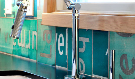
KITCHEN DESIGNSuper Backsplashes to Pair With Recycled-Paper Counters
Aesthetics and personal ethics come together for most folks who opt for this eco-friendly material
Full Story
COLORKitchen Color: 15 Fabulous Green Backsplashes
Get the feel of spring all year round with a tiled, painted or glass backsplash in colors from pale celery to deep olive
Full Story


remodelfla
purplepansies
Related Professionals
El Dorado Hills Kitchen & Bathroom Designers · Pleasant Grove Kitchen & Bathroom Designers · Roselle Kitchen & Bathroom Designers · San Jacinto Kitchen & Bathroom Designers · Holden Kitchen & Bathroom Remodelers · Shamong Kitchen & Bathroom Remodelers · Athens Kitchen & Bathroom Remodelers · Cleveland Kitchen & Bathroom Remodelers · Hanover Township Kitchen & Bathroom Remodelers · North Arlington Kitchen & Bathroom Remodelers · Santa Fe Kitchen & Bathroom Remodelers · Central Cabinets & Cabinetry · Pacific Grove Design-Build Firms · Shady Hills Design-Build Firms · Suamico Design-Build Firmsremodelfla
live_wire_oak
BalTraOriginal Author
BalTraOriginal Author
purplepansies
BalTraOriginal Author
live_wire_oak
Circus Peanut
cawaps
BalTraOriginal Author
purplepansies
Circus Peanut
sochi
dianalo
joaniepoanie
live_wire_oak
cawaps
honorbiltkit
honorbiltkit
BalTraOriginal Author
BalTraOriginal Author
chris11895
Circus Peanut
BalTraOriginal Author
live_wire_oak
BalTraOriginal Author
GreenDesigns
BalTraOriginal Author
sochi
User
chris11895
ghostlyvision
cawaps
Tim