


Tile sizes -- what is best for a smallish kitchen?
I am seeking opinions on what size tile would look best in my kitchen, which is approx. 8' x 14'. The open floor area between the cabinets is an L, whose narrowest dimension is about 4' (as shown below). I understand that there are varying opinions about whether one should use a large tile to make a small room look larger, or if a smaller tile is better suited for the scale of the room. I'd like to know yours!
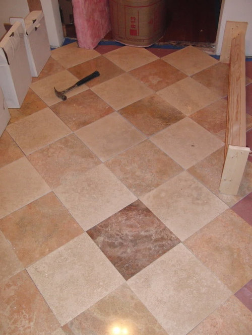
I am planning to use travertine. The tiles are 12"x12" now, but I am happy to cut them to 6"x6" or something else. The tiles are half tan and half reddish (see pictures). I am leaning towards putting these on the diagonal on a subtle checkerboard pattern as a period-appropriate nod towards my 1929 house. Also, for background I should mention that the cabs will be maple (stained light brown), counters are soapstone, and there will be lots of patinaed copper. Paint and backsplash is as-yet undetermined, but leaning towards pale yellow and sage green.
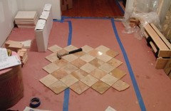
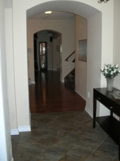
In the photo below, I have laid out the 12x12 tiles between some objects to define the space between the cabinets on the narrow part of the L. Since it is only 4' wide, you can get only 3 full tiles across on the diagonal. The hammer is there for scale.
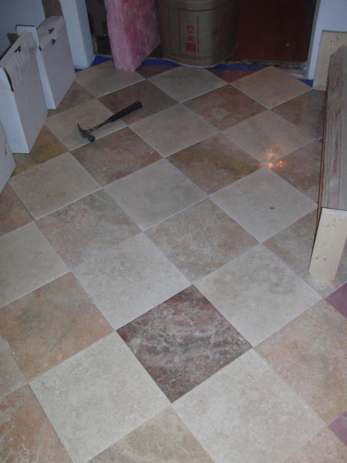
I should point out that the color rendering is a bit touchy for my camera/flash conditions. Here is what that same scene looks like under other conditions. The truth is somewhere between these warm and cool colors.
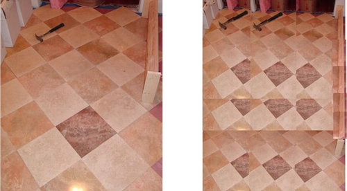
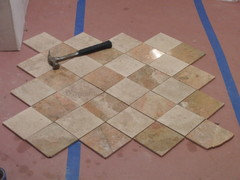
To get an idea of what 6x6 tiles would look like, I tried to "photoshop" something representative. I reduced the picture by 50%, then made multiple overlapping copies to take up the same space. I also put the hammer back in (twice!) at full size to try to give the scale. Again, the boxes on the left and the 2x4 on the right sit where the cabinets will go:
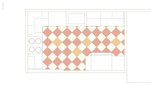
Here is an overhead schematic of the full-size (12x12) tiles in the full floor layout:
And here is the same thing for 6x6 tiles:
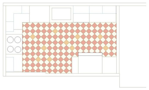
Can you let me know what you think of these choices? I am mostly asking about the tile sizes, but I also wouldn't mind critical feedback on whether you like the checkerboard pattern and/or the diagonal arrangement. (The tiles are already purchased, so I WILL be using red and white travertine! :-)
THANKS generous GWers!
Comments (40)

suzanne_sl
12 years agoWere you thinking you might cut the 12 x 12s to 6 x 6s? Whatever the case, my personal preference is for the 12 x 12s. Several years ago we did a narrow bathroom floor on point like that with room for just 2 tiles across, and we still congratulate ourselves on a great layout.
As for the checkerboard, I like that too. I live in the SW and that layout looks very traditional to me. Because of the overlapping reddish tones, the checkerboard isn't stark. I like the blend.

susanlynn2012
12 years agoI vote for the 12 X 12 especially since they look great and bigger tiles are in for small spaces. The tiles are not big. I am installing 17.25 X 17.25 tiles for my 10 X 14 size kitchen. My foyers have 12.4 X 12.4 tiles and they are much smaller than your kitchen and now I wish I went with the 13 X 13 rectified smaller tile for less grout lines and the more updated look. But I love the checkerboard pattern and your tile size.
Related Professionals
Highland Park Kitchen & Bathroom Designers · Lockport Kitchen & Bathroom Designers · Bay Shore Kitchen & Bathroom Remodelers · Glade Hill Kitchen & Bathroom Remodelers · Champlin Kitchen & Bathroom Remodelers · Chandler Kitchen & Bathroom Remodelers · Fort Pierce Kitchen & Bathroom Remodelers · Vancouver Kitchen & Bathroom Remodelers · Winchester Kitchen & Bathroom Remodelers · Sharonville Kitchen & Bathroom Remodelers · Newcastle Cabinets & Cabinetry · Oakland Park Cabinets & Cabinetry · Wildomar Cabinets & Cabinetry · Brookline Tile and Stone Contractors · Des Moines Tile and Stone Contractors
taggie
12 years ago12x12 for sure! They'll make your space look more open. Love the checkerboard diagonal too!
With 6x6 I think it might look like you got a bargain deal on bathroom wall tiles and decided to make them work for the kitchen floor. Which would be no problem if you really did save a fortune on the 6x6's, but I wouldn't go for that look intentionally.
mhohe
12 years agoI agree that smaller rooms look better with the larger tile. Too much pattern on the floor will draw the eye down, which you never want to do in a small room. Keep it simple below eye level!
pharaoh
12 years agoI too feel that the checkerboard in 12x12 is too busy. I would get larger tiles (if possible). 18x18 or 24x24 if your floor can support it.
angie_diy
Original Author12 years agoSuzanne: Thanks for the feedback. Yes, I would cut the 12x12s to make the 6x6. I know that sounds like a lot of work, but it really wouldn't be a big deal. Thank you for your comments on the color and layout.
Lynne: I did not know that large tiles are "in" for small spaces. Very interesting... Maybe I am drawn to smaller tiles for a "throwback" look?? Thanks for the checkerboard comment.
Taggie: Thanks for the "approval" on the diagonal checkerboard, and the vote on size. Hmmm, good point about the bargain look. I hadn't thought of that...
Actually, come to think of it, the whole reason I am interested in the 6x6 idea is because I thought it would look *richer*, not cheaper. Rightly or wrongly, I associate small tiles with craftsmanship and intensive labor. Rightly or wrongly, I associate large tiles with "builder grade," get the floor laid as quickly as possible and on to the next job. Does anyone else have this perception?
However, I also understand that the common wisdom is that larger tiles counterintuitively make the space look bigger. Of course, I want that, too! :-)Thanks for the thoughts so far!
susanlynn2012
12 years agoAngie_DIY, my friend called the other day to tell me that I was so right that big tiles are IN. His very rich friend redid all his floors in his huge home with large format tiles that were rectified with very slim barely noticeable grout lines and it looked so elegant and rich. When I was going tile in my foyers near the end of 2008, I thought the 12 X 12 were big and I was convinced by the forum to not go smaller. I see now that the bigger 13 X 13 in the pattern and rectified look I wanted would have made me happier but then the 13 X 13 looked so big to me since my kitchen's Linoleum has fake 6 X 6 tiles in the floor and I got used to seeing small. All my bathrooms from 1990 or 1991 have the tiny tiles and most of my neighbors have removed them and replaced the tiles with larger tiles starting at 15 X 15! The real estate inspector told me this when he was upset that he could not increase my taxes since he felt that I did no home improvements to my home that were upgrades. I felt my engineered wood floors downstairs was an upgrade but he did not. I felt all the new appliances and blinds were an upgrade but he did not. He said if I also removed the 20 to 21 year old carpet upstairs, that would have been an upgrade. He also was surprised that I was the only one in my townhouse complex that still have my old Linoleum floor in the kitchen that looks terrible. Well it is going! My home to me has many improvements but I guess not building upgrades and tile is considered an upgrade. Do a search on this forum for kitchens and bathrooms with tile and you will see what is in style right now and what looks upscale.
blfenton
12 years agoIn our small ensuite our tiles are 12"x24" up from 6"x6" and I way prefer the cleaner look of having fewer grout lines. In our front entrance which is about 9'x15' we have tiles that are 24"x18" and again like the unbusyness of the few grout lines. However, depending on the aesthetic look that you want for the space should dictate what size you put down. Bigger does not imply cheaper or a cheaper look.
From what I understand the more current look is with the larger tiles but as I mentioned it depends on the look that you want to show in your kitchen.
susanlynn2012
12 years agoSmall updated kitchen with the checkerboard look you are going for in the link below. I am sure these tiles are no smaller than 12 X 12. I must read the post again to see what size they are. I love the look and the kitchen is small and adorable.
Here is a link that might be useful: Small updated kitchen with the checkerboard look you are going for

enduring
12 years agoI'd do the larger tile, 12", and forget the cutting!!! It wears me out to think you'd be cutting those darned things. I also like the look of the larger tiles in your mock ups. Great to see both in perspective and plan view. The diagonal layout gives the space movement too, not so grided out; ya know what I mean?
jscout
12 years agoThat's interesting, I have the opposite view on "richness" and tile size. To me, the only case where small tiles look richer is when it's a mosaic. And I don't mean the repeating pattern kind. I mean the image or art being create. And even then, it's not about the tile.
Otherwise large tiles look richer because larger whole tiles are heavier and take more contiguous material. They're harder to keep whole. Small tiles can come from scraps. Walk into the foyer of a mansion or the lobby of a luxury apartment building or skyscraper and it's large tile. Five star hotel, large tile. The less clutter in the sight line the larger the perception. Grout lines = clutter, so minimizing it declutters.
It's not about right or wrong, it's about perception. In this case the only perception that matters is yours, unless you care about resale. In that case, you should consider the opinions of others. IMHO, you should go larger, like 18+ inches if possible.

Stacey Collins
12 years agoFirst of all, let me say that I vote for the 12 x 12 in this case. I think it's right in the space. And the tiles already have finished edges.... I think you might find that if you cut them up, you won't like the cut edges, even when grouted. Depending on the tile, the outside edges are often a little bit thinner than the centers, so when cut and butted, there's a slight difference in height. Just enough to seem weird, I'd worry. (You could try cutting one to see.)
On the tile size / "richness" relationship...... I have to say understand your concern. Around here, "builder-grade" homes do often have 12 x 12 tile floors. And 6x6 tile in other areas like bathroom showers. Until recently, mosaic tile backsplashes were a more custom touch, but within the last 4-5 years, since Home Depot and Lowes started carrying so many mosaic patterns, that has changed. LARGE tile, like 12 x 18 or 12 x 14, always seems more high-end. And of course using tile that isn't the ubiquitous beige square helps save you from that look. I think your choice is lovely and the pattern and color variation definitely elevate it to a higher level... it'll be gorgeous!
willtv
12 years agoAngie,
While I'm not a fan of diagonal layouts, I'd definetly go with the 12x12's.
Our kitchen is smaller than yours at 8'x12', and we went for 24"x24" tiles.
I'm attaching a link so you can see our finished kitchen and floor.Here is a link that might be useful: Finished Kitchen w/Large Format Tile
eastfallsglass
12 years agoOur kitchen is about the same scale and age as yours, and we agonized about tile size. We ended up going with 9x9; which ended up being a lot more work, since the stock sizes are 20x20, 13x13 and sheet. I ended up purchasing sheet and cutting each tile to-size. Our feeling was that this size looked more 'historically appropriate' and fit the scale of the room perfectly.
Just another data-point to consider, I do realize that this option could blow your flooring budget since you'd only be able to get 1 smaller tile per 12x12.
Here is a link that might be useful: Finally finished! kitchen thread
dianalo
12 years agoIf you didn't do the checkerboard, going smaller would be ok. In your case, I prefer the 12 x 12s. I think a smaller format checkerboard would be very busy unless it was done as a feature within a larger format field, such as a faux rug that had a border around it.
mtnfever (9b AZ/HZ 11)
12 years agoI like how the 12x12s look and the bonus of less grout to clean!
slightly OT, AngieDIY, your real estate inspector came into your house to appraise it for raising taxes? Was this part of the permit inspection process of your remodel? Obviously we haven't done this remodeling permitting kind of stuff yet!
cheers
mc15
12 years agoIMHO, I think smaller tiles are more appropriate in older homes like yours. I always think of the larger tile for new construction. We recently re-tiled our solarium in our 1915 house and received a lot of suggestions/pushes from the sales people to go with the larger tile because that is what everyone else is doing. We went with the smaller tile (7.5 x 7.5) and are really happy with it. My guess is that the larger tiles will become dated.
Good luck with the decision!
susanlynn2012
12 years agomtnfever, It was in my townhouse complex that has not has a real estate tax assessor here to see what we have as our taxes have more than doubled in the last 14 years due to school tax but not due to any new assessments. My taxes stayed at $7,400 since the inspector did not feel I did any real improvements to my home.
Now Angie has two links with diagonal tiles, one with smaller tile and one with even a smaller kitchen with bigger tiles and she can decide on her own. I know I was surprised bigger tiles were in in 2008 and now I like the bigger tile look and see less grout lines is better and the bigger tiles give up updated look but the smaller tiles in the period kitchen were nice also. But I would not cut tiles if they are already 12 X 12. The tiles will not be exact sizes and will never look as nice.
angie_diy
Original Author12 years agoThanks everyone for the advice. I really appreciate it (even if I am as of yet undecided!). But it is very clear what GW thinks!
Mhohe, interesting point about drawing the eye down. I actually started this process with a MUCH more complicated pattern in mind, with the floor being chosen to be a focal point. I am backing off that now, but I guess some of that feeling is left over.
Pharoh, thanks for your input, which puts my choice in even starker relief. However, I already have the 12x12, and can no longer return it, so that will be the size I use at largest!
Lynn, interesting about the trend! Also, thanks for the link. That was useful.
Blfenton, thanks for sharing your preference *and* for countering my "bigger=cheaper" bias. (Also, thanks for acknowledging that my taste could reasonably differ.)
Enduring, the "do not cut" dictum means something coming from you (who redid her mosaic backsplashes into non-mosaics)! Seriously, I don't think the cutting would be too bad. I have a really nice tile saw. I guesstimate it will take me about 4 hrs. to cut. No biggie.
Jscout, thanks. I really was asking for an analysis of the topic like you offered.
Staceyneil, thanks for the vote. I was worried about the edges, too, but I have practiced cutting and can make very smooth and precise cuts. The travertine cuts like butter on my nice diamond saw! Also, thanks for the vote of confidence on the coloration!
Will, thanks for the link to your ever-lovely kit. I agree your large tiles look nice. I liked your running bond choice. (Hope I can share pix of a black Bluestar range in front of travertine tiles some time this decade!)
Eastfalls, I am glad you can see/empathize with my dilemma. I too thought that something like 8x8 or 9x9 would look better than 6x6. However, that, as you point out, entails a lot of waste starting from 12x12. Cool that you also cut your own field tiles!
Dianalo: I thought long and hard about doing an inset. That really was my preference. What killed it for me was the L-shape of the room. I would be forced to do an L-shaped "rug." The problem is that the edge of the "rug" would bisect a doorway, and I did not think that would look at all nice.
Mtnfever: clean the grout? I don't ever plan to do that! ;-) Seriously, good point.
In answer to your question, yes, I did pull the proper permits and the assessor has come out to visit. However, there is an important element, in that the kitchen will not be done by Jan. 1. Therefore, I may even get a tax break this year! Next year I expect to see a bump, though.MC15: I am glad someone understands where I am coming from! Thank you very much for the "minority report." My neighbors (same vintage house) put in 4x4 marble B/W checkerboard, and I think it looks great. But I also liked (for the most part) the looks of my laid-out floor with the 12x12s.
Still wavering, but I really appreciate all the GWers support...
jscout
12 years agoI think you alluded to this, but one thing to ask yourself. Do you want someone to walk into your kitchen and say, "Beautiful kitchen, love the floor"? Or would you rather they say, "Look at that floor"?
angie_diy
Original Author12 years agoJscout: I don't think I quite got your point. Is the second quote ("Look at that floor") supposed to represent the case where the floor is a (perhaps overwhelming) focal point? To the detriment of the rest of the kitchen?
If I got the question right, I think you know the answer. I'll take the former, please!
Interesting how many of the comments on eastfalls's kitchen said "Love the floor!" (BTW, eastfalls, I spent a summer going to a program at what was then called Phila. College of Textiles and Science. Right in your 'hood!)
eastfallsglass
12 years agoIn the 20's the floor was often the focal point of the kitchen. Today, the backsplash is often used to add color and interest to kitchen design, seems like the floor served to do the same in the 20's. We uncovered a little bit of the original floor in the kitchen during the renovations, unfortunately I did not take a picture, but it was a linoleum mosaic, with maybe the mosaic pieces around 4" in size - in turquoise and white.
The decision for us was a conscious one to make the floor the 'center-piece' of the design and use a more subtle treatment on the cabinets, backsplash and countertops.
And yes, Philadelphia University (nee Phila. College of Textiles and Science) is around 3 blocks from us.
EATREALFOOD
12 years agoAngie: the color variation in the travertine tile is really nice. I used 12x12" tile in a 10.5x12' kitchen. I was going to use 16x16" tiles and I am so glad I did not, they would have been too large for my entryway and kitchen. As others stated it depends on the space..
The 12x12s on diagonal look good.
(I personally love small tiles with older buildings, I do not necessarily agree larger=richer looking)angie_diy
Original Author12 years agoEastfalls: I am sure you are right. I have a book from 1935 called "C.B. Smith's Home Owner's Handbook" that I rely upon for some period-appropriate information. (Along with the link below and a few GW threads such as: http://ths.gardenweb.com/forums/load/kitchbath/msg1110391922585.html
http://ths.gardenweb.com/forums/load/kitchbath/msg1120450213517.html )Most of the kitchens depicted have floors that are either checked or even busier, and few have anything but plain walls. The checked floors seem to have tiles that are about 6x6 to 8x8. The most intricate floors are linoleum cut and inlaid to give some really complicated patterns. But, as you say, the walls are generally austere. I hadn't really noticed the latter fact; thank you for pointing it out!
Here is a link that might be useful: 1920s kitchen gallery
mtnfever (9b AZ/HZ 11)
12 years agooops, sorry lynn2006 (and AngieDIY) for not remembering correctly that it was you and not Angie who posted about the property taxes--mea culpa!
angie_diy
Original Author12 years agoWell, I decided to cut a few tiles into 6x6 just to see how it looked. I must say that I think it is lovely: (I just wish I could decide!)
taggie
12 years agoIt's so hard to see when you've got them laid out against a blank canvas like you do, but 12x12 is a pretty small tile size too, really. Here is a picture of 12x12 in our foyer and they aren't very big tiles:
I'd hate to see 4 times as many tiles as these in the same space (which is what 6x6's would be) ... far too busy IMO.
Go with 12 x 12. Just do it. :-)

mama goose_gw zn6OH
12 years agoAngieDIY, love, love, love the checkerboard diagonal, especially for a house built in the 1920s-30s. I can't decide which would be better, either--they both look good. And the pale yellow/sage green with copper sounds wonderful.
Every time someone posts that link to the 1920s gallery, I have to look at every picture again--they make my heart sing!
marcolo
12 years agoIf I were going vintage, I'd do 4 x 4! I think 12 x 12s are a bit generic, all else being equal, so my favorites would either be much larger in scale or much smaller.
enduring
12 years agoAngie, I don't normally say "go with what you love" but in this case you keep playing with that 6x6. OR maybe you could say go with your inspiration. The 6x6 does look nice in your real sample above.
What do you think of the 4x4 idea of Marcolo? To me the 4x4 might almost transform the floor plane into a texture instead of a pattern. It would be interesting to see a mock up of the 4x4 too.
It doesn't look like you had any problems with your cutting, so go for it.
I love tile designs and it is fun to see you work with this.
Do you have renderings of your walls with the new layout you've decided on? I would love it if you posted it in this link to help me relate it to the floor.

gr8daygw
12 years agoMaybe you could do both. You could do a rug inlay of the smaller tiles or a border or something like that in the smaller tiles with the field being the large tiles. I like those built in tile rugs or at least that is what I call them. This may satisfy your desire for craftsmanship expertise. I would have loved to have done one of those in front of my new pedestal tub in mosaic with the travertine but alas, we had zombies for contractors who never wanted to do anything fun.
angie_diy
Original Author12 years agoSigh. A woman with one watch knows what time it is. One with two watches is never sure... It is really nice to have all this input. Unfortunately, I am one of those people who has a hard time closing off options, and needs to analyze a decision like this to death. Thank you for your comments.
Eatreal: That is interesting, because most people so far have not expressed that they found a "sweet spot," where they did not want to go smaller OR larger. I also thank you for offering your counter to the larger=richer meme.
taggie: Your foyer does look lovely. Thanks for the prod! :-)
mama_goose: Thank you for the comments on the tile and especially on the color theme. I agree on 1920s/30s kitchens. They tend to be my favorite! (I wonder if kids born today will feel that way about 1970's kitchens?)
Marcolo: thanks for the suggestion for sizing in the other direction. As I said upthread, my neighbor has 4x4 B/W checkerboard (chessboard, I guess!), NOT on the diagonal. Hers is tumbled marble, and it looks quite fetching. That size does start to be a bit of work for me: 8 cuts per tile instead of 3. Perhaps I will sacrifice a few more tiles to check it out. As best as I can tell, the photos I have from that time period show 6x6 and 8x8.
Enduring, thanks for your support. I appreciate it, as I am struggling with this stupid decision, as you can tell! :-) Yeah, the cutting is really easy. It takes me about 1 minute per square foot for 6x6, and I have about 112 sq ft. I suppose it would be only 3 min/sq. ft. for 4x4, once I get the jig set up. I love tile designs too! I was even thinking of a Versailles pattern, but then I realized I was getting carried away (and it likely wouldn't even fit the character of the kitchen). I also played with hopscotch and herringbone, but decided to KISS.
I will try to post some renderings later. I had a go of it on Sketchup, but I think the best I will be able to do is to show B/W checked, and not on the diagonal.gr8day, I love the idea of a rug. That was what I originally wanted. However, I claim the room just won't support it. I either have to do a long, skinny rectangle (like 3'x11') or an L. If I do an L, the edge falls in the doorway, or else breaks up the room oddly. I think that would look horrid. I have pretty much committed (finally, some commitment!) to a uniform floor pattern.
Thanks, GW KF.
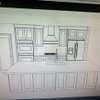
angie_diy
Original Author12 years agoEnduring: I couldn't do any better on the rendering, so the tiles depicted are kinda stark black and white, and not on the diagonal.
Here is the 12x12 tile:
and here is 6x6:
enduring
12 years agoAngie, here is my first attempt at Sketchup.
This is me outside the bathroom (standing in my new kitchen):
{{!gwi}}And this is me inside the bathroom:
{{!gwi}}NEXT, I want to draw a Versailles slate tile pattern on the floor!
My attempt is pretty pathetic, how do you do it!?
angie_diy
Original Author12 years agoWell, the main way "I" do it is by downloading the work of others from the sketchup warehouse. I wrote a longish response to the current thread about whether learning sketchup is worth it (linked below). Even though I got decent results, I am not convinced it is better than spending the $50 or whatever for a program specifically for interior design.
Here is a link that might be useful: thread on sketchup
cluelessincolorado
12 years agoSee Sayde's wonderful kitchen for a smaller tile.
http://www.atticmag.com/2011/09/vintagel-gumwood-cabinet-kitchen/
Here is a link that might be useful: Sayde's gumwood kitchen
angie_diy
Original Author12 years agoClueless! I loved that gumwood kitchen when I saw it months ago, but I did not notice the tile. When you sent me to that page just now, I literally gasped. Quite audibly. Their floor is so beautiful and matches the kitchen wonderfully. Thanks so much for the link!
I have 90% decided on using the 6x6's. I have no idea what will take me the other 10% except for when I am out in the garage cutting tiles and it will be too late! :-)
Mercymygft
12 years agoIn your "renderings", I think the larger tile opens up the space and the smaller tile makes the space look smaller. But, like I said on another thread.... "it's your kitchen, do what YOU like!" GW will not be living in your house, you will. Don't have regrets later down the line.


enduring