Shop Products
Houzz Logo Print
homenoobie

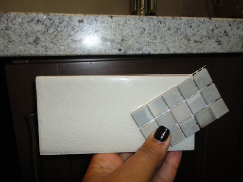
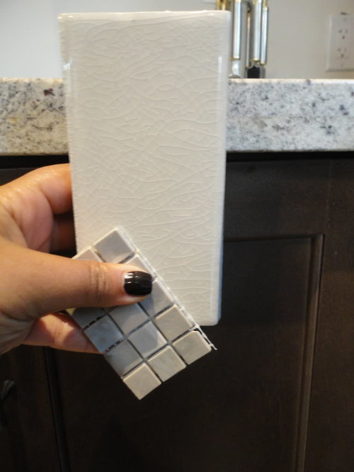
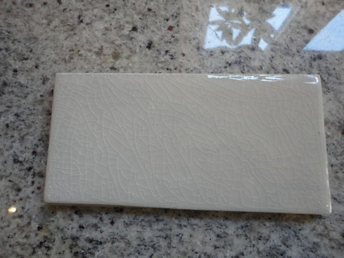
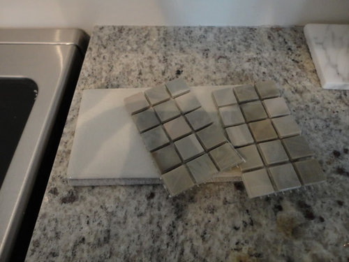
Backsplash hell part 2! Your help needed!

HomeNoobie
12 years ago

Hi guys!

Thanks so much for all your input in my previous thread:

http://ths.gardenweb.com/forums/load/kitchbath/msg1021272925000.html?33

I went tile shopping again today and I came up with a couple more options, the last of which I'm kind of IN LOVE with.. let me know what you think!

Cream crackle, with Sicis mosaic (could do sicis on main hood wall)

And la piece de resistance:

Sici "fireworks" as I call it.. I'm in LOVE with this and would do it throughout the kitchen

and my kitchen again, FYI

Love y'all!

Comments (32)

  • weedmeister
    12 years ago

    That last one adds sparkle and color, which is something you may need. With the others you may end up with too much white and neutral. IMHO

  • bahacca
    12 years ago

    Ohhhh-LOVE that last one. I heard backsplash is like a wedding dress. When you try it on, it just makes you all giddy inside when it is THE one.

  • remodelfla
    12 years ago

    That last one is wildly beautiful and now I have to check it out in other colors for my master bath. However, is it too orange for your kitchen?

  • bahacca
    12 years ago

    I see what remodelfla is referring to only on my screen it has more yellow undertones. Did you get a picture of the actual tile with the cabinet and stone? I'd see if you can get a sample just to make sure the tones are right. I personally like how it is more brown than gray to pull out the brown from the cabinets.

  • remodelfla
    12 years ago

    Noobie... do you know the actual name of the tile series? I am assuming it's by Sicis.

  • HomeNoobie
    Original Author
    12 years ago

    hey!
    YEAH the last one made me swoon.. but it was brand new there so they didn't have pricing or a sample for me to take home :S So I sent her an email. This picture is off my iphone, and doesn't represent how it actually looks at all. In person it doesn't read yellow, it reads warm and those darker parts are actually a bit red. I'm trying to find it online but I'm having trouble! yes it is Sicis! If you have luck finding it, let me know. I'm going to go back and see it again tomorrow because I do love it...

  • mindstorm
    12 years ago

    Beautiful! But, i think you have too little wall space for the last Sicis pattern. That'd be wonderful in a kitchen with few to no uppers as that inset bathroom shows. I'm not sure it will be all that impactful in your space where its mostly the 18" under the cabinet and then just slivers of wall above the cabinet (I assume you are thinking of tiling to the top of the room).

    I think you could meet the spirit of hte thing by using the mosaic (was that Sicis also?) only. Forego the crackle white (it's pretty formulaic now, imo) and just use the mosaic. That's a pretty one, too. Marble? Or a funky glass?

  • HomeNoobie
    Original Author
    12 years ago

    Yeah i do wish I had more space to showcase that last pattern... but couldn't it work anyhow? And where to tile to was another question I had but had no answer to.. I was thinking of tiling to the top but unsure.

    yeah the other one is also glass..

  • HomeNoobie
    Original Author
    12 years ago

    yeah i couldnt find it either...
    the other Sicis, the first one pictured, is $37/sq ft.. she estimated that this swirly one may be between $40-50? I emailed her tonight so I'll let you know when I find out!

  • pondlily
    12 years ago

    I'm trying to find my "perfect" backsplash now too. The more I look around the less sure I am. Part of me wishes I went with my original idea, without looking for something "perfect". I was thinking of marble subway.
    When I choose my granite I just loved it! I'm not feeling love for any tile so far!
    I read your first post with the marble ideas. Did you bring any marble samples home? I really liked some things in the showroom but not as much in my own kitchen. If you haven't, I say try it, you were in love with it before you started looking. Maybe it will look perfect to you!
    Good Luck!

  • HomeNoobie
    Original Author
    12 years ago

    pondlily - I totally feel where you're coming from. I'm so confused now :( Good luck to you too!

    Ok so I got the quote for the swirl, and it IS over $100 per sqft.. so that is out. Not worth it.

    the more I think about it, the more I feel like just doing the cream subway all over. I know it isnt original, but I'm really so lost! :(

  • rococogurl
    12 years ago

    I think the cream crackle is perfect with the granite. Unsure what the mosaic is for -- that's a bit of a different direction style wise.

    If it's possible to find a liner element that would coordinate well with the crackle there could be an outline of some sort or just texture or cap. It depends on where you plan to run the splash.

    The other style that would great in your kitchen is cream tile with a raised design a la beekeeper's -- if you like that style. Those can be a bit more but not as $$$ as the mosaic swirl. No loss on that -- IMO it's a big bathroomy for a kitchen and I don't feel the scale is right either.

    Actually, I feel you're doing fine. Just determine what the design should be.

  • phoggie
    12 years ago

    I vote for the cream crackle as well. The Sicis is beautiful, but for for your kitchen...just my 2 cents~

  • michellemarie
    12 years ago

    I also vote for the cream crackle. I think your kitchen is too small for the Sicis. I think you could add some flair with custom window treatments, paint, and accessories.

  • HomeNoobie
    Original Author
    12 years ago

    thanks guys! for some reason I dont get emails when people respond and every time I try and change the setting, the site crashes...

    Yeah lately when I look at the marble, it seems too "white", and when I hold up the crackle, it just seems to flow.. I also saw this yesterday and emailed the designer.. what do u guys think?

    https://www.houzz.com/photos/traditional-traditional-phvw-vp~129423-Ball-Interiors-traditional-kitchen-portland

  • rococogurl
    12 years ago

    I always worry that range guard designs will date a kitchen though that's not everyone's take. That one makes no sense to me as it doesn't relate to anything else and sort of look like leftover tile from another job. Don't hate me for being negative but that's my honest view.

    Was thinking of the crackle tile this morning as, in addition to tradition staggered subway style it could be run as vertical subways or stacked horizontal -- both taking it a bit more modern.

    Also wondered what other pieces are in the range for the crackle tile. Any reliefs etc.

    It might be helpful for you to take a look at Art Teacher's kitchen on the FKB (if you can find it. Was going to link it but cannot find it).

  • HomeNoobie
    Original Author
    12 years ago

    rococogurl - i don't hate you.. i love the honesty! I know nothing about any of this stuff, which is why I post here :)

    What do you mean by "any other pieces in the range for the crackle tile - reliefs" (excuse my ignorance!)

    I like your ideas about staggering the subways or running them vertically. I am going to go check out ARt Teacher's kitchen now to see what you mean!

    The only reason I wanted to go with mosaic was to do something "Different".. but at the same time, I'm a tiny bit afraid to commit myself to something that will limit my accessorizing options.. taste does change over time..

    I super appreciate your help!

  • HomeNoobie
    Original Author
    12 years ago

    I see why you referred me to ArtTeacher's kitchen.. same two-toned cabinetry and green backyard..lol.. I see what you are getting at and I like the concept, but I feel that that color would be too dark considering that the perimeter is dark and the island light? (the reverse of her kitchen).. also not sure if i'm a fan of limestone and I'm pretty sure I like the subway shape as opposed to the 4x4.. does that helP? lol I think you'll hate me now!

  • HomeNoobie
    Original Author
    12 years ago

    what about the backsplash from that kraftmaid ad? I have been drooling over it for months.. would something like that work?

    http://www.mosaictilestone.com/Casamood-Vetro-Neutra-Glass-Bianco-Lux-p/gl-v-neu-bianco.htm

  • mabeldingeldine_gw
    12 years ago

    I am not a designer by any means, but what about the field mosaic from smarge's kitchen? It is not quite as glitzy as the mosaic you show, but definitely has some life to it.

    Here is a link that might be useful:

  • HomeNoobie
    Original Author
    12 years ago

    mabeldingeldine: oh wow good call.. i love that! do you know what its called/where its from? its so pretty!! also looks costly lol... thanks for your suggestion!!

  • rococogurl
    12 years ago

    What do you mean by "any other pieces in the range for the crackle tile - reliefs"

    The same crackle tile may come in various shape and sizes. "Subways" are a form of what's called field tile -- meaning they are used on the center of the design (usually 3 x6 or 4 x 8 but smaller or larger too). Most people just use those. But there are other types of pieces -- art teachers had little diamond shapes tiles and square tiles. There are relief tiles that have a raised designs in various shapes. Also, hexagonal and circles. Then there are finishing pieces for the top edge of a 'splash' which are skinny and rounded -- those were used to create the borders of art teachers guard. They can all match the field tile but give more options for designs though what's available varies by manufacturer.

    I was just suggesting to see if there were other types of pieces available in the cream crackle. Here's a range guard in a herringbone pattern done with subways run in two different patterns. Again, good size and makes the point about how the tile is used, though more traditional.

    I was suggesting art teacher's for the size of the medallion and the tone-on-tone textural design. Not for color or type of tile. Should have made that clear.

    But the tile from the Kraftmaid ad would certainly be a more modern option -- you have a good eye for the colors you need. It's very lovely and would tie in your floor.

    smarges (yes, costly if I recall) is a bit swirly though again very nice.

    What I think I see, though, is you going for a creamy look with glass mosaic that has some type of small accents. It's funny but I learned that what I pick over and over is what I want. May be difficult for you to see but you're being quite consistent.

    So maybe just focus on that look?

    Meanwhile, I remembered a dark mosaic glass GW kitchen with java cabinets. This is so you can see how darker tile would look -- it can help unifies the walls and the cabinets more than a lighter tile. I thought of this because the mosaics you originally posted were darker (also your nail polish).

  • mpagmom (SW Ohio)
    12 years ago

    Don't give up and settle for something you don't love - you'll find something great.

    In some of the pictures the crackle tile looks perfect and in others it looks too warm compared to the cooler granite. Make sure you like the look of any tile in various lights - natural at all times of the day and artificial light too.

    Maybe you could do a row of 4x4 crackle tiles, with a row or two of the mosaic in your first picture above it, with subway crackle tiles above that.

    I'll search around and see if I can find some inspiration for you.

  • HomeNoobie
    Original Author
    12 years ago

    you guys are seriously awesome rococogurl - I totally get what you're saying now! And you are right, I do keep picking the same thing over and over again.. I feel really drawn to something with a bit of sparkle, but nothing too busy - what about doing the "field" in the subway crackle and then the "range guard" in something sparkly with a border around it? What do you think about that idea? The designer of that range guard that you weren't a fan of sent me a mock up of her idea. It looked like this:

    http://www.mercurymosaics.com/index/Installations/Pages/Residential_Kitchens.html#33

    but with cooler colors as opposed to the red. I'm not sure how I feel about it.. maybe a bit bathroom-y?

    I feel really drawn to the idea of the cream crackle, with something shimmery as a range guard.. I just don't know if it will work, because as

    MPAGMOM said, in some lights I feel that the granite is cold, and at other times, warm. In the store, that cream crackle looked CREAM to me and I said "HIGHLY UNLIKELY".. but when I brought it home, it was JUST perfect (at least to my untrained eye). It is a perfect match to the island color..

    I think as I look more at it, I'm not 100% feeling the mosaic I had on top (the greeny one), and thinking more of a creamy shimmery.. or even.. stainless steel?

    I'm a mess.

  • dejongdreamhouse
    12 years ago

    I totally agree with the idea that your best option is the one that you keep coming back to. What's helped me is to use Pinterest. I make a board for whatever decision we have to make (we're building) and then I go crazy pinning whatever tickles my fancy. As I go through the pins with DH, a theme usually reveals itself.

    If you like the idea of something with a little sparkle/shimmer/shiny/special without being too crazy or too dull, you might want to consider some ideas from Solistone. My eyes loved Ann Sacks, but our wallets loves Solistone :-)

    This is what we're doing in our kitchen, which is similar to yours (espresso shaker cabs, white counters--ours are quartz):

    {{!gwi}}

    Source: dejongdreamhouse.blogspot.com via Jen on Pinterest

    This is Solistone Mardi Gras in Carrollton (there are five or six different colors). This is a closeup:

    {{!gwi}}

    Source: dejongdreamhouse.blogspot.com via Jen on Pinterest

    this is from the folia line:

    {{!gwi}}

    Source: solistone.com via Jen on Pinterest

    and if you're thinking stainless steel, I think this is really pretty, but I don't have a source:

    {{!gwi}}

    Source: erinbrady14.blogspot.com via Jen on Pinterest

  • rococogurl
    12 years ago

    HomeNoo -- What I think I'm trying to say is that the crackle is one direction and the mosaic another. Range guard is a traditional thing. People mix them but....

    You seem to want to go more modern from what you pick. So one very simple option would be to stack the crackle or set it vertically. Third photo down on this link has stacked glass tile to see that look. Amy srq did stacked glazed in her kitchen which has similar color cabinets. There are threads on that.

    Compare that to the look of the staggered glass soliestone. If you like that soliestone I think that type of tile would also look great in your kitchen.

    Think I'm saying go glitzy on the tile choice with irridescent or a cool shape and lose the medallion. Or use the crackle and fashion a range guard with that.

    The range guard would bring focus to that area. But -- and again you seem to want it and likely don't want it and I believe you should have what you want -- but it feels to me as if a square down there would make the whole area appear taller and narrower because it's pulling the eye down below the cabinets which appear more vertical because they're dark.

    IMO: the space will look larger and more cohesive with a solid approach or a blend.

    Hakatai has 25% sale; might help. Also, there's Susan Jablon which, on this page has a tile design tool . She specializes in blends which could be customized.

    Guess I'm just not feeling the aesthetic of that other designer but, again, you have to love it, not me and, of course, it has to work with the budget. But there's a lot of glass tile out there and I think you will find something that will work. Stay strong!

    You are not a mess. You know what you want -- it's a matter of finding/picking. This is not easy and it's always more difficult when everything else is in.

    Here is a link that might be useful: Hakatai on Sale

  • jeanz
    12 years ago

    My vote is for the crackle cream, also! But I do LOVE the Solistone Mardi Gras Carrollton that ICFgreen posted. I found a GORGEOUS Vogue Bay "crackle-type" glass that I just HAD to have until the price came in at $52 sf. Instead, I chose Dal Tile's Glass Reflections "White Ice" subway tile for our kitchen-to-be. Martha Stewart's "Perry Street" cabinets, Kashmere White granite, all LG ss appliances, a 33" Vigo square corners sink, and a Grohe Concetto ss faucet. Really enjoying this forum!

  • HomeNoobie
    Original Author
    12 years ago

    ICFgreen - wow that solistone is so pretty! it is going to look so great in your kitchen! Show pics!! I also love that pic of the stainless steel mosaic... I'm going to look into the solistone some more! thanks so much for your input!

    rococgurl - i totally get what you're saying... I came across this pic:

    I kind of really like it! I like the "shimmer" of the stainless steel and the cream crackle.. what do u think?

    jeanz: your kitchen sounds like it is going to be so gorgeous!! Can't wait to see pictures of it all finished up!! thanks for your input!

  • chrisk327
    12 years ago

    I'm struggling with similar tiles I think. We're considering doing a subway for the field with a 1x2 glass subway accent strip. We also have a range wall similar to the OPs that we're talking about doing in the accent tile.

    my question is, do you go down to the counter on the range wall? like the stainless in HomeNoobie's example? or do you do the normal backspash to backsplash height, then do the shimmery tile above the backsplash height?

    although the stainless is a nice accent, the change from subway to stainles there looks somewhat abrupt, or am I imagining things? I haven't seen one done in person everyone in my area has over the stove microwaves.

  • rococogurl
    12 years ago

    That's not a natural combo but it looks good. The ss mosaics are really nice I think. But they are a tough look. For me, the two tiles work because the kitchen is mostly white -- there's not a lot of difference and then the tile ties into the stainless.

    With the original photos on the thread there is gray/white granite, stainless, then dark cabinets, white island, beige floor. So for me the calling would be something to pull it together.

    That's why I'm thinking I'd be looking to make it more cohesive with one treatment and maybe a pattern, or just one treatment vs two types of tile.

    Do you like the ss mosaic enough to go with it for the entire splash provided cost is good?

    I do like those solistone glass tiles. The right color on those would look great and they have texture and glitz. Or one of the mosaics.

  • HomeNoobie
    Original Author
    12 years ago

    hey rococogurl - I do like the SS, but I feel like it would be a bit busy if it was done over the entire kitchen.. but i do really like how it looks in the picture posted above..

    I will look into the solistone and see if there are any colors that could match my kitchen..

    back to the drawing board!