


99% Finished Off-White Kitchen - want your honest opinion
15 years ago


Sort by:Oldest
Comments (67)
Related Stories

DECORATING GUIDESNo Neutral Ground? Why the Color Camps Are So Opinionated
Can't we all just get along when it comes to color versus neutrals?
Full Story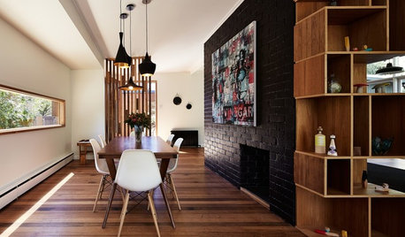
WALL TREATMENTSExpert Opinion: What’s Next for the Feature Wall?
Designers look beyond painted accent walls to wallpaper, layered artwork, paneling and more
Full Story
MOST POPULARMust-Try Color Combo: White With Warm Off-White
Avoid going too traditional and too clean by introducing an off-white palette that brings a touch of warmth and elegance
Full Story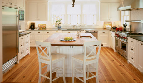
KITCHEN DESIGN3 Steps to Choosing Kitchen Finishes Wisely
Lost your way in the field of options for countertop and cabinet finishes? This advice will put your kitchen renovation back on track
Full Story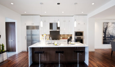
KITCHEN DESIGNKitchen of the Week: Ultra-White Cabinetry in Calgary
Owners turned to a piano finisher for the gloss on this extra-white kitchen
Full Story
COLORColor of the Year: Off-White Is On Trend for 2016
See why four paint brands have chosen a shade of white as their hot hue for the new year
Full Story
KITCHEN DESIGNHave Your Open Kitchen and Close It Off Too
Get the best of both worlds with a kitchen that can hide or be in plain sight, thanks to doors, curtains and savvy design
Full Story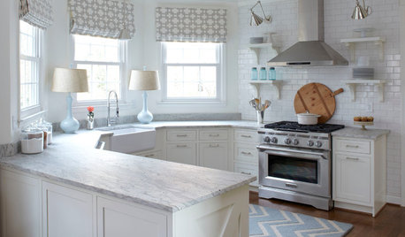
KITCHEN DESIGNHow to Keep Your White Kitchen White
Sure, white kitchens are beautiful — when they’re sparkling clean. Here’s how to keep them that way
Full Story
MOST POPULAR99 Ingenious Ideas to Steal for Your Small Kitchen
Make the most of your kitchen space with these storage tricks and decor ideas
Full Story
REMODELING GUIDESThe Perfect Finish for Your Tile
Bullnose? Quarter round? V-cap? Demystify trim terms and finish off your kitchen and bath tile in style
Full Story

kelleg69
rhome410
Related Professionals
Hammond Kitchen & Bathroom Designers · Hammond Kitchen & Bathroom Designers · Lockport Kitchen & Bathroom Designers · New Castle Kitchen & Bathroom Designers · Ojus Kitchen & Bathroom Designers · Sunrise Manor Kitchen & Bathroom Remodelers · Kendale Lakes Kitchen & Bathroom Remodelers · Kuna Kitchen & Bathroom Remodelers · Shawnee Kitchen & Bathroom Remodelers · South Plainfield Kitchen & Bathroom Remodelers · Upper Saint Clair Kitchen & Bathroom Remodelers · Alafaya Cabinets & Cabinetry · Allentown Cabinets & Cabinetry · Beachwood Tile and Stone Contractors · Santa Paula Tile and Stone Contractorsholligator
remodelfla
susanlynn2012
mustbnuts zone 9 sunset 9
organic_nettie
ci_lantro
rmlanza
catsam00Original Author
susanlynn2012
morton5
pbrisjar
glad
loiseau
lynninnewmexico
adoptedbyhounds
stiles
maydl
rhome410
catsam00Original Author
sailormann
loiseau
catsam00Original Author
redroze
catsam00Original Author
redroze
pluckymama
kateskouros
gorilla_x
catsam00Original Author
gorilla_x
malhgold
catsam00Original Author
catsam00Original Author
redroze
catsam00Original Author
tinykitchen
catsam00Original Author
redroze
catsam00Original Author
malhgold
catsam00Original Author
starpooh
redroze
erikanh
catsam00Original Author
Christine Clemens
pluckymama
tiskers