


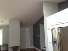
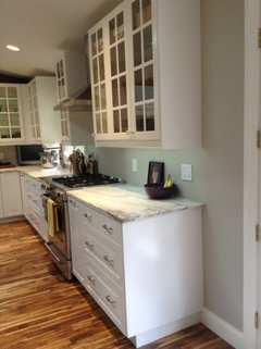
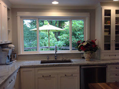
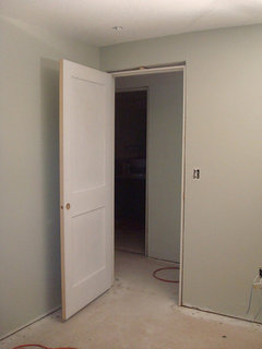
Too many Shades of Grey! Which one did you choose?
beth
9 years ago
Featured Answer
Sort by:Oldest
Comments (14)

Susan St. Pierre
9 years ago
CEFreeman
9 years agoRelated Professionals
Amherst Kitchen & Bathroom Designers · Freehold Kitchen & Bathroom Designers · Gainesville Kitchen & Bathroom Designers · Moraga Kitchen & Bathroom Designers · Rancho Mirage Kitchen & Bathroom Designers · Lisle Kitchen & Bathroom Remodelers · South Park Township Kitchen & Bathroom Remodelers · Upper Saint Clair Kitchen & Bathroom Remodelers · Cave Spring Kitchen & Bathroom Remodelers · Key Biscayne Cabinets & Cabinetry · Marco Island Cabinets & Cabinetry · Ardmore Tile and Stone Contractors · Hermosa Beach Tile and Stone Contractors · La Canada Flintridge Tile and Stone Contractors · Englewood Tile and Stone Contractors
rococogurl
9 years ago
Laura
9 years ago
Bunny
9 years agobeth
9 years agobeth
9 years ago
bbtrix
9 years ago
Jennifer Franson_Hopper
9 years agobeth
9 years agobreezygirl
9 years agocalumin
9 years agobbtrix
9 years ago
Related Stories
KITCHEN DESIGN12 Great Kitchen Styles — Which One’s for You?
Sometimes you can be surprised by the kitchen style that really calls to you. The proof is in the pictures
Full Story
MOST POPULAR50 Shades of Gray
Gray is hotter than ever, thanks to a hit novel full of risks and dark secrets. Tell us: Which paint shade possesses you?
Full Story
KITCHEN DESIGNHouzz Quiz: Which Kitchen Backsplash Material Is Right for You?
With so many options available, see if we can help you narrow down the selection
Full Story
LANDSCAPE DESIGNGarden Overhaul: Which Plants Should Stay, Which Should Go?
Learning how to inventory your plants is the first step in dealing with an overgrown landscape
Full Story
MOST POPULARWhat’s Your Neutral: Beige or Gray?
A designer shares 10 tips for using the neutral shade that works best for you
Full Story
DINING ROOMSColor Feast: When to Use Gray in the Dining Room
The right shade of gray pairs nicely with whites and woods to serve up elegance and sophistication
Full Story
MOST POPULARRethinking Beige in a World Gone Gray
Gray, the ‘it’ neutral of recent years, has left beige in the shade. But is it time to revisit this easy-on-the-eyes wall color?
Full Story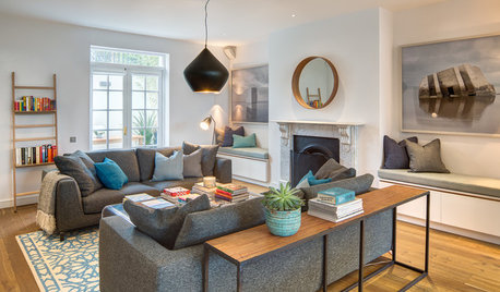
FURNITURE11 Reasons to Love a Gray Sofa
See how a sofa in this neutral shade can take on anything you mix with it, from soft to sharp and everything in between
Full Story
GRAYChoosing Paint: How To Pick the Right Gray
Which Version of Today's 'It' Neutral Is For You?
Full Story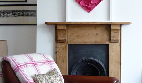
VALENTINE’S DAYTell Us: Why Did You Fall in Love With Your House?
What was it about your house that made your heart flutter? Share your photo, and it could make the Houzz homepage
Full StorySponsored
Central Ohio's Trusted Home Remodeler Specializing in Kitchens & Baths
More Discussions


beths96