


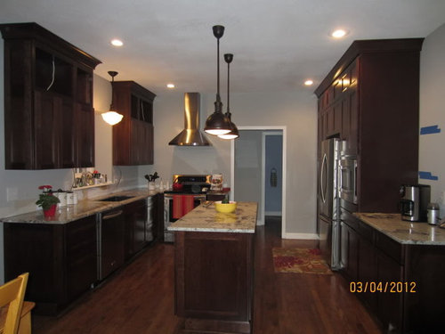
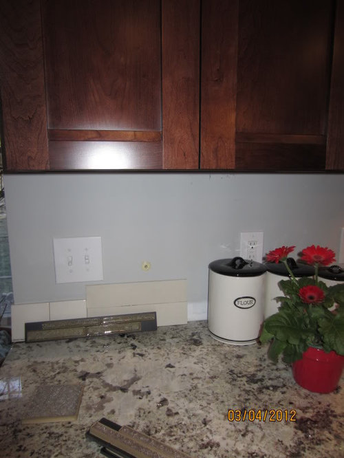
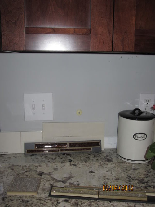
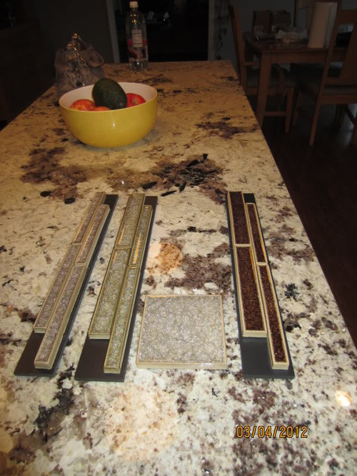
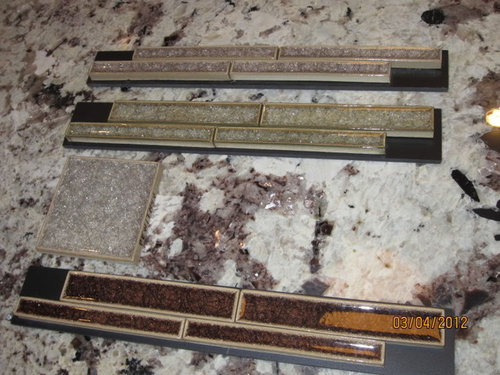
Backsplash help - after granite install this time (pics)!
kellienoelle
12 years ago


Sort by:Oldest
Comments (25)
Related Stories
KITCHEN BACKSPLASHESHow to Install a Tile Backsplash
If you've got a steady hand, a few easy-to-find supplies and patience, you can install a tile backsplash in a kitchen or bathroom
Full Story
REMODELING GUIDESContractor Tips: How to Install Tile
Before you pick up a single tile, pull from these tips for expert results
Full Story
BATHROOM DESIGNShould You Install a Urinal at Home?
Wall-mounted pit stops are handy in more than just man caves — and they can look better than you might think
Full Story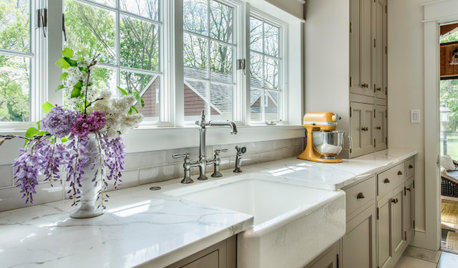
KITCHEN DESIGNHow to Choose the Best Sink Type for Your Kitchen
Drop-in, undermount, integral or apron-front — a design pro lays out your sink options
Full Story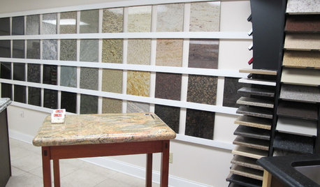
KITCHEN COUNTERTOPSWalk Through a Granite Countertop Installation — Showroom to Finish
Learn exactly what to expect during a granite installation and how to maximize your investment
Full Story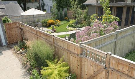
FENCES AND GATESHow to Install a Wood Fence
Gain privacy and separate areas with one of the most economical fencing choices: stained, painted or untreated wood
Full Story
GREAT HOME PROJECTSHow to Install Energy-Efficient Windows
Learn what Energy Star ratings mean, what special license your contractor should have, whether permits are required and more
Full Story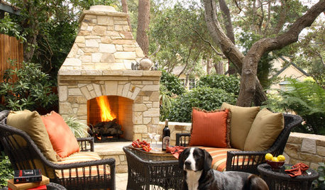
PATIOSSpring Patio Fix-Ups: Install an Outdoor Fireplace or Fire Pit
Make your yard the place to be by adding a fire feature that draws a crowd
Full Story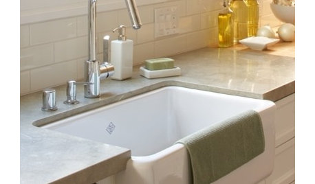
CONTRACTOR TIPSContractor Tips: Countertop Installation from Start to Finish
From counter templates to ongoing care, a professional contractor shares what you need to know
Full Story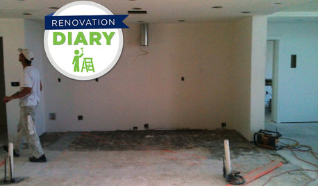
REMODELING GUIDESRanch House Remodel: Installing the Interior Finishes
Renovation Diary, Part 5: Check in on a Florida remodel as the bamboo flooring is laid, the bathroom tiles are set and more
Full Story

Anfrale
lazy_gardens
Related Professionals
Clarksburg Kitchen & Bathroom Designers · Euclid Kitchen & Bathroom Designers · Lafayette Kitchen & Bathroom Designers · Terryville Kitchen & Bathroom Designers · Bensenville Kitchen & Bathroom Designers · Bellevue Kitchen & Bathroom Remodelers · Luling Kitchen & Bathroom Remodelers · Patterson Kitchen & Bathroom Remodelers · Southampton Kitchen & Bathroom Remodelers · Tulsa Kitchen & Bathroom Remodelers · Westminster Kitchen & Bathroom Remodelers · Dover Cabinets & Cabinetry · Manville Cabinets & Cabinetry · Whitefish Bay Tile and Stone Contractors · Mililani Town Design-Build Firmscarp123
gingerjenny
msrose
kellienoelleOriginal Author
kellienoelleOriginal Author
sherwoodva
badgergal
dianalo
westsider40
westsider40
sprtphntc7a
kellienoelleOriginal Author
ILoveRed
pricklypearcactus
jalsy6
christine40
ILoveRed
kellienoelleOriginal Author
rhome410
pricklypearcactus
kellienoelleOriginal Author
podogpodog
cakelly1226