Shop Products
Houzz Logo Print
amysrq

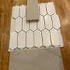
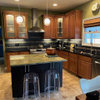
Finally decided on backsplash...please help with layout

amysrq
14 years ago

I am at about 14 months (and counting) on my backsplash dithering. I seem to have had a breakthrough in my favorite breakfast spot yesterday, where they have a stacked subway format in the bathroom. Yippee! Stacked, it is!

So, here is what I need help with. I will be using Oceanside Glasstile Muse in the stacked rectangle.

These are my two inspiration pics:

The large picture is what I think I am after, approximately. The second pic, of the small mosaic, shows the Sandstone color I plan to use for the field. Sandstone is opaque with colors ranging from soft amber to pale blue. The stripe will be a single row of the same size tile, also straight stacked, in a clear, pale blue color that looks like this:

All of the tile will be iridescent, so the stripe will be subtle when you are looking at the tile from an angle. Straight on, the pale blue tile is transparent, so the stripe will be more visible.

This is the kitchen:

The clock is gone. I also bought this to hang over the stove after the tile is in:

The rabbit looks better in person than it does in pics, more of a presence, I think. It in non-negotiable 'cause I love it! I think it should be considered as I ponder the layout and number of stripes.

So, that is the question. How many courses of tile should I use between the stripes? The sheets come nine high and each rectangle is 7/8 of an inch high. Should I aim for five stripes, like the first inspiration picture shows? Or, do I do more stripes since there will be less contrast? Also...I am thinking more stripes since the tile size is much smaller than the inspiration kitchen.

I am a little worried that five stripes will be harder to get looking just right, that maybe more stripes will be more forgiving. There is not a lot of glass being put in in my area and I am a bit nervous about the skill of the local installers, particularly with paper-face mounted tile. I know it is a cop-out, but I often try to devise simpler plans (that I still like, of course) that will be less challenging for contractors to get right. That said, I don't think I want to go as far a pic #3 where the layout is incorporated in the pattern already. But, that would be the simplest route.

The counters will be a soft speckled white quartz. The walls above the tile will be a seafoam color picked up from the tile, as low-contrast with the tile as possible.

If you've made it this far, thanks for reading! I appreciate any insight into my approach. Please offer any critique, except for where the rabbit is concerned! :-)

Comments (14)

  • rjr220
    14 years ago
    last modified: 9 years ago

    1. I love love love your large inspiration photo.
    2. The tiles (carrerra?) in the inspiration look like they are 6 x 12's. I think that what you're planning will be spectacular, but different, with much smaller tiles. I think that you need to go with a stripe color that is different from the main tiles, so that people can tell that it is supposed to be different.
    3. Love the rabbit.

    Do you remember where you got that inspiration photo from? It is HOT! would love to get more details about it, it you remember where you got it

  • honeysucklevine
    14 years ago
    last modified: 9 years ago

    rjr220, that's one of sarah richardson's kitchens. If you go to her website you can probably find it, or google sarah richardson.

    amysrq, I also think that no one will be able to see a pattern unless you pick tiles that are different enough in tone. Those two are two colors are too close.

  • amysrq
    Original Author
    14 years ago
    last modified: 9 years ago

    Honeysucklevine, I am glad you know that photo. I had no idea where it came from. I have spent many late nights gathering photos and am not always so good at documentation.

    RJR, glad you like the rabbit. :-)

    Here are a few more pics of the two tiles together, IRL. They show more of a contrast than pics from the site do.

    These are not the format I will be using. Samples are for color only. I think there is enough of a contrast. I want it to be subtle though. It is a small kitchen and I am afraid of too busy.

  • karinl
    14 years ago
    last modified: 9 years ago

    The rabbit is wonderful. From a distance you really get the degree to which the form conveys movement - quite delightful.

    Have you considered organizing the stripes in a way that would frame/enhance/accommodate the rabbit? Something like two sets of stripes, one above the rabbit and one below? They could be double rows of the stripe tile, or single rows just one tile apart. It looks as if a bottom set of stripes could extent all the way around the kitchen, interrupted by the window (maybe lining up with the sill, maybe not) passing just below the power outlet, while the top stripe would only be above the stove area, above the rabbit.

    Is it just the photo angle or my eyes, or is the gap between the window and the cabinet not quite straight? Maybe figure out what isn't plumb and prepare your contractor for it. It would just require some uncomplicated correction in the corner since you have a horizontal layout.

    KarinL

  • honeysucklevine
    14 years ago
    last modified: 9 years ago

    amysrq, where did you buy the rabbit? I am for an over the range focal point. Actually stopped looking and need to start up again.

    Is that your countertop and if so what is it?

  • amysrq
    Original Author
    14 years ago
    last modified: 9 years ago

    (Slaps head...) Oh good grief. I never noticed the gap being off before. You are right. I first thought it was a trick photo. But, I measured and it is indeed 3/16 of an inch off. (dammit)size=1>

    This house of full of little glitches like that. Most of them, I have just become inured to over time.

    I think the idea of framing the rabbit is a good one. It could be simpler to install than slicing up sheets of tile to get a pinstripe. Maybe two stripes above and below the rabbit and then another set of two splitting the difference on the adjacent wall, positioned so that it shows above the mess array of countertop appliances.

    I am only planning to tile up to the bottom edge of the hood, or thereabouts, btw.

  • malhgold
    14 years ago
    last modified: 9 years ago

    Just to clarify, because I'm a little confused. The tile is all going to be stacked and all the same size regardless if it's the glass or the opaque? The glass row will only be 1 tile tall, so you're trying to decide how many stripes and that will tell you how many tiles high of the opaque tiles you will use?

    Like rjr said, what you're planning is going to have a very different look from the first inspiration pic. You will have alot of grout lines which will make the stacking pattern very visible. Not saying that's a bad thing, just something to be aware of.

    Lucky you that you've finally settled on something!!

  • amysrq
    Original Author
    14 years ago
    last modified: 9 years ago

    HSV, I bought the rabbit from an artist/crafter at the San Rafael farmer's market a couple weeks ago. Her name is Briana Kaufmann. I'll give you a link, below. I fell in love with the rabbit and just trusted I'd find a place for her. Didn't think of the backsplash until I got home from vacation and unpacked. There is a hanging ring on the back, so I can pull her down when I do any particularly messy cooking.

    The counter is Cambria Snowdon White. I am pretty sure that's what I will be using. I am not in love with it...but that's what glass tile is for...LOVE!

    Here is a link that might be useful: The artist

  • amysrq
    Original Author
    14 years ago
    last modified: 9 years ago

    Just to clarify, because I'm a little confused. The tile is all going to be stacked and all the same size regardless if it's the glass or the opaque? The glass row will only be 1 tile tall, so you're trying to decide how many stripes and that will tell you how many tiles high of the opaque tiles you will use?

    Yes, mahlgold, you've got it right. My head was starting to spin, trying to explain it! :-) Thanks for asking for clarification.

    I have wanted glass mosaic all along, and I had something very similar in my last kitchen, so I am ready for the grout lines. The challenge was to bring a subtle suggestion of horizontality (is that even a word?) to the wall, to help ameliorate what I perceive as an imbalance on the range wall, as you may recall.

    So, yes, it will be quite different from the inspiration pic in overall effect. But, that was one of the ways I found to bring in a "horizontal" element.

    Yes, I do feel lucky at the moment. I see you are continuing to struggle. It is so hard. And, often when I think I am there, something shifts. I always wonder when it will end and if this time I really have it right.

    One thing interesting my husband said yesterday as we discussed all the different ways to use the Sandstone and pale blue together was that really any of them would look good. He's right and it helped me relax a bit. Just a bit. :-)

  • onelady1dog2girls
    14 years ago
    last modified: 9 years ago

    Amy, I was just wondering where the first inspirationphoto came from? That is dropdead gorgeous and was hoping to see more...

  • mahatmacat1
    14 years ago
    last modified: 9 years ago

    It's a lapin agile! :)

    And I reiterate my usual advice: color xerox a bunch of the tiles, and mock them up, full height. I'm serious. You can be a master-visualizer, but you'll never see it as clearly as if you actually *see it*. Also, that way if you don't like it, you can cut things up and rearrange patterns, play with the tiles, etc. And you'll know exactly what you'll be getting.

    Here is a link that might be useful: want to go there tonight?

  • rjr220
    14 years ago
    last modified: 9 years ago

    onelady -- I just posted a new thread about that inspiration backsplash and amy has put up a few more pictures with it. Look for a thread rjr220 posted (I can't remember the title, I am too tired and it's only Wednesday, yikes)

  • amysrq
    Original Author
    14 years ago
    last modified: 9 years ago

    Fly... I was thinking I should name her. Maybe something French?

    I don't have the actual tiles in the correct size, but you are probably right. I did that last time and the colors turned out nasty. Something about the glass just doesn't come out right on the color copier. Do you think it would work better on a better copier, like one of those big honkers at Kinko's?

    Onelady, RJR has started a thread about that backsplash and I found a few more pics.

    Here is a link that might be useful: here it is

  • mahatmacat1
    14 years ago
    last modified: 9 years ago

    Yes, that's what I did--I went to Kinkos and used their machine. My Sicis waterglass came out like I could have mounted those and been done with it :)

    Maybe she's a French chanteuse lapin?