


I hate the color in our main living areas
lyfia
15 years ago
Sort by:Oldest
Comments (50)
Related Stories
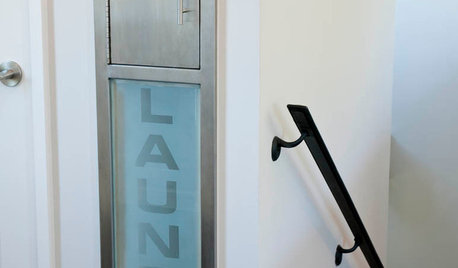
GREAT HOME PROJECTSHate Hauling Laundry? Give Dirty Clothes the Chute
New project for a new year: Install a quick route to the laundry room
Full Story
FURNITUREWhy It's OK to Hate Your New Custom Sofa
It takes time to get used to bold new furniture, but dry your tears — the shock can be good for you. Here's what to expect
Full Story
GARDENING GUIDES8 Plants That Snobs Love to Hate — and You'll Love to Grow
Don't dismiss these common annuals, perennials and shrubs — there are reasons they've been popular for so long
Full Story
DECORATING GUIDESChartreuse: Love It or Hate It?
Try a Sip of Yellow-Green With Blue, Chocolate, Hot Pink, Eggplant and Teal
Full Story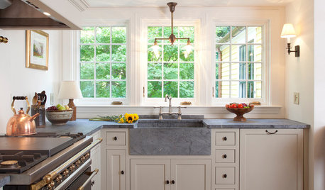
LIFEYou Said It: ‘The Wrong Sink Can Make You Hate Your Kitchen’
Design advice, inspiration and observations that struck a chord this week
Full Story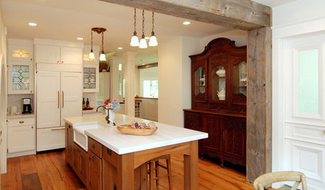
KITCHEN DESIGNKitchen Solution: The Main Sink in the Island
Putting the Sink in the Island Creates a Super-Efficient Work Area — and Keeps the Cook Centerstage
Full Story
SOUTHWEST GARDENINGUnderstanding the American Southwest's Three Main Climate Zones
If you live in one of the arid or semiarid regions of the U.S. Southwest, this gardening zone guide is for you
Full Story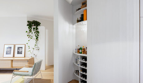
DECORATING GUIDESCurvy, Concealed Wall Storage in Sydney
Valuable storage space hides behind this stylish feature in the main living areas of this apartment
Full Story
DECORATING GUIDESSize Up the Right Area Rug for Your Room
The size of a rug can make an important difference to the feel of a room. Here are some tips to help you make the right choice
Full Story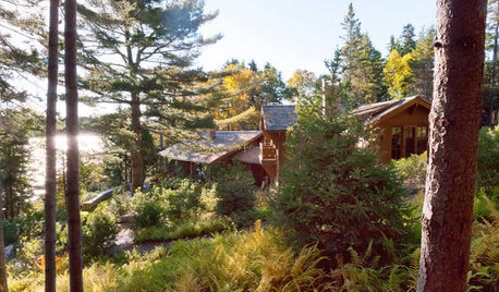
GARDENING AND LANDSCAPINGSublime Coastal Woods Gain a Healthy New Foothold in Maine
Erosion was threatening, and much of the wildlife had fled. See how a homeowner and her landscape architect drove back the danger
Full Story

teacats
squirrelheaven
Related Professionals
Fort Smith Interior Designers & Decorators · Hagerstown Interior Designers & Decorators · Hercules Interior Designers & Decorators · Liberty Township Interior Designers & Decorators · Lake Zurich Furniture & Accessories · Redmond Furniture & Accessories · Rock Hill Furniture & Accessories · Sahuarita Furniture & Accessories · San Juan Capistrano Furniture & Accessories · Maywood Custom Artists · Aurora Lighting · Jefferson Valley-Yorktown Lighting · Suitland Lighting · Fremont Window Treatments · Rolling Meadows Window Treatmentsmahatmacat1
Lemon_Poppy
randita
organic_smallhome
nanny2a
lindybarts
lyfiaOriginal Author
nanmeade
kraftdee
organic_smallhome
organic_smallhome
mahatmacat1
squirrelheaven
patricianat
User
squirrelheaven
house_vixen
patricianat
Saypoint zone 6 CT
squirrelheaven
squirrelheaven
parma42
sweeby
lyfiaOriginal Author
randita
lyfiaOriginal Author
squirrelheaven
lyfiaOriginal Author
lyfiaOriginal Author
squirrelheaven
User
squirrelheaven
squirrelheaven
squirrelheaven
squirrelheaven
gk5040
msrose
randita
lyfiaOriginal Author
patricianat
msrose
squirrelheaven
decor64
User
lyfiaOriginal Author
squirrelheaven
lyfiaOriginal Author
mahatmacat1