


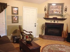
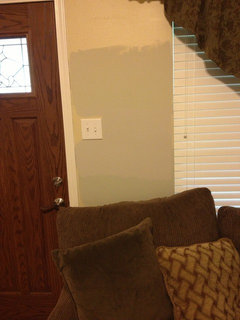
More Samples - Paris rain, Coastal Fog, or Providence Olive?
Ashsmith1972
10 years ago

Featured Answer
Sort by:Oldest
Comments (43)

Ashsmith1972
10 years ago
amykath
10 years agoRelated Professionals
Washington Interior Designers & Decorators · Greenville Furniture & Accessories · Mesa Furniture & Accessories · Midland Furniture & Accessories · Roswell Furniture & Accessories · San Diego Furniture & Accessories · Surprise Furniture & Accessories · Discovery Bay Furniture & Accessories · Murray Furniture & Accessories · Temple Terrace Furniture & Accessories · New Bedford Custom Artists · Glendale Lighting · Jefferson Valley-Yorktown Lighting · El Mirage Window Treatments · Rancho Santa Margarita Window TreatmentsAshsmith1972
10 years agoamykath
10 years ago
DLM2000-GW
10 years agoAshsmith1972
10 years agoDLM2000-GW
10 years agolizzie_grow
10 years ago
localeater
10 years agoAshsmith1972
10 years agonosoccermom
10 years agoindygo
10 years agoindygo
10 years agoyayagal
10 years ago
Annie Deighnaugh
10 years agojoaniepoanie
10 years agoDLM2000-GW
10 years agotuesday_2008
10 years agoAshsmith1972
10 years agolocaleater
10 years agonosoccermom
10 years agoannzgw
10 years agobirdgardner
10 years agoAshsmith1972
10 years agonosoccermom
10 years agoDLM2000-GW
10 years ago
Oakley
10 years agoAshsmith1972
10 years agoAshsmith1972
10 years agoAshsmith1972
10 years ago
redbazel
10 years ago
Sueb20
10 years agoindygo
10 years agoindygo
10 years agoAshsmith1972
10 years agocaminnc
10 years agojollyrd
10 years agosis2two
10 years agoAshsmith1972
10 years agocrl_
10 years agottodd
10 years agolazydaisynot
10 years ago


Related Stories
DECORATING GUIDESThe Case for In-Between Colors
These mutable hues defy easy description, but their appeal all around the home isn't hard to get
Full Story
LIVING ROOMS9 Fashionably Cool Living Room Color Palettes
Chill out in a living room decked in cool-spectrum shades straight from the runway
Full Story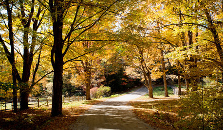
FALL GARDENINGHouzz Call: Show Us Your Autumn Views
Share your pictures of fall foliage and decor in the Comments. Your photos may be featured in an upcoming story!
Full Story
DECORATING GUIDESNo Neutral Ground? Why the Color Camps Are So Opinionated
Can't we all just get along when it comes to color versus neutrals?
Full Story
MOST POPULAR50 Shades of Gray
Gray is hotter than ever, thanks to a hit novel full of risks and dark secrets. Tell us: Which paint shade possesses you?
Full Story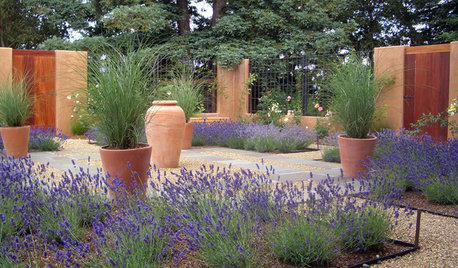
SAVING WATERXeriscape Gardens: How to Get a Beautiful Landscape With Less Water
Conserve water and make gardening much easier with the xeriscape approach’s 7 principles
Full Story
DINING ROOMSColor Feast: When to Use Gray in the Dining Room
The right shade of gray pairs nicely with whites and woods to serve up elegance and sophistication
Full Story
COLOR11 Terrific Paint Color Matches for Wood Details
Pair your wood trim and cabinets with the right shade of wall paint to bring out the beauty in both
Full Story
COLORSet the Mood: 4 Colors for a Cozy Bedroom
Look to warm hues for that snuggle-friendly feeling
Full Story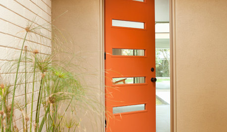
CURB APPEAL77 Front Doors to Welcome You Home
Crossing the threshold is an event with these doors in a gamut of styles
Full Story


DLM2000-GW