


Help! Clueless Young Male!
wstjean42
11 years ago
Sort by:Oldest
Comments (26)
Related Stories
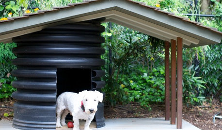
PETSHow to Help Your Dog Be a Good Neighbor
Good fences certainly help, but be sure to introduce your pup to the neighbors and check in from time to time
Full Story
ORGANIZINGGet the Organizing Help You Need (Finally!)
Imagine having your closet whipped into shape by someone else. That’s the power of working with a pro
Full Story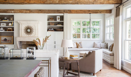
MOST POPULARHouzz Tour: Gracious Older Home Updated for a Young Family
A Texas designer lightens up and repurposes rooms, creating a welcoming space that suits this family’s casual lifestyle
Full Story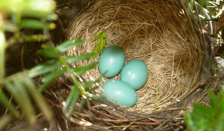
GARDENING FOR BIRDSWhat to Know About Birds Nesting in Your Yard
Learn how to observe, record data and help ornithologists with NestWatch’s citizen science project understand bird trends
Full Story
HOME OFFICESQuiet, Please! How to Cut Noise Pollution at Home
Leaf blowers, trucks or noisy neighbors driving you berserk? These sound-reduction strategies can help you hush things up
Full Story
GARDENING AND LANDSCAPINGBid Bad Garden Bugs Goodbye and Usher In the Good
Give ants their marching orders and send mosquitoes moseying, while creating a garden that draws pollinators and helpful eaters
Full Story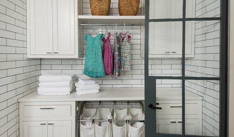
HOUSEKEEPING10 Tips to Streamline Laundry Day
Little adjustments to your attitude and routine can help take the wrinkles out of doing the wash
Full Story
HOUZZ TOURSMy Houzz: Modern and Airy Style on a Budget
Patience, creativity and help from family turn a baker’s cookie-cutter condo into a bright and cheerful home
Full Story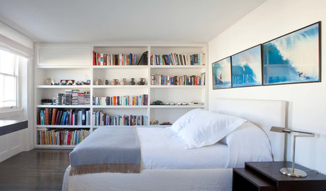
BEDROOMSThe Right Mattress: The Secret to a Great Night’s Sleep
We spend a third of our lives asleep, so investing in a quality mattress is essential. Check out this expert advice to help you choose yours
Full Story
GARDENING GUIDESMake Sure You Read This Before Buying New Plants
Follow these 10 plant-selection tips to avoid buyer’s remorse
Full Story


yayagal
wstjean42Original Author
Related Professionals
Crestview Interior Designers & Decorators · Dallas Furniture & Accessories · Denver Furniture & Accessories · Frisco Furniture & Accessories · Manhattan Furniture & Accessories · Wilmington Furniture & Accessories · Lake Arrowhead Furniture & Accessories · Tucker Furniture & Accessories · Egypt Lake-Leto Lighting · Jefferson Valley-Yorktown Lighting · Palm Springs Lighting · Romeoville Lighting · Sacramento Lighting · Suitland Lighting · Rochester Hills Window TreatmentsUser
stinky-gardener
wstjean42Original Author
User
Sueb20
Annie Deighnaugh
bronwynsmom
amykath
wstjean42Original Author
geokid
chardie
mom2sethc
mclarke
gmp3
bird_lover6
hlove
dawnp
sweeby
juliekcmo
ashef
sloyder
teacats
Tmnca
gr8daygw