


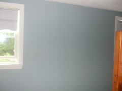
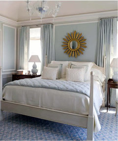
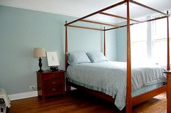
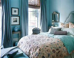
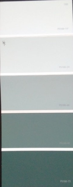
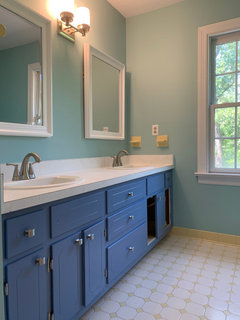
Looking for medium-light aqua blue that isn't shocking
eks6426
14 years ago
Featured Answer
Sort by:Oldest
Comments (45)

Rudebekia
14 years agoboxerpups
14 years agoRelated Professionals
Montebello Kitchen & Bathroom Designers · Salmon Creek Kitchen & Bathroom Designers · Reedley Kitchen & Bathroom Designers · North Druid Hills Kitchen & Bathroom Remodelers · Eagle Kitchen & Bathroom Remodelers · Lakeside Kitchen & Bathroom Remodelers · Overland Park Kitchen & Bathroom Remodelers · Thonotosassa Kitchen & Bathroom Remodelers · Christiansburg Cabinets & Cabinetry · Jefferson Valley-Yorktown Cabinets & Cabinetry · Roanoke Cabinets & Cabinetry · Sunrise Manor Cabinets & Cabinetry · Tooele Cabinets & Cabinetry · Green Valley Tile and Stone Contractors · Hermosa Beach Tile and Stone Contractorspenelopejosephine
14 years ago
plllog
14 years agogillylily
14 years agobuildinginva
14 years agoboxerpups
14 years agoeks6426
14 years agogillylily
14 years agojsweenc
14 years agozelmar
14 years agojudydel
14 years agoprill
14 years agomegpie77
14 years agobestyears
14 years ago
lisa_a
14 years ago
earthpal
14 years agojudydel
14 years agokimkitchy
14 years agoboxerpups
14 years agoeks6426
14 years agobestyears
14 years agoplllog
14 years agogglks
14 years agonicanewjersey
14 years agoeks6426
14 years agomereanne
14 years agoejbrymom
14 years agococaty
14 years agokompy
14 years agoejbrymom
14 years agotrixieinthegarden
14 years agokompy
14 years agofirstmmo
14 years agoeks6426
14 years agocarolinesmom
14 years agomereanne
14 years ago
Condoleeza
7 years agom_gabriel
7 years agolkplatow
7 years agoCondoleeza
7 years agobailey82
7 years ago
Linda Doherty
7 years ago
Jessica Baake
3 years ago


Related Stories
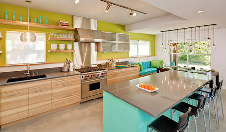
KITCHEN DESIGNKitchen of the Week: Aqua Knockout in Austin
Torn-down walls created more space, while vivid blue and green colors and clever storage gave a one-two punch to a kitchen remodel in Texas
Full Story
FURNITUREObjects of Desire: Recliners That Don’t Look Like Recliners
Forget bulky, hulky eyesores. These 7 smart and svelte chairs — some without levers — have mastered the art of disguise
Full Story
HOUZZ TOURSMy Houzz: An Opposite-Tastes Couple Finds a Happy Medium
Cherished antiques rub elbows with contemporary furnishings in this intimate-feeling open-plan Chicago condo
Full Story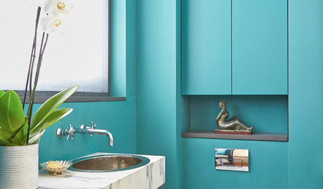
BLUE9 Beautiful Blues for Bathrooms
From soft sky to bold tropical aqua, see why this hue is making waves in bathrooms
Full Story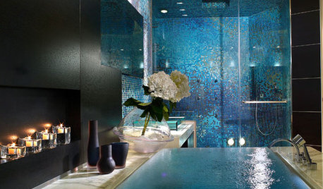
BATHROOM DESIGNDip Into a Watery Blue Bathroom
Relax and Refresh in a Soothing Bath of Blue, Turquoise or Aqua
Full Story
DECORATING GUIDES11 Tricks to Make a Ceiling Look Higher
More visual height is no stretch when you pick the right furniture, paint and lighting
Full Story
LIGHTINGHouse Hunting? Look Carefully at the Light
Consider windows, skylights and the sun in any potential home, lest you end up facing down the dark
Full Story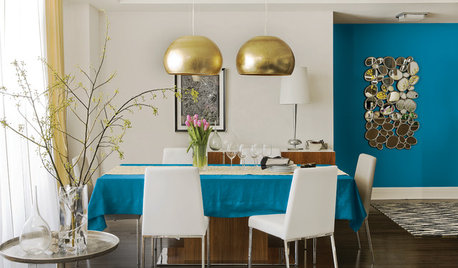
COLORBest Uses for the Boho Blue Color of 2015
PPG Pittsburgh Paints’ Color of the Year is a bold bohemian blue best used in small doses
Full Story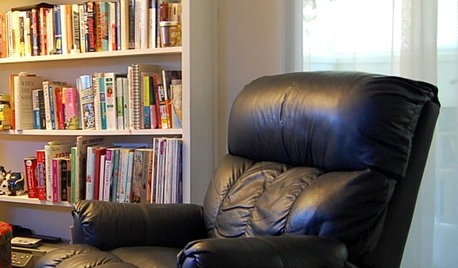
FUN HOUZZ10 Things People Really Don’t Want in Their Homes
No love lost over fluorescent lights? No shocker there. But some of these other hated items may surprise you
Full Story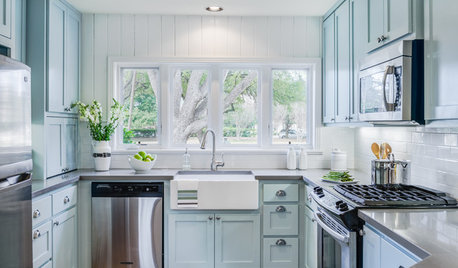
COLOR10 Reasons to Use Sky Blue
This versatile color can look fresh or timeless, beachy or polished. Check out ways to use sky blue indoors and out
Full Story

vchew888