


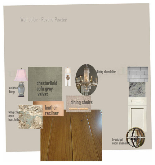
color choices for LR/DR/K in new house - DULL?
bbstx
10 years ago
Sort by:Oldest
Comments (32)
Related Stories
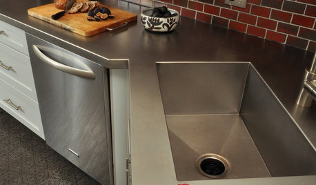
KITCHEN DESIGNKitchen Counters: Stainless Steel, the Chefs' Choice
Professional-grade strength and shining beauty unite in classic stainless steel countertops for the kitchen
Full Story
COLORRoom of the Day: Deep Blue Proves a Hot Hue
Navy takes a New Jersey living room from dull to dashing in the flick of a paintbrush
Full Story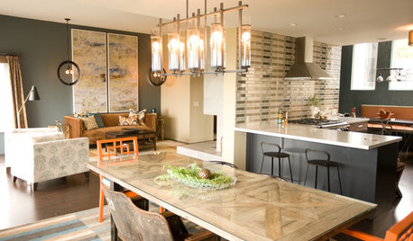
KITCHEN DESIGNKitchen of the Week: Navy and Orange Offer Eclectic Chic in California
Daring color choices mixed with a newly opened layout and an artful backsplash make for personalized luxury in a San Francisco kitchen
Full Story
DECORATING GUIDESHow to Design a Neutral Room That Kicks Boring to the Curb
Neutrals need not be dull and lifeless. Here are some inspiring wow-factor designs — and ways to get the look
Full Story
MOST POPULAR5 Remodels That Make Good Resale Value Sense — and 5 That Don’t
Find out which projects offer the best return on your investment dollars
Full Story
FLOORSHow to Get a Tile Floor Installed
Inventive options and durability make tile a good choice for floors. Here’s what to expect
Full Story
SELLING YOUR HOUSE5 Savvy Fixes to Help Your Home Sell
Get the maximum return on your spruce-up dollars by putting your money in the areas buyers care most about
Full Story
SELLING YOUR HOUSE15 Questions to Ask When Interviewing a Real Estate Agent
Here’s what you should find out before selecting an agent to sell your home
Full Story
REMODELING GUIDESWhen to Use Engineered Wood Floors
See why an engineered wood floor could be your best choice (and no one will know but you)
Full StoryMore Discussions


bbstxOriginal Author
mtnrdredux_gw
Related Professionals
Hercules Interior Designers & Decorators · Austin Furniture & Accessories · Scottsdale Furniture & Accessories · Naples Furniture & Accessories · Rancho Santa Margarita Furniture & Accessories · Stamford Furniture & Accessories · Westport Furniture & Accessories · Carpinteria Furniture & Accessories · Fort Washington Lighting · Palm Springs Lighting · Sacramento Lighting · Chicago Window Treatments · Edmond Window Treatments · Orange County Window Treatments · Placerville Window TreatmentsbbstxOriginal Author
patricianat
Sujafr
bbstxOriginal Author
Gooster
bbstxOriginal Author
Bunny
bbstxOriginal Author
ineffablespace
mtnrdredux_gw
bbstxOriginal Author
patricianat
bbstxOriginal Author
patricianat
User
WendyB 5A/MA
bbstxOriginal Author
patricianat
bbstxOriginal Author
blfenton
bbstxOriginal Author
Bunny
bbstxOriginal Author
msrose
msrose
bbstxOriginal Author
WendyB 5A/MA
bbstxOriginal Author
blfenton
bbstxOriginal Author