


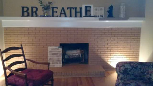
Must paint fireplace NOW. What color?
Jamie
13 years ago


Sort by:Oldest
Comments (12)
Related Stories
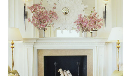
DECORATING GUIDES10 Inspired Ways to Refresh Your Mantel Now
Postholiday blahs don't stand a chance on your mantel when you incorporate these ways to accessorize and light it
Full Story
DECORATING GUIDESHow to Love Your Kitchen More, Right Now
Make small changes to increase the joy in your kitchen while you cook and bake, without shelling out lots of dough
Full Story
KITCHEN DESIGNTrending Now: 25 Kitchen Photos Houzzers Can’t Get Enough Of
Use the kitchens that have been added to the most ideabooks in the last few months to inspire your dream project
Full Story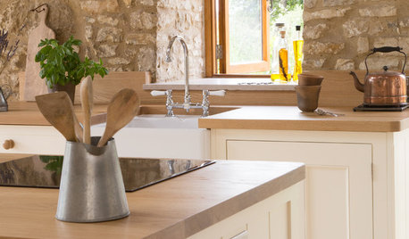
KITCHEN DESIGNHistoric Stone Barn Now a Country Farmhouse Kitchen
A designer carves out a cooking and dining space while carefully preserving the protected 17th-century structure
Full Story
DECORATING GUIDES12 Antique Store Finds to Nab Now, Place Later
See the accessories one decorator always buys when she spots them — as long as she gets there first
Full Story
LIVING ROOMSTrending Now: 5 Foolproof Living Room Ideas From Popular Houzz Photos
A look at recent popular Houzz photos reveals some clever design maneuvers you may want to use in your space
Full Story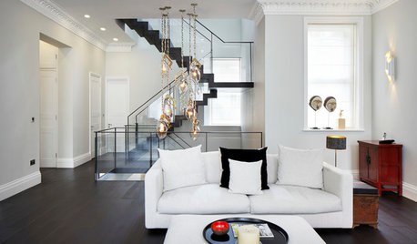
MODERN STYLEHouzz Tour: Three Apartments Now a Three-Story Home
A grand new staircase unifies a sophisticated, industrial-tinged London townhouse
Full Story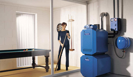
HOUSEKEEPING5 Steps to Improve Your Heating System Now
Increase your heater's efficiency and safety for lower energy bills and greater peace of mind this winter
Full Story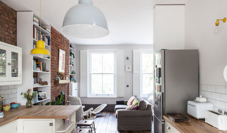
HOMES AROUND THE WORLDHouzz Tour: Former Squatters’ Unit Now a Handsome London Home
A blend of original and reclaimed features gives this two-story apartment a modern rustic look with timeless appeal
Full Story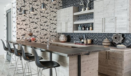
ENTERTAININGTrending Now: 10 Ideas From the Most Popular New Home Bars
Pull up a stool and get inspired by this collection of home bars with sublime style and clever storage
Full StorySponsored
Custom Craftsmanship & Construction Solutions in Franklin County
More Discussions


ummm
abundantblessings
Related Professionals
Linton Hall Interior Designers & Decorators · Lorton Furniture & Accessories · Memphis Furniture & Accessories · Port Charlotte Furniture & Accessories · Discovery Bay Furniture & Accessories · Northbrook Furniture & Accessories · Ocean Springs Custom Artists · Beech Grove Lighting · Green Bay Lighting · Tukwila Lighting · Warwick Lighting · Fraser Window Treatments · Gadsden Window Treatments · Patchogue Window Treatments · Sun Lakes Window Treatmentstheresa2
jay06
JamieOriginal Author
lorriekay
kgibbins
JamieOriginal Author
inspiredisabel
amysrq
JamieOriginal Author
amysrq