


How to tone down artwork
chay
13 years ago
Related Stories
COLORHow to Layer Tones of Gray for Depth and Harmony
Use texture, pattern, contrast and more to create a subtle, sophisticated look with this popular color
Full Story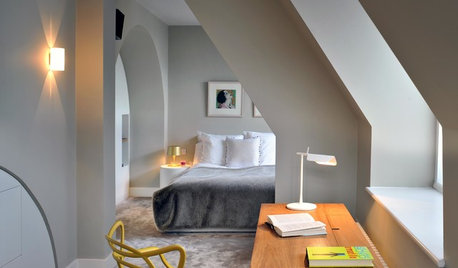
FLOORSBedroom Style: Set the Tone With Your Choice of Flooring
Design your bedroom from the bottom up by choosing your floor treatment first. The rest of the decor will follow
Full Story
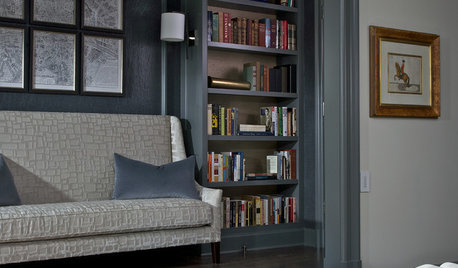
DECORATING GUIDESRoom of the Day: A Painting Sets the Tone
Homeowners happily retreat to their own corners — hers for books, his for tunes
Full Story
MOST POPULAR5 Ways to Pare Down Your Stuff — Before It Gets in the Door
Want to free up some room around the house? Rethink gift giving, give yourself a shopping mantra and just say, ‘No, thank you’ to freebies
Full Story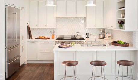
KITCHEN DESIGNWalls Come a-Tumbling Down in a San Francisco Edwardian
Fewer barriers mean better circulation, flow and connection in this family home, making it brighter and cheerier
Full Story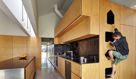
MOST POPULARKitchens Down Under: 20 Design Ideas to Inspire You
These popular Australian kitchens have exciting ideas to borrow no matter where you live
Full Story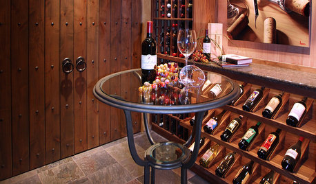
WINE CELLARSFrom Run-down Basement to Bottoms-Up Wine Cellar
See how a dreary storage room and mechanical space became a sophisticated wine cellar and tasting room
Full Story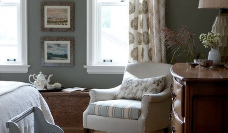
DECORATING GUIDESSplit Your Colors with Two-Toned Walls
There's no need to choose between two paint colors — use both to add dimension and interest to your walls
Full Story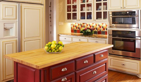
KITCHEN DESIGNTwo-Tone Cabinet Finishes Double Kitchen Style
Love 'em or not, two-tone kitchen cabinet treatments are still going strong. Try these strategies to change up the look of your space
Full Story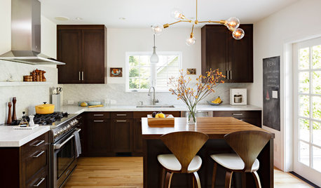
DECORATING GUIDESHow to Make Wood Tones Work for You
Avoid the ski lodge look by using the rule of three, creating texture, adding pattern and more to expertly mix wood types
Full StoryMore Discussions
pezabelle
kraftymom
Related Professionals
Toledo Furniture & Accessories · Farmington Furniture & Accessories · Aventura Furniture & Accessories · Kendall Furniture & Accessories · Lomita Interior Designers & Decorators · Shorewood Interior Designers & Decorators · Everett Painters · Helena Painters · Lansdale Painters · Palos Verdes Peninsula Painters · Rancho Palos Verdes Painters · Red Bank Painters · Truckee Custom Countertops · Tampa Custom Countertops · Lake Oswego Custom CountertopsCheryl.1947
19suzy68
nyboy