


Donna Dewberry's new painting style
paintingfool
17 years ago
Sort by:Oldest
Comments (5)
Related Stories
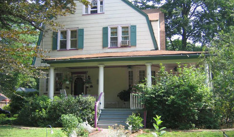
EXTERIORS13 Dramatic Exterior Paint Makeovers by Houzzers
See real-life before and afters of home fronts transformed with paint, in wide-ranging colors and styles
Full Story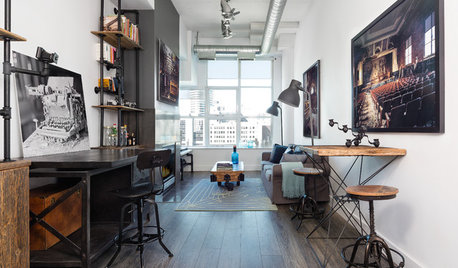
INDUSTRIAL STYLEHouzz Tour: Toronto Loft Gets an Industrial Style Overhaul
Steel pipework shelves, reclaimed barn wood and other raw finishes transform a space into a sleek and modern home
Full Story
DECORATING STYLESCity View: Dallas Design Corrals a Range of Styles
All antlers and cowhide? Hardly. See the real styles and trends, and the misconceptions, about design in this Lone Star State hub
Full Story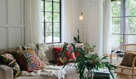
HOMES AROUND THE WORLDHouzz Tour: Tudor Meets Scandi Style in New Zealand
A South Island stylist borrows Scandinavian tricks to bring light and coziness to her home
Full Story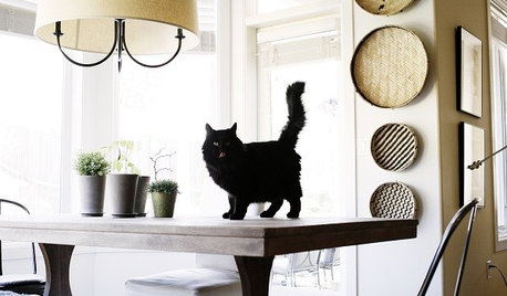
HOUZZ TOURSHouzz Tour: Scandinavian Style with a Twist
This Northwest home gives clean and classic Swedish design a fresh look
Full Story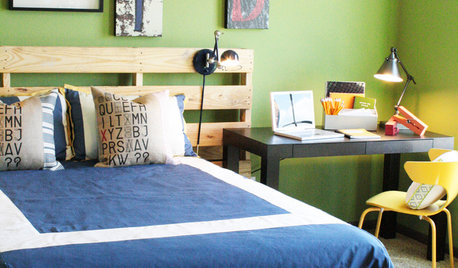
SALVAGESalvage Style: Reinvent Shipping Pallets
Beds, rolling tables, shoe racks and more — ingenuity and elbow grease give discarded wood new life
Full Story
HOUZZ TOURSHouzz Tour: Shingle Style Meets Soho on the Jersey Shore
Surfing, City and the Water's Edge Inspires Beautiful Home With Eclectic Style
Full Story
HOUZZ TOURSMy Houzz: Simple and Chic Style for a Pennsylvania Family Home
White walls, colorful accents, modern furniture and names for rooms bring joy to this suburban home
Full Story
HOUZZ TOURSHouzz Tour: A Single Painting Births a Home's Whole Palette
The colors in this Netherlands home are picture perfect, with paint, furnishings and accessories to match a beloved piece of art
Full Story
HOUZZ TOURSHouzz Tour: Cultural Adventure in Newfoundland
Lovingly renovated coastal cottages enhance a trip of a lifetime
Full StorySponsored
More Discussions
luvstocraft
paintingfoolOriginal Author
Related Professionals
Union City Furniture & Accessories · Vail Furniture & Accessories · Wilmington Furniture & Accessories · Rendon Painters · Anaheim Painters · Damascus Painters · Georgetown Painters · Gretna Painters · New Port Richey Painters · Southbridge Painters · Vernon Hills Painters · Dallas Custom Countertops · Northridge Custom Countertops · Baltimore Custom Countertops · Davie Custom Countertopsluvstocraft
paintingfoolOriginal Author
luvstocraft