


Paint Color Conundrum
retiredprof
13 years ago
Related Stories
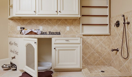
PETSThe Crate Conundrum: A Safe Place for Your Pooch
Get ideas for a comfy den for your dog that works well with your space too
Full Story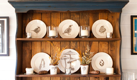
KITCHEN STORAGESmart Storage: Make the Most of Your Hutch
End the “Where are those ... ?” conundrum by storing seasonal and everyday items in a well-organized hutch
Full Story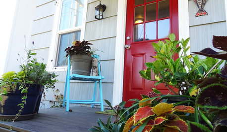
CURB APPEALDIY Painting Project: A Colorful Front Door
Give your entrance a notice-me new hue to make it inviting and energizing for fall
Full Story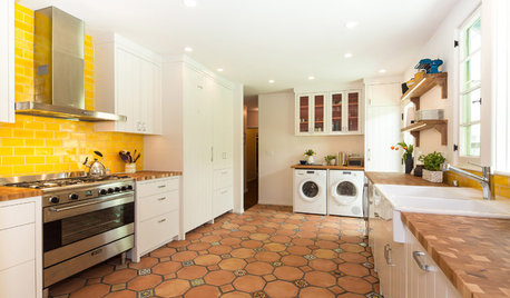
KITCHEN DESIGNNew This Week: 4 Surprising Backsplash and Countertop Pairings
Make your kitchen workspace stand out with colored ceramic tile, back-painted glass, butcher block and more
Full Story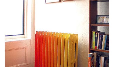
DECORATING GUIDESHow to Make Peace With Your Radiator
Turn a bulky, unattractive old heater into an appealing part of a room
Full Story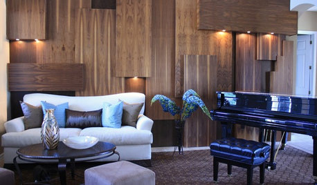
MORE ROOMSGreat Space: Unique Wood Wall Warms Up an Entryway
Designer Shari Misturak solves an interior design challenge with a walnut wall installation inspired by cityscapes
Full Story
DECORATING GUIDESWorld of Design: Decorating Ideas From 10 Renters Around the Globe
Even if you don’t own your home, you can live beautifully. Browse these ideas from international tenants who’ve made their spaces special
Full Story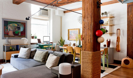
ARCHITECTURE21 Creative Ways With Load-Bearing Columns
Turn that structural necessity into a design asset by adding storage, creating zones and much more
Full Story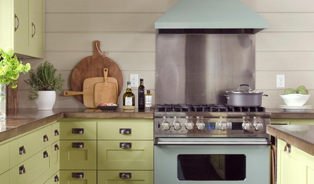
KITCHEN OF THE WEEKKitchen of the Week: Modern Summer Camp Style in Maine
Two window walls let in gorgeous lake views, while barn wood and other reclaimed materials create a relaxed vacation vibe
Full Story
ENTERTAININGHoliday Party Prep: Plan Your Table Settings
Do a dry run with dinnerware, table decorations and the buffet setup now to avoid surprises and stress later
Full StoryMore Discussions
User
flgargoyle
Related Professionals
Pedley Architects & Building Designers · Spring Valley Architects & Building Designers · Vancouver Architects & Building Designers · Bell Gardens Architects & Building Designers · Clearfield Home Builders · Commerce City Home Builders · Dinuba Home Builders · Ellicott City Home Builders · Glenn Heights Home Builders · Home Gardens Home Builders · Lansing Home Builders · Centerville Interior Designers & Decorators · Ridgefield Park Interior Designers & Decorators · Rockland Interior Designers & Decorators · Shorewood Interior Designers & DecoratorsretiredprofOriginal Author
Shades_of_idaho
User
retiredprofOriginal Author
Shades_of_idaho
euglossa
User
retiredprofOriginal Author
Shades_of_idaho
yayagal
Shades_of_idaho
yayagal
Shades_of_idaho
retiredprofOriginal Author
Shades_of_idaho
yayagal
User
brightsea