


What paint colors did you use on your walls?
Hi,
I'm curious to know what colors everyone uses on their walls. Do you use lighter, neutral colors to make your home appear larger or do you go for the darker cozy colors? What about furniture - did you go with solid or patterned upholstery, light or dark wood etc? I'm re-doing my LR and am torn between having a cool, neutral room (taupe, beige, cream, green etc) or a warmer, cozier one (reds, golds, chenille fabric, drapes etc).
I'd be curious to see what everyone has done. Thanks in advance.
Jen
Comments (47)

steve_o
17 years agoNo pics yet (remodel is just finished and I'm still (!) moving things back where they belong), but I went with a greige that looks a lot like mrsmarv's living room with a little more grey. It's interesting, though, that it picks up green nicely in the sunlight (helpful in dealing with the ca. 1974 olive green bathroom). The only room painted differently is the master bedroom, which has a bright blue -- darker than turquoise, but kind of a deeper robins-egg blue. I'm not totally convinced about the blue, but I'll live with it for a while.
My preference would have been for lighter colors. But there was zero chance I'd be removing or refinishing the mid-70s dark-stained millwork in the house and I wanted to cut the contrast between wall and trim. So I went darker. It works. There's enough light in the house to avoid true darkness. Maybe pictures in a week or so when everything is back in place....
Related Professionals
Bayshore Gardens Architects & Building Designers · De Pere Architects & Building Designers · Seal Beach Architects & Building Designers · Seattle Architects & Building Designers · Ronkonkoma Architects & Building Designers · Lake Station Home Builders · Castaic Home Builders · Frisco Home Builders · Glenn Heights Home Builders · Hutto Home Builders · Pine Bluff Home Builders · Roseburg Home Builders · Westmont Home Builders · Garden City Interior Designers & Decorators · Glassmanor Design-Build Firmslorinscott_1
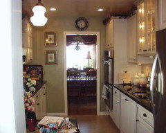
17 years agoI just mentioned this on the "How Did You Decorate?" thread....we lived in our house for 5 years before we started any renovations. This was good for us because we knew just about exactly what we wanted to do....the attributes we wanted to highlight, what colors to use, which rooms got more light, where we hung out the most.
Since the living, dining and master bedroom get a major amount of afternoon light, we used what I call "sunset colors".....a deep gold faux in the bedroom, gold in the living room and burgandy in the dining room. Both rooms have creamy light gold trim. The den, warmly panelled in pine wainscotting with a matching ceiling got painted a deep olive with Eddie Bauer Cabin Red trim and beams. The kitchen went light olive when we renovated, and the attached "utility room" became our coffee bar/laundry/powder room area and got painted a gold faux. The guest room is a light buttery yellow with black and red accents.
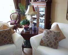
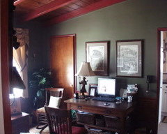
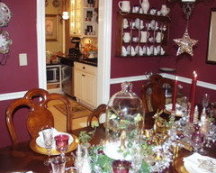
{{!gwi}}
sunrochy
17 years agoMy house has different paint colors in most rooms. The living room and master bedroom has the same paint color; and also the mudroom and hall area has the same paint color but on different areas. I just go with what I like and fits the mood of each room. I also notice that I usually don't go along with the idea of light in summer and dark in winter. I like it bright all year, especially in the winter.
The pictures are in the album in below link.
Here is a link that might be useful: My Home
johnmari
17 years agoI'm another "no two rooms the same" gal, loving that I can do so. Each room tells me what it needs, although I work by the rule "light colors for light rooms, dark colors for dark rooms" - a dark little cave of a room isn't going to magically turn into "light and airy" so I make it into a cozy den instead.
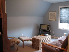
Living room, 12x12, BM Wet Concrete; my favorite color.
{{!gwi}}Library/foyer, 12x17 (including foyer) BM Boardwalk. Not really working out to be my favorite color and I hate this flat paint but DH would kill me if I asked him to repaint. Ignore my nightstands, that's the safest place for them until the bedroom is done. The curtains aren't really that pink, either.
{{!gwi}}Guest room, 10x14, C2 Limon. This room gets the most light in the house by far, so it got the lightest paint. It's very bright and cheerful... a little "perky" for my tastes, actually.
{{!gwi}}
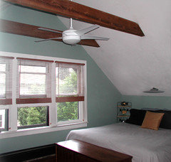
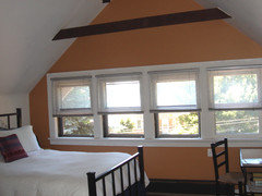
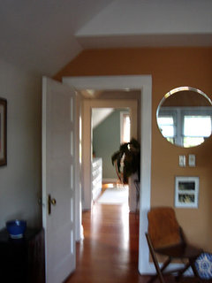
This room is undergoing some pretty drastic furniture changes in a few months; the cherry furniture is disappearing in favor of painted "scrounges" for a more cottagey look.Master bedroom, 12x12, C2 Cheetah. Darkest room in the house, windows facing north with heavy woods, so I intentionally went for the "cave" look. This room is currently torn to pieces, about the only things staying the same in here are the color scheme and bedding; even the moldings got changed out. (Final pics will be available in a couple of months.)
{{!gwi}}{{!gwi}} will be painted a dark green (very likely Devine Fir) and I'm seriously considering a milk chocolate color for the stairway.

Pamela Church
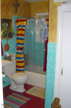
17 years agoI was in severe color deficit when we moved from a beige on beige on beige apartment, so I Had to have color! Our living room is a deep butter gold, bathrooms are medium aqua blue, utility room light aqua blue. I went with a dark hunter green in our bedroom (at the time, hubby was working third shift, so dark cave was the theme, lol). Hubby picked out the dining room color (a rather wimpy yellow that I don't really care for) and his office/computer room, which he left a medium blue). The only room that is not painted a definite color color is the kitchen. I went with white because of all of the 30's, 40's and 50's signs and kitchen collectibles, all in bright colors. I'm thinking of changing the bedroom and dining room, but inspiration hasn't hit yet.
krustytopp
17 years agoMy home has northeastern exposure so I thought that a light, warm, neutral would be best. The walls in my main areas are a yellowish off-white (Benj. Moore Ivory Tusk) which looks creamy by day and almost pale yellow at night. I like this color and will choose it again when it comes time to repaint.
organic_smallhome
17 years agoFor the living room, I used a BM "Pale Oak." For the dining room, I used California Paints Historic Color, "Jackson Antique," on the upper wall, and CP Historic Color "Jewett White" for the chair rail and the lower walls. I love the historic colors because they are somewhat "complicated": for example, Jackson Antique is somewhere between green and blue, depending on the light, and both rich and subtle at the same time. The Jewett White is a rich, creamy off-white. For the rest of the house I used BM "Neutral Echo," which is maybe a shade or two darker than white: you really don't even notice that it has color! I did this partly because my rooms and staircase are small and I wanted to open them up, and partly because I'm terrified of color!
lousit
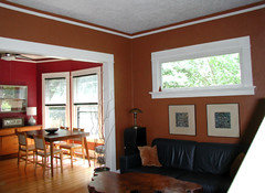
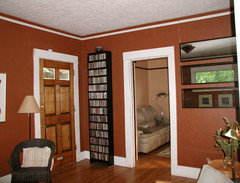
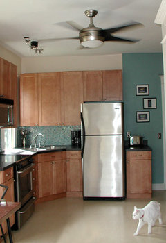
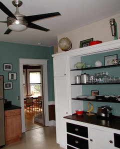
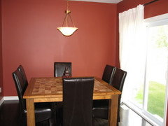
17 years agoI already have my livingroom posted ( It's old avocado green and the windowwall is burgadise) so I'll go on with the master bedroom. It's a light orchid on the top and creamy white on the bottom. This makes it much lighter. The guest room is a nice Jade green, the "Office" is tawny gold. The hall is the same old green of the livingroom with the color LightCoffee of the kitchen rag rolled over it. This gives a apparence of old flocked wallpaper. My niece that I claim as my third daughter did an excellent job.....As I already gave the colors of the kitchen I'll just tell you that the one wall has a marbled affect that I did with mixing a brown paint with GLAZE and then the Antique gold paint that I painted the back hall. I first washed the already painted light coffee wallwith the brown mix then after it dried I used the gold mix. Then finished it using a feather line here & there with plain gold. The bath room is very small and one whole wall is a three mirrored medicine cabinet that was already here, and the wall across from that is the tub/shower combo all while. Plus a small window on the wall between, so I went very bold and painted the walls the same Burgandaize color of the one livingroom wall.I think it'sstill ligt enough with all the white already in there. Thank Heaven for HGTV. I hope I haven't bored you too much.
{{!gwi}}
{{!gwi}}
{{!gwi}}
{{!gwi}}
{{!gwi}}
{{!gwi}}jyyanks
Original Author17 years agoWow! Everyone has such lovely homes. Honestly, they are all gorgeous. Thanks for sharing.
Mrsmarv - I love your colors - is that behr harvest brown in your bathroom? I'm thinking of painting my bathroom that color.
sdteveo - do post pictures if you get a chance. I'm sure the colors you picked will look really nice with the millwork.
Lorinnscott - I love how you used light and dark colors. Your home is lovely. What color did you use in your LR?
sunrochy - I agree with you about liking everything light all the time but for some reason I'm drawn to darker colors in the winter. I chose colors and fabrics for my LR in the winter and now that its summer, I'm changing my mind! Anyway, I love all the detail in your home.
johnmari- I, like you, am of the "no two rooms the came color" mentality. That BM Wet concrete is to die for-hmmm- wonder where I can fit that in my house? I can't wait to see everything once you're done
pamelaiap - I know what you mean about beige on beige. My DH is of the same mindset which is why I don't let him pick out colors anymore LOL!
krustytopp- Ivory tusk is a nice color. Its very soothing and goes well with everything.
Organic-I'd love to see pictures of the rooms done in the historic colors. The color that looks green/blue has really peaked my curiosity.
Louisit-I used similar colors in my MBR except I have the orchid on the bottom. I can't believe how talented you are with a paintbrush. It sounds like you put a lot of effort into your kitchen and hallway! Love the burgundy in the bath-I tend to shy away from dark colors b/c I am afraid of them but always love how they look in other people's homes.
Thanks again for all your replies.
mrsmarv
17 years agojyyanks ~ da*n, you're good! Yes, it is Behr's "Harvest Brown". We used it in both our master baedroom and bath. Thank you for the compliments ;o)
lovingroyaloak
17 years agoranaeluvstexas, please share color names! I'm using a similar green (Behr's dried palm) in my living/dining, and love what you did with the blue and yellow added.
angelcub
17 years agoWe use mostly greens and butter yellows, with a few blues. We recently found a color called Butter Pecan at our local hardware store and I repainted the living room and entry/ stairwell and upstairs hallway in it. It's gorgeous and looks so good with the hickory floors. I painted the upper 4 feet of the kitchen in it, too. The lower half will be white bead board. So far, we're loving it, but I won't know for sure if it will stay until most of the remodel is done.
We have a color called Palm Breeze in the dining room and downstairs half bath. It's a very soft, soothing shade of green. Then our den (secondary bedroom and adjacent bathroom is darker sage green with the ceilings a shade lighter. My sewing room is a blue that tends towards the purple - no name because I had the hardware store experiment with several colors to get it. I just call it Diana blue. ; ) Our MB and Bath is Restoration Blue, another very calming color which we prefer for bedrooms. The bathrooms all have white beadboard 4 ft. up the walls. All our woodwork is white, giving us the vintage cottage look we love.
I'll post new pics once we finish more of the renovations. I do have some pics in various albums on PB. Most are in the house int/ext album.
One last thing, do what YOU love. We all have different tastes for different reasons. And you're the one that has to live with the results. Take a cue from the magazine pics that you are drawn to. Hopefully you will have a more narrowed palette than I, and not lust after every color chip in sight. : )
Diana
Here is a link that might be useful: pics
ranaeluvstexas
17 years agoLoving so sorry I didn't post that and that it has taken me a few days to get back to you... u know how life can keep ya away from the pc anyways here are my colors all from Lowes
The Kitchen Yellow is Perkins Cove from American Traditions Signature Colors Seaside Retreat SeriesSR607The Dinning Room Blue is American Traditions National Trust Color Woodlawn Silver Brook5001-1b
The Living Room Green is American Traditions Willow Wind 6004-3b
I have to say most of the time our green is very muddy I don't know if I would use it again it is very light sensative- only at a certain time of day because of our limited natural light does it look light and clear like I like it.
Thanks for yoour nice comments.
RaNaejyyanks
Original Author17 years agoMore gorgeous homes! Thanks for sharing.
Mrsmarv - everytime I see that color I say "Love that color-wonder what it is?" and it always turns out to be Harvest brown! At least I'm consistent.
organic_smallhome
17 years agoSome really nice paint choices here. And deconut: I'm really impressed by your use of more than one color in your rooms: it's just lovely.
gwendolynne
17 years agoCan't post pics from this computer, but my colour scheme is yellow/cream, gray/blue, apple green and medium red. Paint colours are all same intensity and all 4 colours show up somewhere (in art/accessories) in almost every room. Master bed and bath don't follow the same scheme.
Main floor - flooring is dark gray/blue ceramic tile and walnut-stained oak hardwood
South-facing foyer - Farrow & Ball Light Blue (very gray)
South-facing living room - F&B Farrow's Cream
Hall (down and upstairs) - F&B Farrow's Cream
East-facing powder/laundry room - Sico warm white custom mixed to a more brown white, trim is black
North-facing kitchen - F&B Cooking Apple Green
North-facing dining room - F&B Picture Gallery RedUpstairs - flooring is light beige carpet for now
North-facing loft - F&B Parma Gray
South-facing bath - Behr Butter Cookie
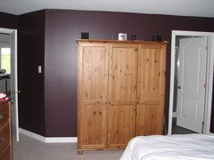
South-facing Master bed - Behr Deep Aubergine
East-facing master bath - can't remember, but it's a light
Behr tanTrim everywhere is F&B Pointing.
Our upholstery everywhere is neutral, mostly shades of brown in different textures (leather, corduroy). Drapes are simple, mostly shades of cream. We figure that if we keep the big stuff within the same tones/stains, it will always be easy to move around.
valzone5
17 years agoWhen we moved in 5 yrs ago we'd just gotten back from our honeymoon in Quebec City and I was heavily influenced by the colors there so I painted intense colors throughout - red, deep blue, gold, terra cotta. I found most of them hard to live with, and now I am in the middle of re-painting all of the rooms. I want a lighter, airier feel.
The master bedroom was a nice green, but I got tired of it and we now have med blue (still darker than I wanted to go this time around, but I like it anyway).
{{!gwi}}
The dining room went from gold to green.
{{!gwi}}a>
The bathroom went from navy blue to cream. The main floor living area is a light buttery yellow and I can't wait to change that - very cold feeling. The kitchen is terra cotta and I want to change that too, but I get a bit nervous when I think about painting around the cabinets (when I painted the kitchen terra cotta, the cabinets had not been installed yet).
{{!gwi}}
I prefer a cozier feel, but intense, dark colors really make me feel blue, and since I suffer from SAD, I need light. I am hoping to lighten up the walls, and change things like bedding, pillows, throws, etc, to cozy up a room in winter, and make it feel airier in summer.
jyyanks
Original Author17 years agoValzone,
That blue is gorgeous! Can you share the color and the brand.house_vixen
17 years agoFun thread! These rooms are all lovely. And I too love that blue, Valzone.
I always joke that I'm in the Crayola Crayon house: pick a color, any color, and it's there. The PO slapped a deadening coat of griege over most of the downstairs before he listed it--the place didn't seem bigger, just bland. Though I have seen the "one or shades of one color" thing done very well, too....
Here are my "I" statements....
I always take the flooring into consideration and try to flatter it. I too use deeper shades in dim rooms. I believe in mixing light and dark--I actually think letting the eye travel from dark to light or vice versa can create a sensation of roominess. [Or so these eyes say!]
Hmmm, what else? I've made mistakes; one room had cobalt accent zones that looked great in the summer but deadly during our 9 months of grey, so I painted them teak a few years later. [Which "feels" a little warm in 90 degree weather, but that's when I bring out the white duvet, so.] I like historic colors but rarely use "designated" ones--mine tend to pull from the 40s and 50s, not the '00s. I consider all my colors to be neutrals and move "art"/accessories around from one to the next--amazing what looks good against deep aqua, ha.
gwendolynne
17 years agohouse_vixen, your colours are so pretty! Your kitchen makes me smile every time I see it.
I posted colour names earlier, but finally have a chance to post a few pics, house is very much a work in progress.
Main floor palette:
And on the walls:
And a couple of the upstairs,
laurenk88_pa
17 years agoI'm just getting settled, so it's a mess, but attached are the colors of my Living Room and Dining Room.
Living Room - Behr - Brown Bread
Dining Room - Lowes American Traditions - Cinnamon DiamondsHere is a link that might be useful: Dining Room/Living Room
mcgillicuddy
17 years agoI love these photos of everyone's non-white rooms. White begone! We live in the midwest, where it's gray/white outside too many months of the year, so who needs it inside?!?
We have a Dutch Colonial with an open LR/DR around the central staircase. A chair rail runs around the entire space. We used Behr Desert Rose (earthy rose) below the rail, and Behr Butter Cookie (deep cream with just a touch of yellow) above. We used Behr Interlude (deep eggplant/aubergine) above the fireplace mantle, which is 72" wide and takes up nearly half of a living room wall.
Butter Cookie is the perfect, deeper warm neutral color. I could use it everywhere.
Our kitchen cabs and floor are stark white (not of our choosing), so we used Behr Celery Sprig to give it some color without making it appear even smaller than it is.
Our upstairs bath is also all-white (tile walls, floor), so we used Behr Asparagus, which is a green two shades deeper than Celery Sprig.
Next project is the foyer, for which I'm leaning toward a deeper version of Butter Cookie (I like a Behr color called Amber Gold).
I like to use the Behr online color tool to find shades that are deeper or lighter versions of colors I already know I like. That helps us stay somewhat coordinated.

IdaClaire
17 years agoIn my case, it's more like - what paint colors didn't I use?! ;-)
Kitchen:
{{!gwi}}Bath:
The downstairs bedrooms, den, living and dining rooms are more subdued. I used SW Buckram Binding on those walls.
(This pic was taken when I was placing an ad to sell my punchbowl and cups!)
{{!gwi}}helenill
17 years agoDeconut56, will you please post colors you used for your rooms. I was running a search this morning and found this post...love your home!
ranaeluvstexas
17 years agoI have another two to add our library/guestroom and our office/craft studio
{{!gwi}}
{{!gwi}}

susanlynn2012
17 years agomcgillicuddy, Your birthday is the same as my older brother.
I would love to see a picture of the Behr Butter Cookie. Please.... Thank you.
So far I have only painted this year BM Bone White, BM Linen White, RL Deep Cream and used SW Extra White Gloss Trim. The walls are in Pearl except I used Satin for the bathroom. The ceiling was painted in BM Super White.
I have two very small bedrooms left to paint, a laundry room, and my garage. I am trying to see what other colors I could. To me I have color since I had a flat off-white everywhere with no contrast for 9 years. I love having more warmth. My favorite of my three colors is the BM Bone White since it is so warm And a tad darker with a tad less gray and no green tones than the SW Navajo White. It is a tad prettier to me than the BM Natural Wicker that it matches 94%.
organic_smallhome
17 years agohouse_vixen and gwendolynne: your rooms and colors are gorgeous. Would you mind sharing the names of the colors with us, including trim colors? Both of you clearly have impeccable taste.
gwendolynne
17 years agoThank you so much, Organic! I should post some updated pictures since a few things have changed since those pictures, I think.
Entry: F&B Light Blue
Living room and hall/stairs: F&B Farrow's Cream
Dining room: F&B Picture Gallery Red
Kitchen: F&B Cooking apple green (although we have just finished painting it the same red as the dining room - looks much better!)
Upstairs family room: F&B Parma Gray
Master bedroom: Behr Deep AubergineTrim throughout - F&B Pointing
esga
17 years agoI painted my living/dining area (deep and cavernous, with two windows in the LR part only) a pinkish peach when I moved in 8 years ago. I love the color, but the peaches out now are more pale orange. Not sure I still have the can so I can paint a sample to have matched. The room gets full sun from the west, but I just adore how the paint changes color with the light. It it beautiful at every time of day, and with artificial light. That's why I don't want to change it, even though the color world has moved on.
My bedroom is the quirkiest: very pale peach undercoat with very subly sponged overcoat of copper metallic mixed with opal metallic. The trim is copper mixed with bronze, except the baseboard, which is such a pale peach it looks white. I like pale trim for contrast in everyone else's house, but it doesn't look right in mine. Will have to change that. Someday. Cork floor.
2nd BR: Ellen Kennon Celadon on 3 walls and trim, with Verdigris on the other wall and one of her just-there blues on the ceiling. I would like to darken the ceiling a little. IN this room, the floor is vinyl, a green and blue that looks subtly sponges, with a little gold stamp. It looks like leather, not vinyl. This is an artist friend's favorite room in the house.
Bathroom keeps trying to change to green and plum (same as the outside of the house: my white-house neighbors hate it, but I live in a funky little city and my house is much more in keeping with the spirit of things than their is!). Somehow I nver get around to even painting the accent pieces (like the medicine cabinet). Kitchen, cream walls with green cabinets (just dark enough so every fingerprint doesn't show up).
I adore Auntjen's colors - very energinzing! I like to live in a slightly more soothing environment. I wish I could decorate my office in those colors, though - we have to live with ghastly grayish-blue and a gray with what I think are khakhi undertones. I would like some color stimulation at work!
Thanks to everyone for sharing - some wonderful colors here!
maggiemuffin360
17 years agoYet another believer in 'no two rooms the same'!
For some of the rooms, I unfortunately did not keep the paint colour information (my bad!).
Kitchen is Tuscany Gold.
Dining Room - Behr's Caramel Sundae.
Living Room - Behr's Fall Straw
1/2 Bath - a lavender colour that almost seems fluorescent, but I love it.
Full Bath - Yellow green (celadon?).
MBR - Mocha.
Have 2 guest rooms and an office that I plan to paint this year. Right now, I don't have any idea what colour they will be but I am sure that it won't be any of the above.My DH was less than excited about my plan to use some rather intense colours. However, we came to the agreement that I would paint the rooms in those colours BUT if he hated them, I would repaint. Well, the room colours are the same after several years so either he was humouring me or he really did come to like the colours :-)
Elisabeth, I love the sound of what you did with your bedroom. Do you have a photo? Sounds like it's something that might work for us....hmmmmmm!
Margaret
susanlynn2012
17 years agoMargaret,
Do you have any pics of your lavender bathroom? I am thinking of repainting my laundry room or guest bathroom lavender when my busy season ends. I am ready to take a chance. :) I love lavender.
maggiemuffin360
17 years agoLynn,
Don't have any pics but will take some (and post) on the weekend when I can do it during the day; hopefully natural lighting will show the colour well.
Margaretmaggiemuffin360
17 years agoLynn,
The bathroom is very small so it is hard to get a full shot. Hope this helps a bit - gives an idea of the wall colour anyway.
Margaret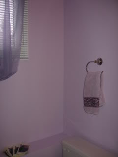
susanlynn2012
17 years agoserendipty, I love the color so much on the wall and the matching hand towel and the purple sheers! Just gorgeous! Do you remember the name of the paint color? Thanks for sharing.
maggiemuffin360
17 years agoLynn,
Actually managed to find the information about that colour - it is the Behr Premium Line, Chateau Rose 660A-2 in an eggshell finish.
Chose that colour initially because the laminate on the counter is a blend of lilac and a medium blue (it came with the house!!) and I wanted to work with that. Had never imagined that I would like that colour on the walls but we love it.
Margaret
susanlynn2012
17 years agoMargeret, Thanks for letting me know the name of the color. I want to try a sample out to see how it would look in my laundry room since surprisingly the Bone White that looked great in so many rooms, does not look that great in that small room with the white shelves. I have wanting a lavender or lilac or purple color and your wall color is so pretty and happy. I have so many Home Depots near me so I can easily get a sample to try out.
Thank you so much.
mcgillicuddy
17 years agoLynn2006,
I haven't looked at this thread in a while, so I just now saw your request to see the Behr Butter Cookie.
Here are some pics of my LR with Butter Cookie above the chair rail and Desert Rose (also Behr) below. I'm thinking about painting the Butter Cookie below the chair rail, too, because I feel like the darker color chops up the room a bit.
Note that the Butter Cookie is coming out a bit pale in the pictures. It's a very rich cream, and it has a really beautiful warm glow at night.
Here is a link that might be useful: Behr Butter Cookie in living room
susanlynn2012
17 years agomcgillicuddy,
I love the Behr Butter Cookie color. I am sure it is even prettier in person. What a happy and warm color. I would paint the bottom chair rail also the Behr Butter Cookie. The white chair rail looks nice matching the trim and the drapes.
I love your carpet! Where did you buy your rug which I like so much.
I also like that Roman Shade look on your doors which maybe could be what I should do in my bedroom on my balcony door.
Thanks for sharing.
mcgillicuddy
17 years agoHi Lynn,
The rug is from Ballard Designs. It's called the French Leopard Indoor/Outdoor Rug.
We have a rambunctious dog and two cats that use rugs as scratching posts, so I wanted something durable and easy to clean.
The roman shades are kind of a boring color, but they were only $15 each on sale at JC Penney. I've thought about using fabric paint to jazz them up a bit, but I don't really know what I'd do.
Glad you like the Butter Cookie... It's really a pleasant color.
Here is a link that might be useful: Ballard Designs leopard rug
susanlynn2012
17 years agomcgillicuddy,
Th price is great on that rug also and it would look nice in my family room if I decide to go back to the leopard idea. I do love leopard patterns. Thank you for sharing.
That is a great price from JC Penney. When they have sales, their products are really marked down. I have their towels and pictures for my bathroom from their store.
The Butter Cookie really is a pleasant color. Thank you again.
sdmmom
17 years agoGwendolynne, I LOVE your choice of colours. I wish my furniture and decorating could mathc your colours. They are soo soo nice!
I am completely colour challenged, and I have seen all of these wonderful rooms posted with fabulous colours, so I need your help with choosing colours for my rec room, bathroom, and kitchen.
1. REC ROOM/LIVING ROOM: We live in a side split house and are wanting to redecorate our rec room area, which is half in the basement but with full windows and still with lots of natural light. The bottom half is with cedar / oak wainscotting and the carpet is a blue colour. I have no idea what colour to paint the top half. Our furniture conssits of beige couches, wood coffee table and end tables. Our theme is going to have bar and sports paraphernalia (and we have a foosball table). I dont want to go with a blue paint because two of our bedrooms are painted blue and I would like some different colours in the house. I love colours but have trouble picking out colours on my own. Since this is the main room where we watch tv and hang out while the kids play, I would like a warm colour that makes the room cozy but fresh and new/classy. Someone suggested yellow or beige to me, but I am thinking I want more colour. What about red (Benjamin Moore Northern Fire) or would that be too dark?
2. BATHROOM: For our bathroom, it has a "teal-like" colour for the countertop and gray-blue cushion flooring. I have no idea what colour to put on these walls. I know green is not good to put in the bathroom. Someone suggested white, but I want colour! However, I know that the green counter top probably limits my wall colours. Am I stuck with white walls?
3. KITCHEN: Our kitchen has wall paper on the bottom half and a beige on the top half. Our counter is a pink (UGH!) and our back splash has pink, browns. Our theme is a country kitchen. I would like a dark warm brown for the bottom and a lighter colour for the top, but I dont know if this would work or not with the pink countertop.
Any suggestions are very much appreciated. I have pictures of all three rooms, but I dont know how to post them. (Can someone tell me how?)
THANK YOU SO MUCH!
lizinnh
17 years agoWhen we bought our small home, I could not decide. A local town built a library and I loved the colors. I wrote to the architect and here are my colors... Sherwin Williams Humble Gold, Austere Gray, Oyster Bay, Cordial,
Searching Blue et al... I know, I cheated but it looks great!
I use a neutral color for the room and choose an accent color for my focal point walls. This gives the room the illusion of space in my opinion and gives a splash of color. I also creatively use mirrors to duplicate window light and highlight color.


mrsmarv