


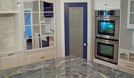
Still blue in the kitchen, but sunnier :)
lavender_lass
13 years ago
Related Stories
KITCHEN COUNTERTOPSKitchen Counters: Granite, Still a Go-to Surface Choice
Every slab of this natural stone is one of a kind — but there are things to watch for while you're admiring its unique beauty
Full Story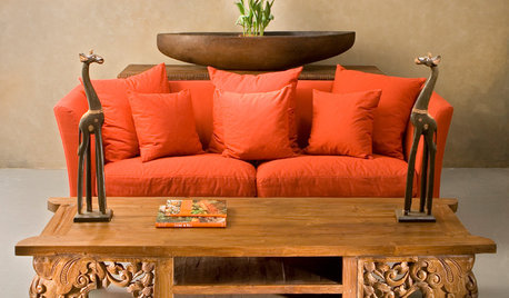
ORANGEOrange: Still Hot, Hot, Hot
Get fired up to bring in more orange with energizing paint, furnishings, rugs and accessories
Full Story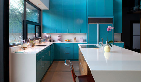
COLORFUL KITCHENSKitchen of the Week: Brilliant Blue Cabinets in a Modern Setting
Lacquered turquoise gives this Lake Austin kitchen a cheerful look without compromising the clean lines
Full Story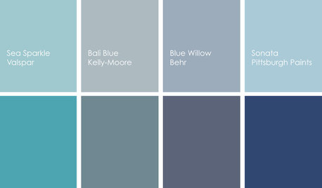
COLORCooking With Color: When to Use Blue in the Kitchen
Keep your cool. We show you when to nosh around navy or try a taste of turquoise so you can stay relaxed while finishing your kitchen
Full Story
BLUEColor Guide: How to Use Navy Blue
Solid, steadfast navy blue can ground a room, but it still knows how to have a good time
Full Story
KITCHEN DESIGNColor Splash: Cool Blue Kitchens
Blue hues from azure to navy give your kitchen a glamorous touch
Full Story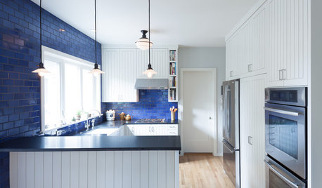
COLORKitchen Color: 15 Beautiful Blue Backsplashes
Blue is the new cool kid on the backsplash block, showing up in shades from pale ice to cobalt
Full Story
KITCHEN DESIGN2012 Color Trends: Blues for the Kitchen and Bath
Watery hues, indigo and denim tones relax, refine and rejuvenate your space
Full StoryKITCHEN OF THE WEEKKitchen of the Week: We Can’t Stop Staring at This Bright Blue Island
A single mom updates her childhood kitchen, so she and her daughter have a functional and stylish space
Full Story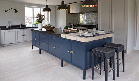
Shop Houzz: Try Prussian Blue in the Kitchen
Get a cozy yet vibrant feel with dark blue tableware, lighting and even appliances
Full StoryMore Discussions
Shades_of_idaho
desertsteph
Related Professionals
Keansburg Architects & Building Designers · Yeadon Architects & Building Designers · Accokeek Home Builders · Ammon Home Builders · Forest Hill Home Builders · Garland Home Builders · North Ridgeville Home Builders · Prichard Home Builders · Seguin Home Builders · Westwood Home Builders · Kearns Home Builders · Crestview Interior Designers & Decorators · Fort Smith Interior Designers & Decorators · Glenbrook Interior Designers & Decorators · Ridgefield Interior Designers & Decoratorslavender_lassOriginal Author
TxMarti
young-gardener
lavender_lassOriginal Author
User
phoggie
lavender_lassOriginal Author
Shades_of_idaho
krayers
User
lavender_lassOriginal Author
lavender_lassOriginal Author
Shades_of_idaho
Shades_of_idaho
User
TxMarti
flgargoyle
phoggie
User
writersblock (9b/10a)
lavender_lassOriginal Author
User
Shades_of_idaho
lavender_lassOriginal Author
Shades_of_idaho
Shades_of_idaho
User
Shades_of_idaho
TxMarti
User
krayers
lavender_lassOriginal Author
Shades_of_idaho
flgargoyle
Shades_of_idaho
flgargoyle
caryscott
Shades_of_idaho
writersblock (9b/10a)