


Need Help for My Idea.
arleneb
15 years ago
Sort by:Oldest
Comments (10)
Related Stories
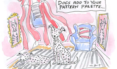
8 Ways Dogs Help You Design
Need to shake up a room, find a couch or go paperless? Here are some ideas to chew on
Full Story
REMODELING GUIDES8 Tips to Help You Live in Harmony With Your Neighbors
Privacy and space can be hard to find in urban areas, but these ideas can make a difference
Full Story
HEALTHY HOMEDecorate With Intention: Let Your House Help You De-Stress
Break free of automatic TV time and learn how to really unwind and recharge with these easy ideas that don't cost a dime
Full Story
LIFEYou Said It: ‘Put It Back’ If It Won’t Help Your House, and More Wisdom
Highlights from the week include stopping clutter from getting past the door, fall planting ideas and a grandfather’s gift of love
Full Story
SELLING YOUR HOUSE10 Tricks to Help Your Bathroom Sell Your House
As with the kitchen, the bathroom is always a high priority for home buyers. Here’s how to showcase your bathroom so it looks its best
Full Story
REMODELING GUIDESKey Measurements to Help You Design the Perfect Home Office
Fit all your work surfaces, equipment and storage with comfortable clearances by keeping these dimensions in mind
Full Story
ENTRYWAYSHelp! What Color Should I Paint My Front Door?
We come to the rescue of three Houzzers, offering color palette options for the front door, trim and siding
Full Story
EXTERIORSHelp! What Color Should I Paint My House Exterior?
Real homeowners get real help in choosing paint palettes. Bonus: 3 tips for everyone on picking exterior colors
Full Story
DECORATING GUIDESDownsizing Help: Color and Scale Ideas for Comfy Compact Spaces
White walls and bitsy furniture aren’t your only options for tight spaces. Let’s revisit some decorating ‘rules’
Full Story
Sponsored
arlenebOriginal Author
urlee
Related Discussions
curtains over sliding doors
Q
Help! I need ideas for the front of my house!
Q
My quirky idea for my powder room, I need help.
Q
Need some ideas to help ground the exterior of my home
Q
urlee
arlenebOriginal Author
urlee
urlee
urlee
urlee
urlee
arlenebOriginal Author