


Elevation
jkziel
10 years ago
Sort by:Oldest
Comments (13)
Related Stories
REMODELING GUIDESHome Elevators: A Rising Trend
The increasing popularity of aging in place and universal design are giving home elevators a boost, spurring innovation and lower cost
Full Story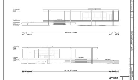
DESIGN DICTIONARYElevation
Capturing a 3-D structure in two dimensions, an elevation is an architectural drawing that puts the line of sight on a vertical plane
Full Story0
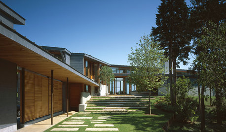
ENTRYWAYSSteps and Stairs Elevate Modern Exterior Entryways
Gently sloped or at a sharper angle, modern ascents on a home's entrance serve both architectural and aesthetic purposes
Full Story
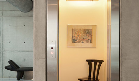
HOUZZ TOURSMy Houzz: Hold the (Freight) Elevator, Please!
Industrial style for this artist's live-work loft in Pittsburgh starts before you even walk through the door
Full Story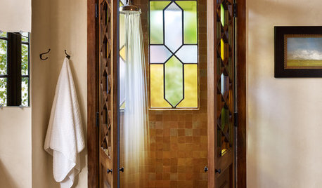
WINDOWSThe Art of the Window: 10 Ways to Elevate Your Bathroom
These window styles and treatments bring in natural light while creating a restful and rejuvenating ambience
Full Story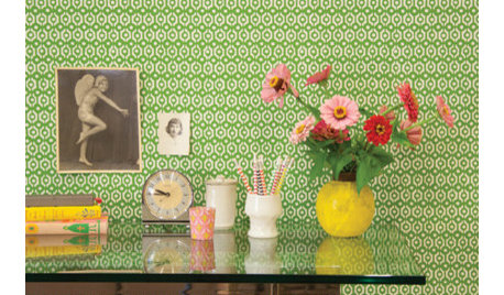
MORE ROOMSGuest Picks: 20 Beautiful Wallpapers to Elevate Your Room
Whatever your style, one of these pretty wallcoverings should work for you
Full Story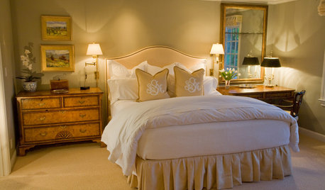
DECORATING GUIDESDecorating With Antiques: Tables to Elevate the Everyday
They may have common uses, but antique tables bring a most uncommon beauty to dining, game playing and more
Full Story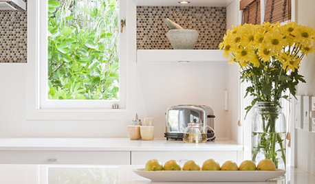
Elevate Your Everyday Edibles Into Kitchen Art
Sugar and spice and everything nice deserve pride of place on your kitchen counters and shelves. These ideas can help
Full Story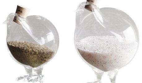
SHOP HOUZZShop Houzz: Everyday Items, Elevated
Amp up every inch of your home with design-forward versions of kitchen, bath and home office accessories
Full Story0
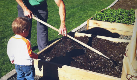
GARDENING AND LANDSCAPINGBuild a Raised Bed to Elevate Your Garden
A bounty of homegrown vegetables is easier than you think with a DIY raised garden bed to house just the right mix of soils
Full StoryMore Discussions


live_wire_oak
Fori
Related Professionals
Biloxi Kitchen & Bathroom Remodelers · Chicago Ridge Kitchen & Bathroom Remodelers · Thonotosassa Kitchen & Bathroom Remodelers · Warren Kitchen & Bathroom Remodelers · Wilson Kitchen & Bathroom Remodelers · Appleton Interior Designers & Decorators · Washington Interior Designers & Decorators · Bay City General Contractors · Evans General Contractors · Green Bay General Contractors · Lakewood General Contractors · Mount Laurel General Contractors · Mount Vernon General Contractors · Nampa General Contractors · Waxahachie General Contractorspalimpsest
jkzielOriginal Author
Fori
User
jkzielOriginal Author
palimpsest
live_wire_oak
palimpsest
Fori
palimpsest
Fori