


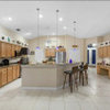
Your thoughts on this color choice?
f1668065
9 years ago

Sort by:Oldest
Comments (35)
Related Stories

HOUZZ TOURSMy Houzz: Thoughtful Updates to an Outdated 1900s Home
Handmade art and DIY touches bring a modern touch to a classic Boston-area home
Full Story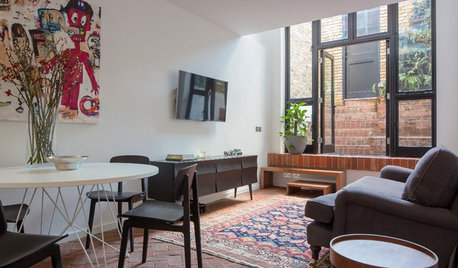
SMALL HOMESHouzz Tour: Thoughtful Design Works Its Magic in a Narrow London Home
Determination and small-space design maneuvers create a bright three-story home in London
Full Story
ENTERTAINING20 Fabulously Thoughtful Host Gifts
Convey your gratitude (and maybe earn repeat invitations) with these useful gifts that show your host you care
Full Story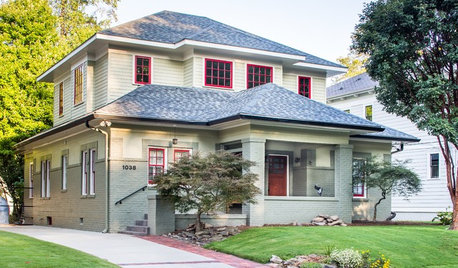
CRAFTSMAN DESIGNHouzz Tour: Thoughtful Renovation Suits Home's Craftsman Neighborhood
A reconfigured floor plan opens up the downstairs in this Atlanta house, while a new second story adds a private oasis
Full Story
COLOR10 Color Combos You Never Thought Would Work
Orange and blue? Purple and green? Yes and yes. Unlikely pairings can look great if you do them right
Full Story
KITCHEN DESIGNNew This Week: 4 Kitchen Design Ideas You Might Not Have Thought Of
A table on wheels? Exterior siding on interior walls? Consider these unique ideas and more from projects recently uploaded to Houzz
Full Story
BATHROOM VANITIESShould You Have One Sink or Two in Your Primary Bathroom?
An architect discusses the pros and cons of double vs. solo sinks and offers advice for both
Full Story
COLORPick-a-Paint Help: How to Quit Procrastinating on Color Choice
If you're up to your ears in paint chips but no further to pinning down a hue, our new 3-part series is for you
Full Story
KITCHEN COUNTERTOPSKitchen Counters: Granite, Still a Go-to Surface Choice
Every slab of this natural stone is one of a kind — but there are things to watch for while you're admiring its unique beauty
Full StoryMore Discussions

f1668065Original Author
f1668065Original Author
Related Professionals
Agoura Hills Kitchen & Bathroom Designers · White House Kitchen & Bathroom Designers · Woodlawn Kitchen & Bathroom Designers · Albuquerque Kitchen & Bathroom Remodelers · Emeryville Kitchen & Bathroom Remodelers · Glen Allen Kitchen & Bathroom Remodelers · Wilson Kitchen & Bathroom Remodelers · Fountain Hills Interior Designers & Decorators · Claremont General Contractors · Coffeyville General Contractors · Dallas General Contractors · Dothan General Contractors · Mashpee General Contractors · Spencer General Contractors · Statesboro General ContractorsUser
aidan_m
f1668065Original Author
colleenoz
speaktodeek
kirkhall
f1668065Original Author
kirkhall
jcalhoun
msjay2u
elizabetheva
f1668065Original Author
speaktodeek
gothaml
gothaml
f1668065Original Author
f1668065Original Author
f1668065Original Author
robo (z6a)
f1668065Original Author
robo (z6a)
f1668065Original Author
f1668065Original Author
carolb_w_fl_coastal_9b
f1668065Original Author
robo (z6a)
carolb_w_fl_coastal_9b
f1668065Original Author
f1668065Original Author
f1668065Original Author
f1668065Original Author
carolb_w_fl_coastal_9b
Jenny