


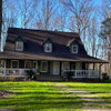
listing link - feedback please!
mysoultokeep
14 years ago
Related Stories
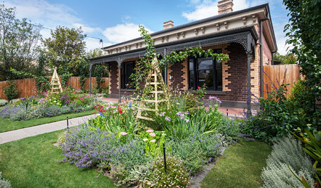
EDIBLE GARDENSAn Edible Cottage Garden With a Pleasing Symmetry
The owners of this cottage garden in Australia grow vegetables, herbs and fruit to delight their family and friends
Full Story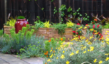
SUMMER GARDENINGHouzz Call: Please Show Us Your Summer Garden!
Share pictures of your home and yard this summer — we’d love to feature them in an upcoming story
Full Story
GARDENING GUIDESGreat Design Plant: Ceanothus Pleases With Nectar and Fragrant Blooms
West Coast natives: The blue flowers of drought-tolerant ceanothus draw the eye and help support local wildlife too
Full Story
HOME OFFICESQuiet, Please! How to Cut Noise Pollution at Home
Leaf blowers, trucks or noisy neighbors driving you berserk? These sound-reduction strategies can help you hush things up
Full Story
REMODELING GUIDESHave a Design Dilemma? Talk Amongst Yourselves
Solve challenges by getting feedback from Houzz’s community of design lovers and professionals. Here’s how
Full Story
WORKING WITH PROSWhat to Know About Concept Design to Get the Landscape You Want
Learn how landscape architects approach the first phase of design — and how to offer feedback for a better result
Full Story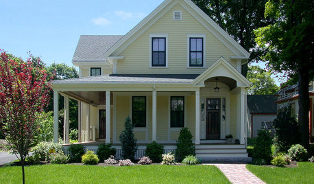
SELLING YOUR HOUSE10 Low-Cost Tweaks to Help Your Home Sell
Put these inexpensive but invaluable fixes on your to-do list before you put your home on the market
Full Story
FENCES AND GATES12 Delightfully Different Garden Walls and Fences
If pickets seem picked over and you shrink from chain link, try these full-of-personality fencing alternatives
Full Story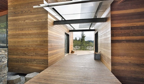
ARCHITECTUREBreezeways: Architecture's Cool Connections
Sheltered open passages link spaces, catch breezes and frame a great view
Full Story
BEDROOMSHow to Create a Calm and Relaxing Bedroom
Find out how to set the scene for a good night’s sleep
Full StoryMore Discussions


graywings123
neesie
Related Professionals
Holtsville Architects & Building Designers · Syracuse Architects & Building Designers · Abington General Contractors · Fitchburg General Contractors · Forest Grove General Contractors · Groveton General Contractors · Hamilton Square General Contractors · Kettering General Contractors · North Tustin General Contractors · Pacifica General Contractors · Rosemead General Contractors · San Marcos General Contractors · Springfield General Contractors · Toledo General Contractors · Key Biscayne Home Stagerssusanjn
Happyladi
mysoultokeepOriginal Author
xamsx
susanjn
Pipersville_Carol
bmrbabe
sheilajoyce_gw