


Critique my photos, phase 1
threepinktrees
10 years ago
Sort by:Oldest
Comments (17)
Related Stories
BATHROOM DESIGNConvert Your Tub Space to a Shower — the Planning Phase
Step 1 in swapping your tub for a sleek new shower: Get all the remodel details down on paper
Full Story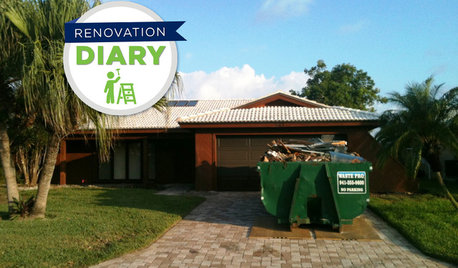
REMODELING GUIDESPlan Your Home Remodel: The Construction Phase
Renovation Diary, Part 3: The Dumpster arrives, and a little designing on the fly comes in handy
Full Story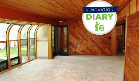
REMODELING GUIDESPlan Your Home Remodel: The Design and Drawing Phase
Renovation Diary, Part 2: A couple has found the right house, a ranch in Florida. Now it's time for the design and drawings
Full Story
BUDGETING YOUR PROJECTDesign Workshop: Is a Phased Construction Project Right for You?
Breaking up your remodel or custom home project has benefits and disadvantages. See if it’s right for you
Full Story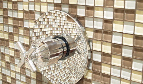
BATHROOM DESIGNConvert Your Tub Space to a Shower — the Fixtures-Shopping Phase
Step 2 in swapping your tub for a sleek new shower: Determine your mechanical needs and buy quality fixtures
Full Story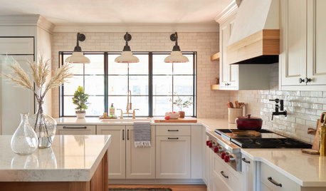
REMODELING GUIDESThe 4 Stages of a Remodel: The Honeymoon Phase
Prepare for the fast-paced progress of demolition — and the potentially jolting slowdown of structural issues
Full Story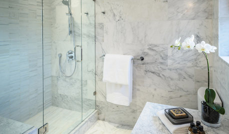
BATHROOM DESIGNConvert Your Tub Space Into a Shower — the Tiling and Grouting Phase
Step 3 in swapping your tub for a sleek new shower: Pick the right tile and test it out, then choose your grout color and type
Full Story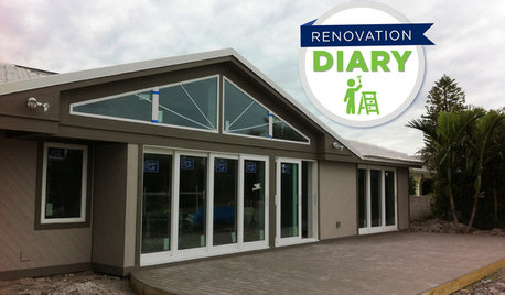
REMODELING GUIDESPlan Your Home Remodel: The Interior Renovation Phase
Renovation Diary, Part 4: Peek in as the team opens a '70s ranch home to a water view, experiments with paint and chooses tile
Full Story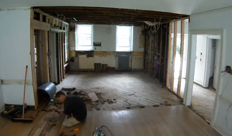
REMODELING GUIDESWatch an Entire Kitchen Remodel in 3½ Minutes
Zip through from the gutting phase to the gorgeous result, thanks to the magic of time-lapse video
Full Story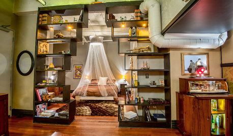
LOFTSHouzz Tour: A Bachelor Pad’s Part II
A designer has a hand in two phases of this movie director’s life and his loft in a landmark Art Deco building in L.A.
Full StorySponsored
Columbus Area's Luxury Design Build Firm | 17x Best of Houzz Winner!
More Discussions
deesweethome
threepinktreesOriginal Author
Related Professionals
Dania Beach Architects & Building Designers · Lafayette Architects & Building Designers · North Bergen Architects & Building Designers · Westminster Architects & Building Designers · Cibolo General Contractors · Enfield General Contractors · Geneva General Contractors · Murrysville General Contractors · Red Wing General Contractors · Sauk Village General Contractors · Valley Station General Contractors · Wright General Contractors · Belle Glade Interior Designers & Decorators · Gloucester City Interior Designers & Decorators · Nashville Interior Designers & Decoratorsdeesweethome
User
littlebug5
threepinktreesOriginal Author
DreamingoftheUP
ncrealestateguy
threepinktreesOriginal Author
louislinus
chicagoans
alisonn
ncrealestateguy
threepinktreesOriginal Author
ncrealestateguy
gmp3
threepinktreesOriginal Author