


Please critique photos before we list
persnicketydesign
10 years ago
Related Stories
BEFORE AND AFTERSMore Room, Please: 5 Spectacularly Converted Garages
Design — and the desire for more space — turns humble garages into gracious living rooms
Full Story
DECORATING GUIDESPlease Touch: Texture Makes Rooms Spring to Life
Great design stimulates all the senses, including touch. Check out these great uses of texture, then let your fingers do the walking
Full Story
HOUSEPLANTSMother-in-Law's Tongue: Surprisingly Easy to Please
This low-maintenance, high-impact houseplant fits in with any design and can clear the air, too
Full Story
GARDENING GUIDESGreat Design Plant: Ceanothus Pleases With Nectar and Fragrant Blooms
West Coast natives: The blue flowers of drought-tolerant ceanothus draw the eye and help support local wildlife too
Full Story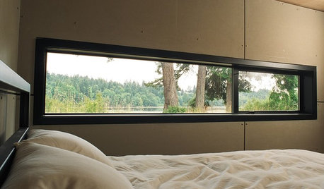
ARCHITECTUREDesign Workshop: Just a Sliver (of Window), Please
Set the right mood, focus a view or highlight architecture with long, narrow windows sited just so on a wall
Full Story
LIFE7 Things to Do Before You Move Into a New House
Get life in a new house off to a great start with fresh paint and switch plates, new locks, a deep cleaning — and something on those windows
Full Story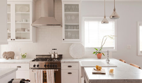
REMODELING GUIDES10 Things to Do Before the Renovation Begins
Prep and plan with this insight in hand to make your home remodeling project run more smoothly
Full Story
MOST POPULAR10 Things to Ask Your Contractor Before You Start Your Project
Ask these questions before signing with a contractor for better communication and fewer surprises along the way
Full Story
BEFORE AND AFTERSBefore and After: 19 Dramatic Bathroom Makeovers
See what's possible with these examples of bathroom remodels that wow
Full Story
MOST POPULAR8 Questions to Ask Yourself Before Meeting With Your Designer
Thinking in advance about how you use your space will get your first design consultation off to its best start
Full StoryMore Discussions
liriodendron
duluthjeff
Related Professionals
Annandale General Contractors · Coffeyville General Contractors · Fort Lee General Contractors · Fridley General Contractors · Los Lunas General Contractors · Mansfield General Contractors · Meadville General Contractors · Seguin General Contractors · Wallington General Contractors · Williston General Contractors · Avocado Heights General Contractors · Cherry Hill Home Stagers · Mountain Home Home Stagers · West New York Home Stagers · Sweetwater Interior Designers & DecoratorsMmmbeeer
persnicketydesignOriginal Author
maddielee
littlebug5
persnicketydesignOriginal Author
mdln
alisonn
alisonn
lyfia
gyr_falcon
Happyladi
Debbie Downer
persnicketydesignOriginal Author
deegw
NHBabs z4b-5a NH
dedtired
gyr_falcon
persnicketydesignOriginal Author
persnicketydesignOriginal Author
littlebug5
patti43
nanj
joinsf
Mmmbeeer
sheilajoyce_gw
persnicketydesignOriginal Author
patti43
patti43