


Re doing sewing room poll on color
redpenny
15 years ago
Sort by:Oldest
Comments (21)
Related Stories
LIFESo You're Moving In Together: 3 Things to Do First
Before you pick a new place with your honey, plan and prepare to make the experience sweet
Full Story
FUN HOUZZ14 Things You Need to Start Doing Now for Your Spouse’s Sake
You have no idea how annoying your habits at home can be. We’re here to tell you
Full Story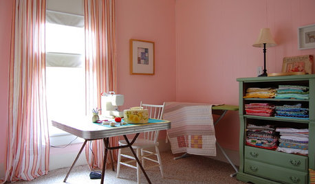
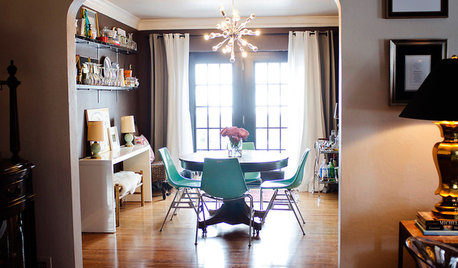
STUDIOS AND WORKSHOPSA Stitch in Time: Creative Sewing Spaces
Sewing rooms have become popular again as people of all ages embrace simple crafts they can do at home
Full Story
PETSSo You're Thinking About Getting a Dog
Prepare yourself for the realities of training, cost and the impact that lovable pooch might have on your house
Full Story
LAUNDRY ROOMSThe Cure for Houzz Envy: Laundry Room Touches Anyone Can Do
Make fluffing and folding more enjoyable by borrowing these ideas from beautifully designed laundry rooms
Full Story
DECORATING GUIDESThe Cure for Houzz Envy: Family Room Touches Anyone Can Do
Easy and cheap fixes that will help your space look more polished and be more comfortable
Full Story
MAN SPACESWhy Men Really Do Need a Cave
Don't dismiss cars, bars and the kegerator — a man space of some kind is important for emotional well-being at home
Full Story
ARCHITECTUREDo You Really Need That Hallway?
Get more living room by rethinking the space you devote to simply getting around the house
Full Story
FUN HOUZZHouzz Quiz: What Should You Do With a Basement?
Take our quiz to find out if you should turn your subterranean space into a London pub, a Lego lounge or something else
Full Story
LIFEFun Houzz: 14 Signs You’re an Interiors Geek
Are you obsessed with interiors? It’s OK, you can admit it — you’re among friends
Full Story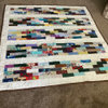


vicky4x4
calliope
Related Professionals
Jupiter Furniture & Accessories · Owensboro Furniture & Accessories · Phoenix Furniture & Accessories · La Mirada Furniture & Accessories · Brooklyn Park Flooring Contractors · Campbell Flooring Contractors · Chelsea Flooring Contractors · Fox Chapel Flooring Contractors · Kansas City Flooring Contractors · Laguna Niguel Flooring Contractors · White Bear Lake Flooring Contractors · Jupiter Furniture & Accessories · Clark Furniture & Accessories · New Hope Furniture & Accessories · Bull Run Specialty ContractorsredpennyOriginal Author
User
damascusannie
athomesewing
susan_on
biwako_of_abi
redpennyOriginal Author
carolek
fatquarters
redpennyOriginal Author
biwako_of_abi
nana24
FlamingO in AR
redpennyOriginal Author
Vique_Pa
easystitches
FlamingO in AR
anitastitch
damascusannie