


Choosing paint colors for an open floor plan?
pattyann1
17 years ago
Sort by:Oldest
Comments (5)
Related Stories
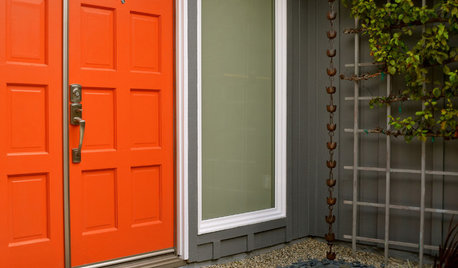
MOST POPULARHow to Choose a Front Door Color
If choosing a door paint isn't an open-and-shut case for you, here's help
Full Story
DECORATING GUIDESHow to Use Color With an Open Floor Plan
Large, open spaces can be tricky when it comes to painting walls and trim and adding accessories. These strategies can help
Full Story
GRAYChoosing Paint: How To Pick the Right Gray
Which Version of Today's 'It' Neutral Is For You?
Full Story
COLORChoosing Hues: Roll With the Color Wheel
See how an age-old tool can help you find the right paint
Full Story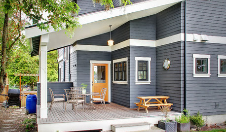
EXTERIORS5 Easy Tips for Choosing Your Exterior Paint Palette
Make your home the talk of the neighborhood — in a good way — with an exterior paint scheme that pops
Full Story
COLORDecorating 101: How to Choose Your Colors
Learn where to look for palette inspiration — and one commonly advised place maybe you shouldn’t
Full Story
REMODELING GUIDESHouse Planning: How to Choose Tile
Glass, Ceramic, Porcelain...? Three Basic Questions Will Help You Make the Right Pick
Full Story
COLORHow to Choose a Paint Color
Designers offer tips for examining your closet, memories and daily life to find the right paint colors for your home
Full Story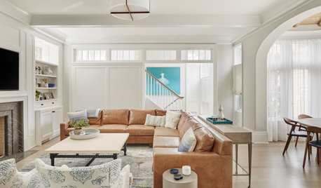
HOUSEKEEPINGChoose Your Own Spring Cleaning Plan
Instead of trying to do it all, pick one of these six cleaning approaches that’s right for you now
Full Story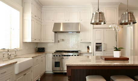
KITCHEN CABINETSYour Guide to Choosing Kitchen Cabinets
Updating your kitchen? See designers' top choices for kitchen cabinet styles, hardware choices, colors, finishes and more
Full Story


pirula
pirula
Related Professionals
Chesapeake Painters · Columbus Painters · Sarasota Painters · St. Johns Painters · Tustin Painters · Homewood Painters · Country Club Cabinets & Cabinetry · Homer Glen Cabinets & Cabinetry · American Canyon Flooring Contractors · Lewis Center Flooring Contractors · Medway Flooring Contractors · Monroe Flooring Contractors · Olympia Flooring Contractors · Shaker Heights Flooring Contractors · Woodbridge Flooring ContractorsLori A. Sawaya
pirula
pattyann1Original Author