


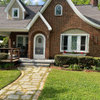
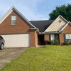
Do certain colorants cause more shifts in different lights?
sayde
13 years ago
Sort by:Oldest
Comments (13)
Related Stories
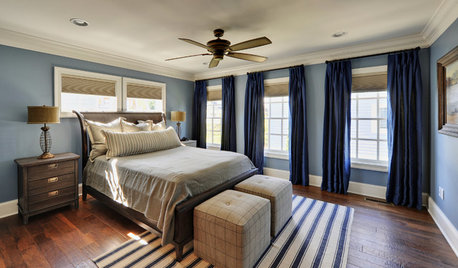
COLORBedroom Color: The Secret to More Sex and More Sleep
Look to surprising revelations about bedroom wall colors to get more of what you want
Full Story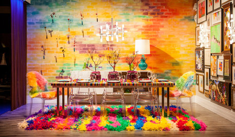
FUN HOUZZ10 Fantasy Dining Rooms for a Good Cause
Outlandishly creative or subtle and sophisticated, these designer spaces for Serving Up Style 2013 show admirable imagination
Full Story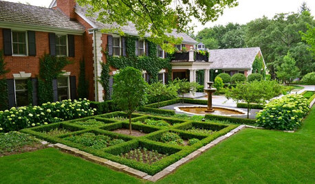
GARDENING GUIDESBoxwood: Still Shape-Shifting After 350 Years
Wild or mild, the humble boxwood still brings style and order to all kinds of gardens
Full Story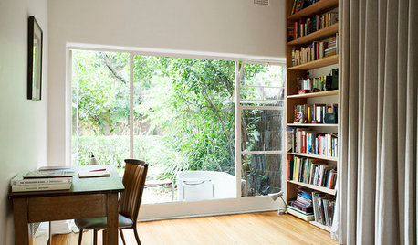
SMALL SPACESHouzz Tour: A Shape-Shifting Space, Cloaked in History
An architecturally significant Melbourne apartment makes the most of its limited square footage
Full Story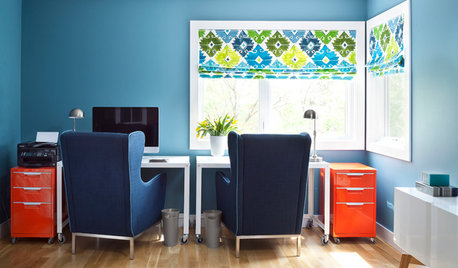
COLORFUL HOMESHouzz Tour: A Home of a Different Color
An interior designer infuses a Colorado home with daring and drama
Full Story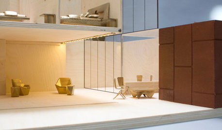
EVENTS20 Innovative Dollhouses for a Good Cause
Prominent architects scale down for charity, creating dollhouses to be auctioned off to help kids with disabilities
Full Story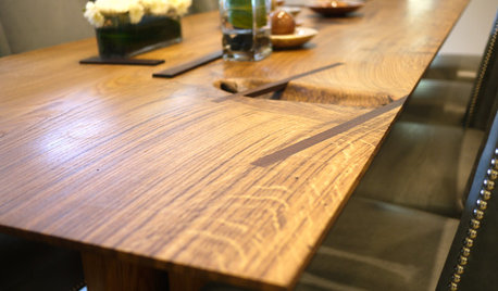
FURNITUREWood Furniture Has Root Cause
Sustainability is just the beginning with Robin Wade's lovingly made 'rustic modern' wood furnishings
Full Story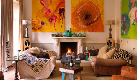
DECORATING GUIDESMore Is More: The 10 Tenets of Maximalist Style
Ready to join the school of over-the-top design? Learn how to embrace excess in your interiors
Full Story
URBAN GARDENSGardeners Champion Nature's Cause in the City
Garden advocates and artists in San Francisco have joined forces to find creative ways to bring nature back into the urban landscape
Full Story
NEUTRAL COLORSDare to Choose a More Colorful Neutral
Understanding Shades of Hue Helps You Go Beyond Gray, White and Beige
Full Story
lazy_gardens
saydeOriginal Author
Related Professionals
Redmond Painters · Chico Painters · Davie Painters · Glendora Painters · Haslett Painters · La Mirada Painters · Lodi Painters · Winchester Painters · Allentown Cabinets & Cabinetry · Aspen Hill Cabinets & Cabinetry · Ham Lake Cabinets & Cabinetry · University Park Cabinets & Cabinetry · Anaheim Flooring Contractors · Green Bay Flooring Contractors · Salem Flooring ContractorsWendyB 5A/MA
debbiedoes
saydeOriginal Author
lazy_gardens
Lori A. Sawaya
saydeOriginal Author
paintguy1
saydeOriginal Author
lazy_gardens
crnaskater
saydeOriginal Author