


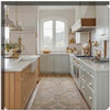
Compare F&B Pointing to BM Linen White?
sayde
13 years ago
Sort by:Oldest
Comments (3)
Related Stories

COLORColor of the Year: Off-White Is On Trend for 2016
See why four paint brands have chosen a shade of white as their hot hue for the new year
Full Story
WHITEHow to Pick the Right White Paint
White is white, right? Not quite. See 8 white paint picks for 8 very different effects
Full Story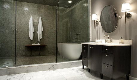
KITCHEN DESIGNUsing White Marble: Hot Debate Over a Classic Beauty
Do you love perfection or patina? Here's how to see if marble's right for you
Full Story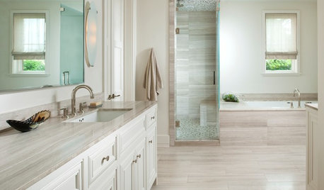
COLORBathed in Color: How to Get White Right in the Bath
Get the pure look you want without going institutional by paying attention to tone, texture and sheen in an all-white bathroom
Full Story
TRIMTrim Color Tips: Get Your White Trim Right
Set off wood tones, highlight architectural features, go minimalist ... white trim is anything but standard when you know how to use it
Full Story
DECORATING GUIDES10 Reasons to Embrace White Walls
Do they strike you as even more boring than watching white paint dry? Consider what makes them the darling of so many
Full Story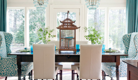
DECORATING GUIDESDecorating 101: How to Use White Right
If you’ve ever been in white-paint-swatch limbo, you know white can be tricky to work with. Here’s how to get the fresh look you’re after
Full Story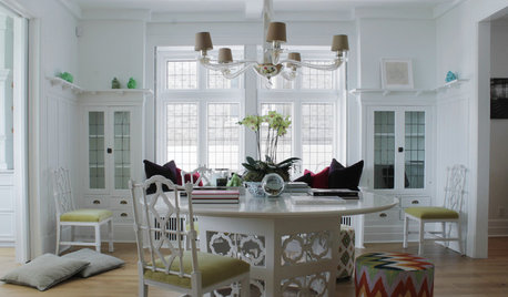
HOUZZ TOURSMy Houzz: Going White and Bright in Montreal
White lacquer and wider doorways help create an airer backdrop for colorful contemporary art in a 1910 Arts and Crafts home
Full Story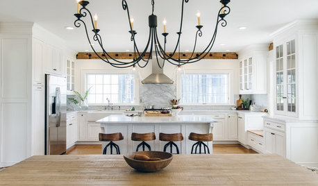
WHITE KITCHENS4 Dreamy White-and-Wood Kitchens to Learn From
White too bright in your kitchen? Introduce wood beams, countertops, furniture and more
Full Story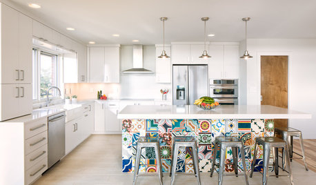
KITCHEN DESIGNNew This Week: 4 Ways to Punch Up a White Kitchen
Avoid the hospital look by introducing a bit of color, personality and contrast
Full Story
rococogurl
saydeOriginal Author
Related Professionals
Burien Painters · Cleveland Painters · Leominster Painters · Reedley Painters · Tomball Painters · Springdale Handyman · Country Club Cabinets & Cabinetry · Murray Cabinets & Cabinetry · Atascocita Cabinets & Cabinetry · Alexandria Flooring Contractors · Alpine Flooring Contractors · Brockton Flooring Contractors · Green Bay Flooring Contractors · Jacksonville Flooring Contractors · Palm Harbor Flooring Contractorsrococogurl