


Exterior Color Scheme for 1892 Victorian
victoriandream
14 years ago
Sort by:Oldest
Comments (6)
Related Stories

REMODELING GUIDESGlobal Architecture Style: Victorian
Victorian homes grace almost every city in the world, but do you know their history? Here's the scoop on this grand style
Full Story

DECORATING GUIDES10 Ways to Update a Victorian Living Room
Bring your period living room sensitively into the 21st century with these simple yet effective design tricks
Full Story
HOUZZ TOURSMy Houzz: Hip, Historic Victorian in Santa Cruz
Thrifty finds, bold colors and cheeky top notes give a California Victorian a fresh new attitude
Full Story
DECORATING GUIDESHouzz Tour: Victorian With a Modern Outlook
Layering in furnishings from style eras up to the present gives a period home’s decor a collected-over-time look
Full Story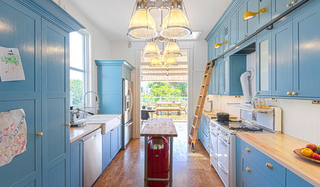
KITCHEN DESIGNKitchen of the Week: Pushing Boundaries in a San Francisco Victorian
If the roll-up garage door doesn’t clue you in, the blue cabinets and oversize molding will: This kitchen is no ordinary Victorian galley
Full Story
HOUZZ TOURSVisit a Victorian Fairy-Tale Retreat in the Woods
This renovated cabin is an ultra-feminine getaway
Full Story
HOUZZ TOURSMy Houzz: Charming, Beautiful Renovated Victorian
A couple gives a 19th century home in Poughkeepsie, N.Y. a modern footprint
Full Story
VINTAGE STYLEHouzz Tour: Farmhouse Meets Victorian in Los Angeles
Fanciful scrolls and sweet botanical prints join playful vintage touches for a home that’s altogether charming
Full Story
HOUZZ TOURSHouzz Tour: Glamorous Victorian in London
This eclectic, high-octane terrace house is unlike anything you've ever seen. Hold on to your hats, folks!
Full Story


Lori A. Sawaya
ummm
Related Professionals
East Hanover Painters · Knightdale Painters · Reedley Painters · Reston Painters · Roswell Painters · South Jordan Painters · Hanover Park Cabinets & Cabinetry · American Canyon Flooring Contractors · Easton Flooring Contractors · Franklin Flooring Contractors · Lynbrook Flooring Contractors · New Britain Flooring Contractors · Pompano Beach Flooring Contractors · Saint Louis Park Flooring Contractors · Winchester Flooring ContractorsvictoriandreamOriginal Author
Lori A. Sawaya
victoriandreamOriginal Author
Lori A. Sawaya