


Funcolors...I don't know you, but I need you! LOL
rightdi_gw
9 years ago
Sort by:Oldest
Comments (2)
Related Stories
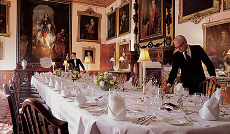
FUN HOUZZEverything I Need to Know About Decorating I Learned from Downton Abbey
Mind your manors with these 10 decorating tips from the PBS series, returning on January 5
Full Story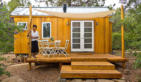
LIFEYou Said It: ‘Just Because I’m Tiny Doesn’t Mean I Don’t Go Big’
Changing things up with space, color and paint dominated the design conversations this week
Full Story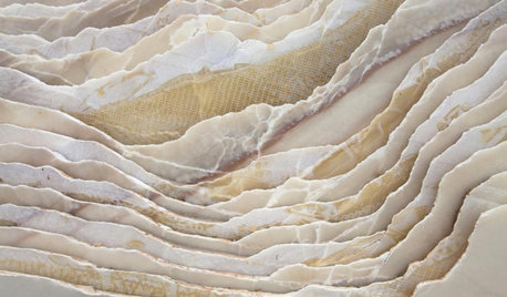
WORLD OF DESIGN8 Things You Didn’t Know About Italian Marble
How did the ancients extract marble? What makes it white or colored? We unearth fascinating facts about this luxurious stone
Full Story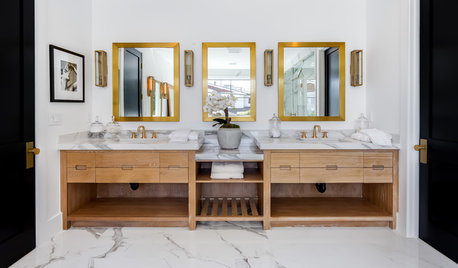
BATHROOM DESIGNHow to Know if an Open Bathroom Vanity Is for You
Ask yourself these questions to learn whether you’d be happy with a vanity that has open shelves
Full Story
COLORHave You Heard the Hues? 15 Colors You May Not Know About
Name-drop these shades at holiday parties — or better, try one on your walls — and expand your palette possibilities
Full Story
FURNITUREMust-Know Furniture: Bergères and Fauteuils
These two classic French chairs are frequently misidentified. Big on comfort and easy on the eye, they are worth learning about
Full Story
REMODELING GUIDES6 Must-Know Lessons From a Serial Renovator
Get your remodel right the first time, with this insight from an architect who's been there too many times to count
Full Story
BATHROOM DESIGN14 Design Tips to Know Before Remodeling Your Bathroom
Learn a few tried and true design tricks to prevent headaches during your next bathroom project
Full Story
GARDENING FOR BIRDSWhat to Know About Birds Nesting in Your Yard
Learn how to observe, record data and help ornithologists with NestWatch’s citizen science project understand bird trends
Full Story
HEALTHY HOMEWhat You Need to Know About Dust and How to Fight It
Breathe easier with these 10 tips for busting mites, dander and other microscopic undesirables
Full StoryMore Discussions


Lori A. Sawaya
rightdi_gwOriginal Author
Related Professionals
Midlothian Painters · Murfreesboro Painters · Estero Painters · Gulfport Painters · Hayward Painters · Tustin Painters · Lakeside Cabinets & Cabinetry · Warr Acres Cabinets & Cabinetry · Burlington Flooring Contractors · East Haven Flooring Contractors · Greenville Flooring Contractors · Merriam Flooring Contractors · Oak Park Flooring Contractors · Olympia Flooring Contractors · Rockledge Flooring Contractors