


Farrow & Ball - just received brochure and colors
winesnob
12 years ago
Related Stories
COLOR4 Cool Paint Colors Touted for 2014 — and How to Use Them
Muted but complex, these hues from Farrow & Ball can stand on their own or play supporting roles
Full Story
DECORATING GUIDESNo Neutral Ground? Why the Color Camps Are So Opinionated
Can't we all just get along when it comes to color versus neutrals?
Full Story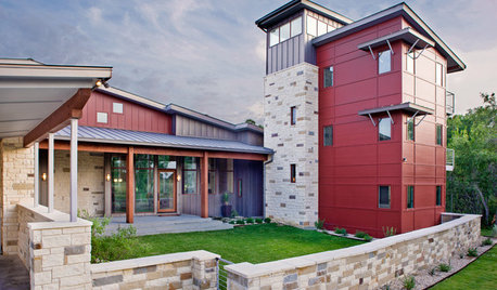
EXTERIOR COLORThe Joyful Exterior: Rev Up With Red
These 8 exteriors prove that red is right at home on more than just the front door
Full Story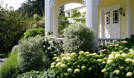
GARDENING AND LANDSCAPINGHave a Ball With Hydrangeas
Even if you don't tinker with the hue by changing the soil, hydrangeas have an entertaining range of uses in all kinds of landscapes
Full Story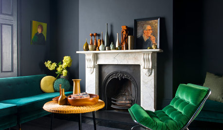
COLORHow to Add Just the Right Amount of Dramatic Black
Done right, black can add punch and personality to just about any room. Here’s how to go over to the dark side in style
Full Story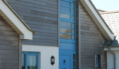
EXTERIORSThe Joyful Exterior: How to Give Your Home Just the Right Touch of Blue
Here are ways to add blue to the outside of your house — and 8 palettes to try
Full Story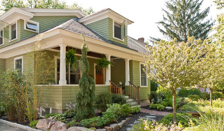
TRADITIONAL ARCHITECTUREHow to Research Your Home's History
Learn what your house looked like in a previous life to make updates that fit — or just for fun
Full Story
EXTERIOR COLORExterior Color of the Week: 7 Ways With Warm Gray
See why this hue can be the perfect neutral for any house
Full Story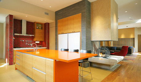
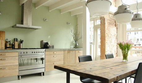
KITCHEN DESIGNPalatable Palettes: 8 Great Kitchen Color Schemes
Warm and appetizing or cool and relaxing? These 8 paint palettes can help you choose the best colors for your kitchen
Full Story
CURB APPEAL5 Bright Palettes for Front Doors
Splash bold green, blue, orange or red on your front door, then balance it with a more restrained hue on the rest of the house
Full Story


awm03
kitchendetective
Related Professionals
Katy Painters · Lakeland North Painters · Springfield Painters · Walnut Creek Painters · Gardner Painters · Gaffney Cabinets & Cabinetry · Kaneohe Cabinets & Cabinetry · Bethpage Flooring Contractors · Boca Raton Flooring Contractors · Brooklyn Park Flooring Contractors · Faribault Flooring Contractors · Little Falls Flooring Contractors · Redlands Flooring Contractors · Scotts Valley Flooring Contractors · The Crossings Flooring Contractorsajpace
kitchendetective
bagpipers
Michael
kitchendetective
DenStetson
littlesmokie
CaseStudy22
kimmieb
trinkette1