


Natural Linen 966 BM Paint Color
nanga
9 years ago
Sort by:Oldest
Comments (2)
Related Stories

COLORNature’s Color Wisdom: Lessons on Blue From the Great Outdoors
Take some cues from the sea and sky to find a blue to match any taste and mood
Full Story
COLORNature’s Color Wisdom: Lessons on Earth Tones From the Great Outdoors
Look to the land for hues that are grounding, soothing and endlessly versatile
Full Story
COLOR12 Tried-and-True Paint Colors for Your Walls
Discover one pro designer's time-tested favorite paint colors for kitchens, baths, bedrooms and more
Full Story
COLOR11 Terrific Paint Color Matches for Wood Details
Pair your wood trim and cabinets with the right shade of wall paint to bring out the beauty in both
Full Story
BEDROOMSHouzz Quiz: What Color Should You Paint Your Bedroom Walls?
Cool and soothing, or warm and spicy? Answer these questions and learn what hue is right for you
Full Story
MOST POPULAR11 Reasons to Paint Your Interior Doors Black
Brush on some ebony paint and turn a dull doorway into a model of drop-dead sophistication
Full Story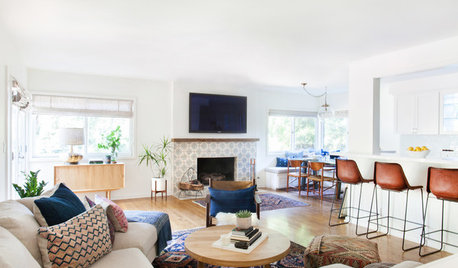
DECORATING GUIDES10 Reasons to Embrace White Walls
Do they strike you as even more boring than watching white paint dry? Consider what makes them the darling of so many
Full Story
WHITEHow to Pick the Right White Paint
White is white, right? Not quite. See 8 white paint picks for 8 very different effects
Full Story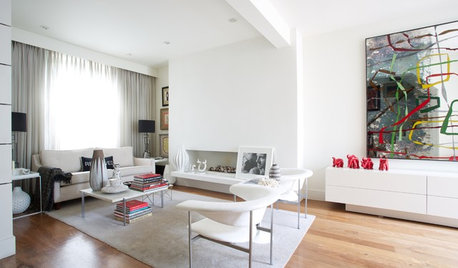
COLOR9 Decorating Ideas for White Living Rooms
These inspiring living rooms show how good an (almost) all-white room can look
Full Story
WALL TREATMENTSExpert Opinion: What’s Next for the Feature Wall?
Designers look beyond painted accent walls to wallpaper, layered artwork, paneling and more
Full Story


snowbean
nangaOriginal Author
Related Professionals
Berkeley Painters · Crest Hill Painters · Hesperia Painters · Indio Painters · Lakewood Painters · Leominster Painters · Ridgeland Painters · Ridgewood Painters · Stafford Painters · Country Club Cabinets & Cabinetry · Carlsbad Flooring Contractors · Miami Flooring Contractors · Palm Springs Flooring Contractors · Reno Flooring Contractors · Uxbridge Flooring Contractors