


Please help with a paint issue!
aok27502
14 years ago
Sort by:Oldest
Comments (6)
Related Stories


HOME OFFICESQuiet, Please! How to Cut Noise Pollution at Home
Leaf blowers, trucks or noisy neighbors driving you berserk? These sound-reduction strategies can help you hush things up
Full Story
COLORPick-a-Paint Help: How to Create a Whole-House Color Palette
Don't be daunted. With these strategies, building a cohesive palette for your entire home is less difficult than it seems
Full Story
COLORColor Commitment Issues? Just Throw In a Pillow
You don't need to go big or permanent to go bold with color in your rooms; you only need to master the easy art of the toss
Full Story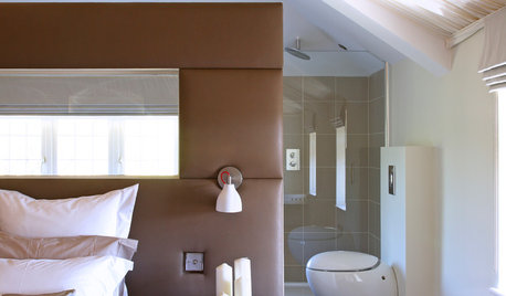
You Said It: Hot-Button Issues Fired Up the Comments This Week
Dust, window coverings, contemporary designs and more are inspiring lively conversations on Houzz
Full Story
DECORATING GUIDES10 Bedroom Design Ideas to Please Him and Her
Blend colors and styles to create a harmonious sanctuary for two, using these examples and tips
Full Story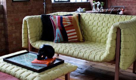
DECORATING GUIDESPlease Touch: Texture Makes Rooms Spring to Life
Great design stimulates all the senses, including touch. Check out these great uses of texture, then let your fingers do the walking
Full Story
BATHROOM DESIGNUpload of the Day: A Mini Fridge in the Master Bathroom? Yes, Please!
Talk about convenience. Better yet, get it yourself after being inspired by this Texas bath
Full Story
WORKING WITH PROS3 Reasons You Might Want a Designer's Help
See how a designer can turn your decorating and remodeling visions into reality, and how to collaborate best for a positive experience
Full Story
LIVING ROOMSCurtains, Please: See Our Contest Winner's Finished Dream Living Room
Check out the gorgeously designed and furnished new space now that the paint is dry and all the pieces are in place
Full Story

Lori A. Sawaya
aok27502Original Author
Related Professionals
Cumberland Painters · Rosenberg Painters · Hayward Painters · Mastic Painters · Buena Park Cabinets & Cabinetry · Brushy Creek Flooring Contractors · Carlsbad Flooring Contractors · Cleveland Flooring Contractors · East Palo Alto Flooring Contractors · Fairview Park Flooring Contractors · Garfield Heights Flooring Contractors · Huntington Station Flooring Contractors · Indian Trail Flooring Contractors · Riverbank Flooring Contractors · San Carlos Flooring ContractorsLori A. Sawaya
aok27502Original Author
Lori A. Sawaya
aok27502Original Author