


Help needed for warm/cool colors
twinkletoesmomma
14 years ago
Sort by:Oldest
Comments (15)
Related Stories


KITCHEN DESIGNDesign Dilemma: My Kitchen Needs Help!
See how you can update a kitchen with new countertops, light fixtures, paint and hardware
Full Story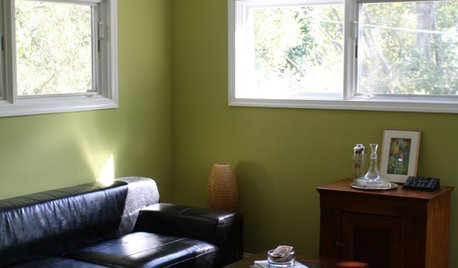

EXTERIORSHelp! What Color Should I Paint My House Exterior?
Real homeowners get real help in choosing paint palettes. Bonus: 3 tips for everyone on picking exterior colors
Full Story
EXTERIOR COLORExterior Color of the Week: 7 Ways With Warm Gray
See why this hue can be the perfect neutral for any house
Full Story
COLORPick-a-Paint Help: How to Create a Whole-House Color Palette
Don't be daunted. With these strategies, building a cohesive palette for your entire home is less difficult than it seems
Full Story
COLORPaint-Picking Help and Secrets From a Color Expert
Advice for wall and trim colors, what to always do before committing and the one paint feature you should completely ignore
Full Story
COLORPick-a-Paint Help: How to Quit Procrastinating on Color Choice
If you're up to your ears in paint chips but no further to pinning down a hue, our new 3-part series is for you
Full Story
DECORATING GUIDESDownsizing Help: Color and Scale Ideas for Comfy Compact Spaces
White walls and bitsy furniture aren’t your only options for tight spaces. Let’s revisit some decorating ‘rules’
Full Story
DECORATING GUIDESConfident Color: When to Use Cool and Warm Hues
Change the Mood of a Room With Colors that Advance or Recede
Full StoryMore Discussions


Lori A. Sawaya
randita
Related Professionals
Monterey Paint & Wall Coverings · Birmingham Painters · Blue Island Painters · New Port Richey Painters · Norman Painters · Owensboro Painters · Ripon Painters · Daly City Cabinets & Cabinetry · Kaneohe Cabinets & Cabinetry · Hugo Flooring Contractors · Limerick Flooring Contractors · South Lake Tahoe Flooring Contractors · Town and Country Flooring Contractors · Washington Flooring Contractors · Wausau Flooring ContractorstwinkletoesmommaOriginal Author
parma42
Lori A. Sawaya
randita
Lori A. Sawaya
randita
Bunny
Lori A. Sawaya
parma42
randita
parma42
amysrq
parma42