


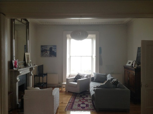
Paint colours for sea side period house
HelenDuignan
10 years ago
Sort by:Oldest
Comments (11)
Related Stories
HOUZZ TOURSMy Houzz: Modern Features Join Period Details in Toronto
A hundred-year-old home in Canada gets a new addition and modern updates, with respect for its beautiful original elements
Full Story
DECORATING GUIDESA Periodic Table of Design Elements
Add Panache With Copper, Tin, Aluminum and More
Full Story
COLORGet a Soft Spot for Sea-Glass Green
Soften a room's look by washing its walls in this delightfully airy shade, no sand in your shoes required
Full Story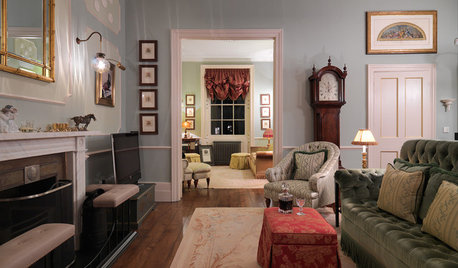
HOMES AROUND THE WORLDHouzz Tour: Period London Townhouse Gets a Lavish Makeover
Luxurious fabrics, custom features and lush details make this Regency house a French-inspired showstopper
Full Story
BLUEMy Blue Heaven: New Reasons to Love the Color of Sea and Sky
Derived from gems, worn by royalty and loved the world over, blue has a past as deep as the midnight sky
Full Story
KITCHEN DESIGNKitchen of the Week: Preserving Period Charm in Atlanta
Additions and updates to this kitchen respect the past while meeting the owner's needs in the present
Full Story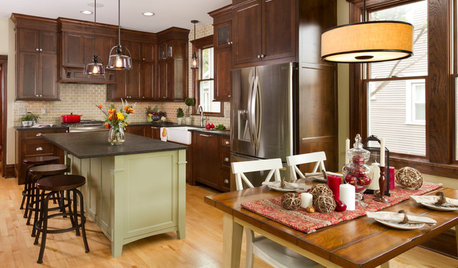
KITCHEN MAKEOVERSRoom of the Day: A Period-Appropriate Kitchen for a Tricky Style
Restoring a kitchen in a Minnesota Foursquare uncovers secrets and captures the spirit of the original
Full Story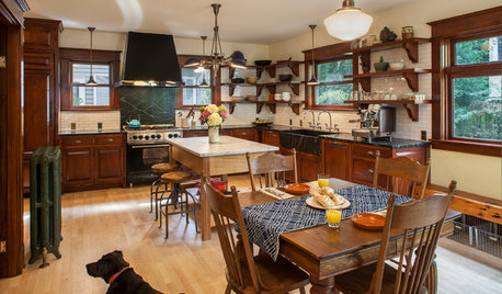
KITCHEN DESIGNKitchen of the Week: Period Details Keep History Alive in Portland
Modern functionality and doubled square footage bring a 1910 kitchen into the present while respecting its past
Full Story
VINTAGE STYLEMy Houzz: ‘Pavement Pickings’ a Happy Fit in a Period Home
An eclectic array of antiques and vintage items adds to the charm and character of this Melbourne home
Full Story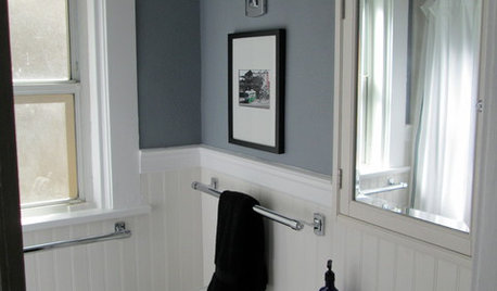
BATHROOM DESIGNMakeover Magic: Period Style for an All-New 1920s Bathroom
Leaky fixtures and water damage got the heave-ho, while the entire bathroom got a crisp new look in line with the home's style
Full StoryMore Discussions

HelenDuignanOriginal Author
HelenDuignanOriginal Author
Related Professionals
Bothell Painters · Annapolis Painters · College Park Painters · Libertyville Painters · Okemos Painters · Raytown Painters · Sebastian Painters · Land O Lakes Cabinets & Cabinetry · Rowland Heights Cabinets & Cabinetry · Monroe Flooring Contractors · Powell Flooring Contractors · Redlands Flooring Contractors · South Lake Tahoe Flooring Contractors · Suwanee Flooring Contractors · Yorba Linda Flooring Contractorssis2two
kitchendetective
sloyder
HelenDuignanOriginal Author
JoanLast
Vertise
HelenDuignanOriginal Author
kitchendetective
eclecticcottage