


Best taste in colors
bugbite
9 years ago
Sort by:Oldest
Comments (4)
Related Stories

EXTERIOR COLORExterior Color of the Week: Tasteful Taupe
When you want to skip the peachy beiges and ubiquitous creams, consider this rich cool brown neutral instead
Full Story
DECORATING GUIDESTaste a Rainbow: 11 Top Home Decorating Colors and How to Use Them
Prime yourself for spring painting season with our color-happy guide to working with popular shades around the home
Full Story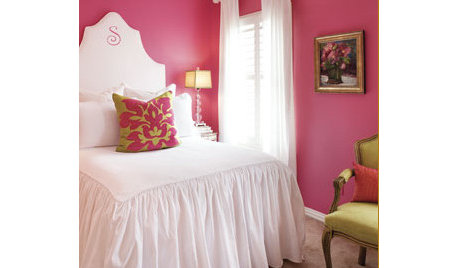
PINKLoving Color: Enjoy the Sweet Taste of Raspberry
Try this confident pink for bold color all over, or step into it lightly with just the right raspberry accent
Full Story
PRODUCT PICKSGuest Picks: Colorful Patterned Area Rugs for All Tastes
From subtly sophisticated to downright swirltastic, these area rugs will please the eye while cushioning the feet
Full Story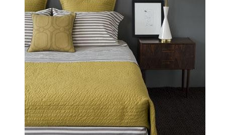
YELLOWMustard Yellow Offers a Fresh Taste for Rooms
New shades and tones have sown the seeds of a mustard-yellow revival, and rooms everywhere are reaping the benefit
Full Story
LIFEWhen Design Tastes Change: A Guide for Couples
Learn how to thoughtfully handle conflicting opinions about new furniture, paint colors and more when you're ready to redo
Full Story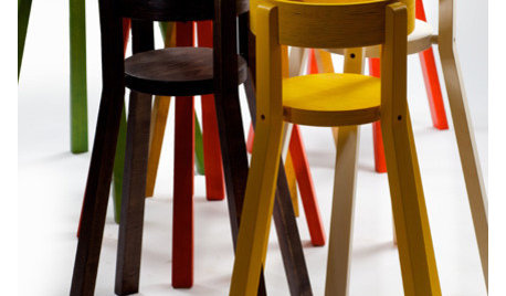
PRODUCT PICKSGuest Picks: High Chairs for All Tastes
With modern designs, convertible options and more color choices than ever, there's a high chair to fit every style
Full Story

LIFEWhen Your Tastes Clash: How to Design and Decorate as a Couple
Want to keep the peace? Work with both of your styles when remodeling, decorating or building new, for a home that feels right to all
Full Story
HOUZZ TOURSMy Houzz: Goodwill and Good Taste in a Grand Colonial
Welcoming the community for charity fundraisers and more, this Massachusetts home radiates graciousness
Full Story


Handymanpainter
bugbiteOriginal Author
Related Professionals
Orlando Painters · Carlsbad Painters · Glassmanor Painters · Midlothian Painters · North Charleston Painters · Providence Painters · Paramount Painters · Martha Lake Painters · South Gate Cabinets & Cabinetry · Atascocita Cabinets & Cabinetry · Conyers Flooring Contractors · Fort Myers Flooring Contractors · Mount Vernon Flooring Contractors · Oakdale Flooring Contractors · Suitland Flooring ContractorsLori A. Sawaya
bugbiteOriginal Author