Shop Products
Houzz Logo Print
gwer2007

PIRULA - questions for you

eleena
16 years ago

Yvette,

You told me you used C2 Archival for silvery gray look.

I clicked on the link on another recent post (cannot remember now which one) and saw pix of you house. Wow, your house is beautiful - I would not change a thing! You have a great taste and an exceptional eye for color!

I have a few questions for you.

Question one.

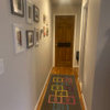
Do you mind telling me what color you used for your foyer (or whatever you call it by the entrance door)? It looks exactly like the color in my guest room. I just wanted to get a "reference point" to what that silver gray may look like (how dark or light etc.)

When searching posts for C2 paint, I found one from January with subject "Calling Pirula and/or Housekeeping for Donald Kaufman help". Here are two of your quotes from it.

"I didn't even bother looking at the other brands once I found these......." and "I can't remember if I told you or not, I know I posted this somewhere, that DKC paint changes extremely with the second coat".

I couldnÂt find the original post you are referring to where DKC was discussed. We do not have C2 and DKC here, so I have to order online. I donÂt have much time to research every company out there and I trust your opinion.

I have been using BM exclusively in the recent past but I can see that other brands can have more "exquisite" colors. I am picky when it comes to color but not overly. I can see subtle hues that many people donÂt but I probably would not spend half-a-year to find that one "right" color for just one room (though I did spend 6 weeks ones). The bathroom in question is contemporary though not stark contemporary, it is sort of casual with slate-like porcelain floor that looks like stone. It does not have windows and somehow calls for a "subdued" design. For example, when I tried a real Carrara marble sample in there, it looked completely out of place.

I need a color that is sophisticated but not too "up-scaled", not what youÂd use in a high-end living room. E.g., one wouldnÂt use very "rich" colors in a Japanese house ("if you know what I mean..."). This one is supposed to have a slight Japanese "feel" to it. I looked at the pix with rooms painted with C2 colors that somebody posted on THS and they seemed "too much" to me ("too rich" or "too smooth" or "too expensive" or something).

So, my question set number two.

Do you find DKC better than C2? Is there a reason you chose C2 for that room over DKC? How did you decide on the Archival? As you have experience with both brands, which one would you recommend if I want a sophisticated but casual look?

Thank you very much! Your answers are always so wonderful and "right on the money".

Comments (8)

  • pirula
    16 years ago
    last modified: 9 years ago

    Hi Eleena! My goodness, thanks so much for the kind words, you're too kind!

    The color in the foyer/hallway is DKC #16. What you have to understand about DKC is that you cannot possibly take a chance and buy it without testing it. It's very different in different rooms, different locales, and different times of day. So you really need to test the color with an ENORMOUS swatch and live with it for a couple of days. DKC is pretty much only sold in NJ I believe, I just ordered the color cards, then ordered sample pots from Cox Paint online (they sell the samples, but not the paint). Then just called the place in NJ and ordered it. They're super nice, the number is online at the DKC website.

    The DKC #16 is a very beautiful, and sophisticated color, but not "fancy". However it changes from a beautiful gray, to a taupey gray to almost a taupe at night in artificial light. I love it at all times of day. If you look at the paint chip, it doesn't even LOOK gray! But it is, or at least in my house it is. It's not silvery gray though, if that's what you're looking for.

    DKC isn't really better than C2, they're just different. One is full spectrum and one is not. The DKC colors are more sophisticated to my mind (the color in the master bath is also DKC). C2 is good paint, their primer is amazing. They're colors are beautiful, but in the end the only C2 color that won out above DKC for some rooms and Farrow & Ball for others was the 'Archival' for the powder room. I chose it because it looked absolutely perfect with the carerra marble mosaic floor, in ARTIFICIAL light. That powder room has no natural light source and is in the middle of the darkest hallway known to mankind.

    DKC also does change from the first coat to the second, then AGAIN while it's drying. You have to wait it out to see what you're really going to get.

    For some people, this is just way too much effort for picking a paint color. And I can understand that. It was worth it to me for these two rooms, and now I've decided I will almost certainly use DKC in the both the guest room and the guest bathroom downstairs when we get around to remodeling those. As much as I like C2, I prefer both DKC and Farrow & Ball's colors and depth. But that's such a personal thing, I'd hate to think you dismissed C2 without giving it a whirl. Of course, if you can't find it locally, I'm not sure it is worth the trouble of going online and having samples shipped. If you're going to do that, then do the DKC. It's blended in Pratt & Lambert paints btw. It's fine paint, and is holding up very well (but I used eggshell, not flat). My only negative is that it was stinkier than any of the others (in fact none of the others smelled at all). It's time P&L got their VOC's under control.

    Does that help at all? As much as I appreciate your faith in me, I cannot emphasize enough that you test each color you're considering in your own home first. Paint is just too personal and too DIFFERENT in different locales not to.

    Also, on the BM. I'm afraid I am not a fan. While the colors are lovely going on and for a year or two, I experienced fading and just a general blahness after a few years. And by the time we sold our first house, five years after painting, it needed painting again. I realize I am probably the only person on the planet who won't go with BM again. But that's okay.

    Ivette

  • eleena
    Original Author
    16 years ago
    last modified: 9 years ago

    Yvette,

    Thank you for taking your time! Wow, that was a very detailed answer and I really appreciate it.

    I am guessing you were out for the holiday weekend as you were nowhere to be seen on these forums. Did you have a good time?

    Do not worry, I do not buy paint without testing it first - not anymore. I had 3 color consultations - one free (if I bought paint from them) and two that I paid for - and I learned it the hard way not to take anyone's word blindly.

    That bathroom does not get ANY sunlight - just artificial light, so I do not need a paint that would change color with the time of the day. My only concern about C2 Archival is that it looks like a "cool" color on on my screen (I downloaded their color chart in PDF). I don't have a real Carrara in that bathroom as it simply did not work there (looked to shiny and too formal). I used a Carrara-like subway-like tile which is warm white with warm gray. I am wondering if Archival will look too "old" there. Would you consider it a "cool" or a "warm" color?

    C2 has some other grays. Do you think any warmer ones could give me that effect? No matter how long it takes to get the paint online, it's still easier than "faux"ing in my mind.

    Thanks so much!

  • eleena
    Original Author
    16 years ago
    last modified: 9 years ago

    "I am wondering if Archival will look too "old" there"

    I meant "too cold", sorry.

  • pirula
    16 years ago
    last modified: 9 years ago

    Archival is definitely cool. Thére's nothing warm about it. My floor is Carrara mosaic, and it's not warm either. The Calacatta mosaic in our master bathroom is warm though.

    Ivette

    P.S. We were home for the weekend and had a very nice one thanks! Hope you did too. I don't get to the forums nearly as much as I used to. You were wise to post over on decorating, I get to Paint even less often!

  • eleena
    Original Author
    16 years ago
    last modified: 9 years ago

    Thank you!

    Enjoy the rest of it!
    I'll try to do the same...

  • eleena
    Original Author
    16 years ago
    last modified: 9 years ago

    Yvette,

    There is a local company here that sells Pratt and Lambert paints. I have asked them to look into getting DKC colorants. They'll let me know soon. So, perhaps, I should go with a DKC color for my bathroom.

    You said (on a diffrent post) that you had their color fan and went through all their grays. Any suggestions for a (warm) silvery gray with DKC?

    Thank you!

  • pirula
    16 years ago
    last modified: 9 years ago

    Yep. DKC #16. It's warm at times, and silvery at others, and BOTH at others. Definitely worth a test. On the sample it looks BEIGE. But it is SO NOT beige.

    There's another too. I believe #55. Will have to check and get back to you.

    Ivette

  • Vertise
    9 years ago
    last modified: 9 years ago

    Pirula, are you still around? Love your house!

    So how do you go about picking your colors - if a swatch looks beige (so, one would seem to be looking for a beige) but is "so not beige" rather is really a gray. How can you search for colors if the swatches don't resemble the color? Do you just get a pleasant surprise and change plans?

0