


paint colors and home staging
Soniap
12 years ago
Sort by:Oldest
Comments (4)
Related Stories
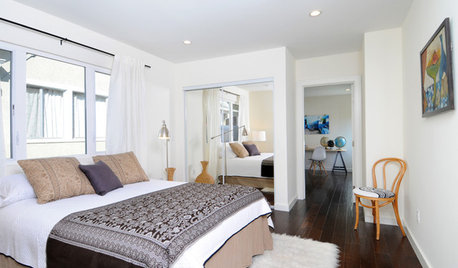
SELLING YOUR HOUSEHome Staging to Sell: The Latest Techniques That Really Work
Get up to speed on the best ways to appeal to potential buyers through accessories, furniture, colors and more
Full Story
CURB APPEAL5 Bright Palettes for Front Doors
Splash bold green, blue, orange or red on your front door, then balance it with a more restrained hue on the rest of the house
Full Story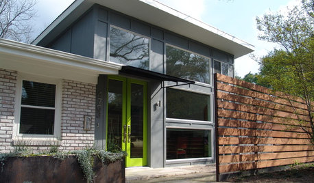
FRONT DOOR COLORSFront and Center Color: When to Paint Your Door Green
Fresh, fun and a pleasant surprise on a front door, green in subtle to strong shades brings energy to home exteriors
Full Story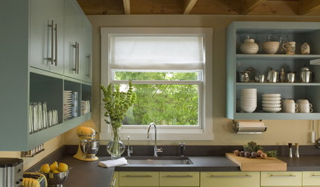
MOST POPULAR8 Great Kitchen Cabinet Color Palettes
Make your kitchen uniquely yours with painted cabinetry. Here's how (and what) to paint them
Full Story
EXTERIORSHelp! What Color Should I Paint My House Exterior?
Real homeowners get real help in choosing paint palettes. Bonus: 3 tips for everyone on picking exterior colors
Full Story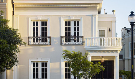
FRONT DOOR COLORSFront and Center Color: When to Paint Your Door Black
Love the idea of a black front door? Here are 8 exterior palettes to make it work
Full Story
COLORImitating Art: Color Palettes from Paintings
Borrow the eye of an artist when choosing paint colors for your home
Full Story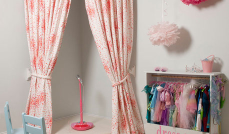
KIDS’ SPACES12 Home Stages That Put on a Great Show
Get ideas for encouraging your family's performance skills from these kid-size and grown-up home stages and theaters
Full Story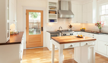
SELLING YOUR HOUSEHow to Stage Your Kitchen for a Home Sale
Attract buyers with a kitchen that’s clean, bright and welcoming — no expensive overhaul required
Full Story
HOUZZ TOURSMy Houzz: Saturated Colors Help a 1920s Fixer-Upper Flourish
Bright paint and cheerful patterns give this Spanish-style Los Angeles home a thriving new personality
Full Story


graywings123
jessicaml
Related Professionals
El Monte Painters · Encinitas Painters · Gallatin Painters · La Habra Painters · Milpitas Painters · Summit Painters · Wolf Trap Handyman · Mount Holly Cabinets & Cabinetry · Atascocita Cabinets & Cabinetry · Brooklyn Park Flooring Contractors · ‘Ewa Beach Flooring Contractors · Jenison Flooring Contractors · Lansdale Flooring Contractors · Owings Mills Flooring Contractors · San Carlos Flooring ContractorsFabFrugalJane
Faron79