


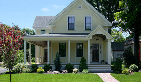
looking for a light true yellow paint plus ?
susandt
15 years ago
Related Stories
LIFETrue Confessions of a House Stalker
Letting go when a new owner dares to change a beloved house's look can be downright difficult. Has this ever happened to you?
Full Story
COLOR12 Tried-and-True Paint Colors for Your Walls
Discover one pro designer's time-tested favorite paint colors for kitchens, baths, bedrooms and more
Full Story
GARDENING FOR BUTTERFLIESGreat Design Plant: Giant Coneflower, a True Exclamation Point
Watch as towering stalks topped by yellow blossoms become a beacon for birds and insects in the midsummer garden
Full Story
FUN HOUZZ31 True Tales of Remodeling Gone Wild
Drugs, sex, excess — the home design industry is rife with stories that will blow your mind, or at least leave you scratching your head
Full Story
DECORATING GUIDESPaint Color Ideas: 8 Uplifting Ways With Yellow and Green
Dial up the cheer with yellow and green paint combinations sure to cast off winter doldrums
Full Story
COLORBest Ways to Use the Soft Yellow Color of 2014
You may fall for PPG Pittsburgh Paints’ Turning Oakleaf if you like your hues warm, mellow and cheery
Full Story
MOVING9 Things New Homeowners Know to Be True
Just moved into a new home? Congratulations! The fun is about to begin
Full Story
MORE ROOMSTrue Blood: What If Sookie Stackhouse Just Moved Away?
More Security, Familiar Elements and Updated Decor for Sookie's New Home
Full Story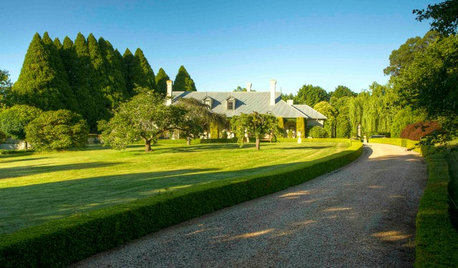
GARDENING GUIDESHow to Fix Bare and Yellow Lawn Spots
Restore your turf’s good looks by reseeding unsightly patches
Full Story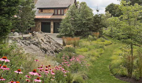
GARDENING GUIDES13 Risks to Take for True Garden Rewards
Go ahead, be a rebel. Breaking rules in the garden can lead to more happiness, creativity and connection with the earth
Full Story


Lori A. Sawaya
randita
Related Professionals
Easton Painters · Cape Coral Painters · Gallatin Painters · Middle Island Painters · Torrance Painters · Wheat Ridge Painters · Rohnert Park Painters · Chesapeake Flooring Contractors · Cornelius Flooring Contractors · Dracut Flooring Contractors · Montgomery County Flooring Contractors · Powder Springs Flooring Contractors · Smyrna Flooring Contractors · Temple Terrace Flooring Contractors · Washougal Flooring ContractorsLori A. Sawaya
mjsee
trk65
mjsee
trk65