


Choosing Farrow and Ball paint colors
KateB22
10 years ago
Related Stories
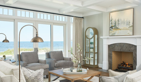
COLORHow to Choose a Paint Color
Designers offer tips for examining your closet, memories and daily life to find the right paint colors for your home
Full Story
GRAYChoosing Paint: How To Pick the Right Gray
Which Version of Today's 'It' Neutral Is For You?
Full Story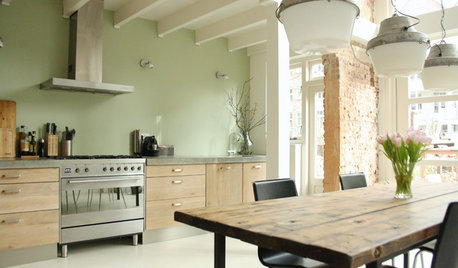
COLOR4 Cool Paint Colors Touted for 2014 — and How to Use Them
Muted but complex, these hues from Farrow & Ball can stand on their own or play supporting roles
Full Story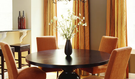
GRAYGoing Greige: Tips for Choosing This All-Around Neutral
Here are some ways to highlight and complement your home with this elegant hybrid of gray and beige
Full Story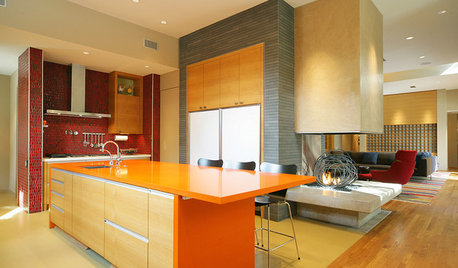
KITCHEN DESIGNPalatable Palettes: 8 Great Kitchen Color Schemes
Warm and appetizing or cool and relaxing? These 8 paint palettes can help you choose the best colors for your kitchen
Full Story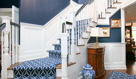
STAIRWAYSGot Stairs? Here’s How to Choose the Right Runner for You
Get the skinny on material selection, color and pattern, installation and more
Full Story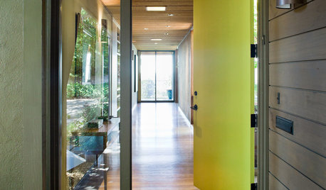
CURB APPEAL5 Bright Palettes for Front Doors
Splash bold green, blue, orange or red on your front door, then balance it with a more restrained hue on the rest of the house
Full Story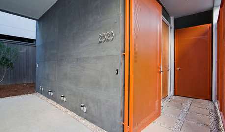
FRONT DOOR COLORSFront and Center Color: When to Paint Your Door Orange
Bring high energy and spirit to your home's entryway with a vibrant shade of orange on the front door
Full Story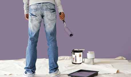
PAINTINGBulletproof Decorating: How to Pick the Right Kind of Paint
Choose a paint with some heft and a little sheen for walls and ceilings with long-lasting good looks. Here are some getting-started tips
Full Story
COLORColor of the Year: Off-White Is On Trend for 2016
See why four paint brands have chosen a shade of white as their hot hue for the new year
Full StoryMore Discussions


KateB22Original Author
kitchendetective
Related Professionals
Blue Island Painters · Brandon Painters · Hanover Park Painters · Meadow Woods Painters · Revere Painters · Ridgeland Painters · Tomball Painters · Wolf Trap Handyman · Prospect Heights Cabinets & Cabinetry · Englewood Flooring Contractors · Laconia Flooring Contractors · Miami Flooring Contractors · Monroeville Flooring Contractors · Old Bridge Flooring Contractors · Wyoming Flooring ContractorsKateB22Original Author
trinkette1