Help with a coordinating color
lucas_tx_gw
11 years ago
Related Stories
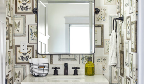
BATHROOM DESIGNKey Measurements to Help You Design a Powder Room
Clearances, codes and coordination are critical in small spaces such as a powder room. Here’s what you should know
Full Story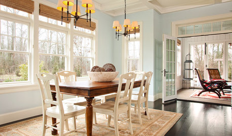
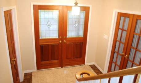
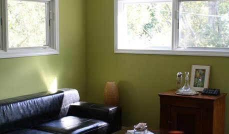
COLORPick-a-Paint Help: How to Create a Whole-House Color Palette
Don't be daunted. With these strategies, building a cohesive palette for your entire home is less difficult than it seems
Full Story
WORKING WITH PROS5 Steps to Help You Hire the Right Contractor
Don't take chances on this all-important team member. Find the best general contractor for your remodel or new build by heeding this advice
Full Story
WORKING WITH PROS3 Reasons You Might Want a Designer's Help
See how a designer can turn your decorating and remodeling visions into reality, and how to collaborate best for a positive experience
Full Story
LIFE12 House-Hunting Tips to Help You Make the Right Choice
Stay organized and focused on your quest for a new home, to make the search easier and avoid surprises later
Full Story
DECORATING GUIDESDecorate With Intention: Helping Your TV Blend In
Somewhere between hiding the tube in a cabinet and letting it rule the room are these 11 creative solutions
Full Story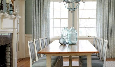
REMODELING GUIDESRoom of the Day: Antiques Help a Dining Room Grow Up
Artfully distressed pieces and elegant colors take a formerly child-focused space into sophisticated territory
Full StoryMore Discussions





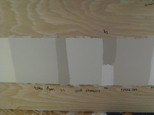




lucas_tx_gwOriginal Author
graywings123
Related Professionals
Glendale Painters · Lawrenceville Painters · Bountiful Painters · Cupertino Painters · Del Aire Painters · Hartford Painters · Pikesville Painters · West Jordan Painters · Middleburg Painters · Sunrise Manor Cabinets & Cabinetry · Town 'n' Country Cabinets & Cabinetry · Glendale Flooring Contractors · Lady Lake Flooring Contractors · Naugatuck Flooring Contractors · Tewksbury Flooring Contractorslucas_tx_gwOriginal Author
Vertise
Shelley Neilson