


Best paint for Color Quality
Debbie Downer
16 years ago
Sort by:Oldest
Comments (2)
Related Stories
DECORATING GUIDES8 Qualities of Great Interior Design
We identify some elusive attributes of excellent interiors to get you past "I know it when I see it"
Full Story
WORKING WITH AN INTERIOR DESIGNER5 Qualities of a Happy Designer-Client Relationship
Cultivate trust, flexibility and more during a design project, and it could be the beginning of a beautiful alliance
Full Story
FURNITURESmart Shopper: How to Judge Antique Furniture Quality
Pick the treasures from the trash without expert experience by learning how to evaluate antiques and what questions to ask
Full Story
FURNITUREHolding Out for Quality
Cheap furniture has its place, but more shoppers are waiting to invest for the long haul
Full Story
BEDROOMSRoom of the Day: A Master Retreat Designed for Quality Family Time
Bright colors, bold patterns and dark walls cozy up a space where the whole family connects each night
Full Story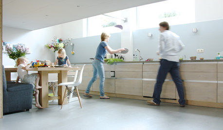
HOUZZ TOURSMy Houzz: Quality Shows in a Contemporary Dutch Home
Materials as hard wearing as they are lovely now fill this once-commercial space in the Netherlands
Full Story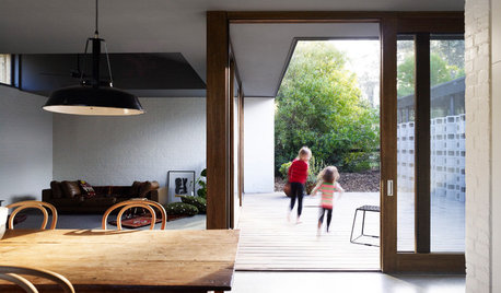
HOMES AROUND THE WORLDHouzz Tour: Quality Family Time in a Beach Vacation Home
Designed as a place to escape for the weekend, this architect’s home is nestled gracefully into its bushy surroundings by the beach
Full Story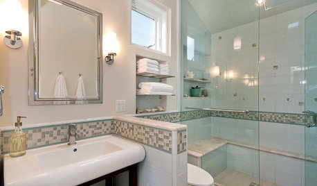
BATHROOM DESIGN6 Elements of a Perfect Bathroom Paint Job
High-quality paint alone won't cut it. For the best-looking painted bathroom walls, you'll need to get these other details right
Full Story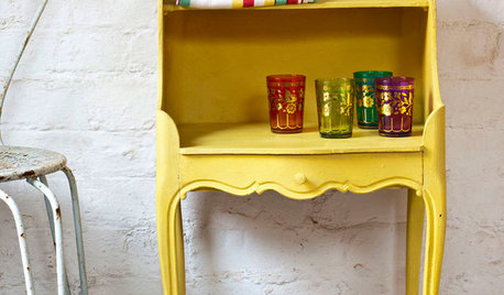
PAINTINGWhat to Know About Milk Paint and Chalk Paint — and How to Use Them
Learn the pros, cons, cost and more for these two easy-to-use paints that are great for giving furniture a vintage look
Full Story
Lori A. Sawaya
Debbie DownerOriginal Author
Related Professionals
Decatur Painters · Eagan Painters · Easton Painters · Hutto Painters · Apple Valley Painters · Gallatin Painters · Kenosha Painters · Lake Wales Painters · Naples Painters · Alton Cabinets & Cabinetry · Lakeside Cabinets & Cabinetry · Lockport Cabinets & Cabinetry · Bothell Flooring Contractors · Palm Harbor Flooring Contractors · Panama City Beach Flooring Contractors