


Paint is too yellow, too pink, or too peach
Peke
11 years ago
Featured Answer
Comments (21)

Vertise
11 years ago PRO
PROLori A. Sawaya
11 years agoRelated Professionals
Merritt Island Paint & Wall Coverings · Alexandria Painters · Carson Painters · Everett Painters · Lansdowne Painters · Louisville Painters · New Bern Painters · Whittier Painters · Drexel Hill Cabinets & Cabinetry · Watauga Cabinets & Cabinetry · Ahwatukee Flooring Contractors · Lombard Flooring Contractors · Mashpee Flooring Contractors · Plainfield Flooring Contractors · Redlands Flooring Contractors
graywings123
11 years agoVertise
11 years ago- PRO
Lori A. Sawaya
11 years ago Vertise
11 years ago- PRO
Lori A. Sawaya
11 years ago Vertise
11 years agoPeke
11 years agoVertise
11 years agoPeke
11 years agoVertise
11 years agoPeke
11 years agoVertise
11 years agoPeke
11 years agoolympia776
11 years agoPeke
11 years agoVertise
11 years ago- PRO
Lori A. Sawaya
11 years ago Peke
11 years ago
Related Stories

COLORBest Ways to Use the Soft Yellow Color of 2014
You may fall for PPG Pittsburgh Paints’ Turning Oakleaf if you like your hues warm, mellow and cheery
Full Story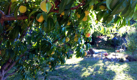
EDIBLE GARDENSHow to Grow Your Own Peaches and Nectarines
Make gardening a little sweeter with these juicy fruits, which you can eat after plucking or preserve for later
Full Story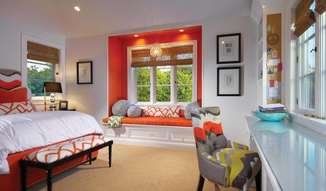
KIDS’ SPACESHow to Ditch the Pink in a Child’s Bedroom
Avoid a Pepto-Bismol pandemic with these 6 smart ways to bring more vibrant color and pattern to a kids’ bedroom
Full Story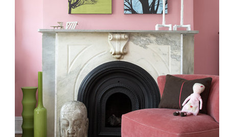
COLORPretty Pink Color Schemes, Subtle to Sensational
How do we love pink? Let us count the ways: soft, sassy, with chartreuse and electric blue and, yes, even red ...
Full Story
COLORSpring Forecast: Dare to Love Peach Again
8 Succulent Spaces Show How to Welcome Peach Back Home
Full Story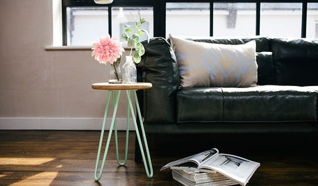
COLOR PALETTESWhy Pink and Mint Are the Perfect Color Pairing
Step aside, yellow and gray — a new double act is in town. Meet color’s latest dynamic duo: pink and mint
Full Story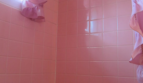
BATHROOM DESIGNTickled Pink in the Bathroom
We asked you to show us your vintage pastel bathrooms — and you responded with a tsunami of photos and comments
Full Story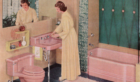
MOST POPULARHomeowners Give the Pink Sink Some Love
When it comes to pastel sinks in a vintage bath, some people love ’em and leave ’em. Would you?
Full Story
COLOR11 Ways to Add a Splash of Yellow to Your Interior
See how a dab of this sunshiny color can bring warmth and cheer to a room
Full Story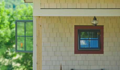
EXTERIOR COLORWhen to Paint Your Home Yellow
Be a cheer leader with this color that captures the sun and radiates a warm welcome
Full Story


judykrausbrown