


Deciphering Benjamin Moore hues? **funcolor 8**??
pbx2_gw
11 years ago
Sort by:Oldest
Comments (3)
Related Stories
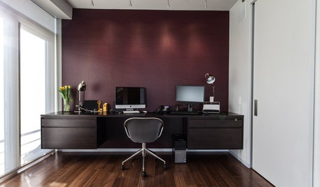
COLORHow Merlot Can You Go? 8 Enticing Ways With Wine-Inspired Hues
Add warmth and drama to your home with these deepest shades of red
Full Story
DECORATING GUIDES4 Hip Hues for 2013 and How to Use Them at Home
Strike a bluesy chord that's decidedly upbeat or make things greener on your side of the fence, with fresh paint colors for the new year
Full Story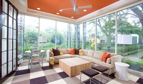
MOST POPULARHeads-Up Hues: 10 Bold Ceiling Colors
Visually raise or lower a ceiling, or just add an eyeful of interest, with paint from splashy to soothing
Full Story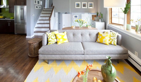
COLOR10 Reasons to Love Lemony Hues
Yellow adds zest to interiors, crosses gender lines and lifts the spirit. If you usually shy away from yellow, this may change your mind
Full Story
COLORHave You Heard the Hues? 15 Colors You May Not Know About
Name-drop these shades at holiday parties — or better, try one on your walls — and expand your palette possibilities
Full Story
COLORBest Ways to Use the Neutral Green Color of 2015
Benjamin Moore’s Color of the Year is soft and natural
Full Story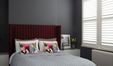
COLORDreaming in Color: 8 Gorgeous Gray Bedrooms
With this versatile hue, you can go dark and bold or slip into something more soothing
Full Story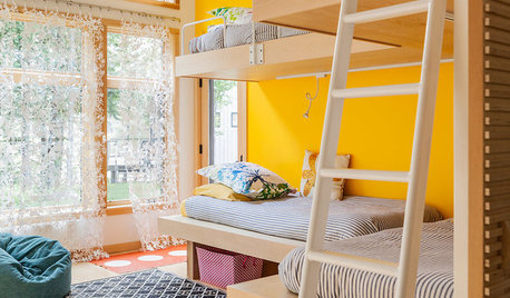
COLORDreaming in Color: 8 Eye-Opening Yellow Bedrooms
Start your day energized and cheerful with bedroom hues that sing of sunshine or golden fields
Full Story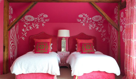
COLORDreaming in Color: 8 Pretty-in-Pink Bedrooms
Don't be afraid to rethink pink: Try softer hues for soothing comfort or bolder tones for a touch of drama
Full Story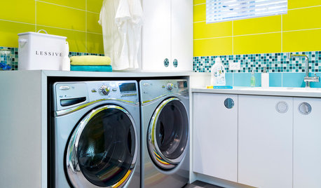
MOST POPULAR8 Ways to Add a Load of Color to Your Laundry Room
Give a tedious task a boost by surrounding yourself with a bold, happy hue
Full StoryMore Discussions


Lori A. Sawaya
Vertise
Related Professionals
Deptford Painters · Eastvale Painters · Glendora Painters · Oak Lawn Painters · Oldsmar Painters · Thornton Painters · North Bellmore Painters · Daly City Cabinets & Cabinetry · Fort Myers Flooring Contractors · Fort Pierce Flooring Contractors · Leland Flooring Contractors · Little Rock Flooring Contractors · Oxford Flooring Contractors · St. Johns Flooring Contractors · Swansea Flooring ContractorsLori A. Sawaya