


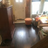
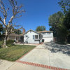
Need help with interior color selection for a victorian
kterlep
13 years ago
Sort by:Oldest
Comments (8)
Related Stories
WORKING WITH PROS3 Reasons You Might Want a Designer's Help
See how a designer can turn your decorating and remodeling visions into reality, and how to collaborate best for a positive experience
Full Story
EXTERIORSHelp! What Color Should I Paint My House Exterior?
Real homeowners get real help in choosing paint palettes. Bonus: 3 tips for everyone on picking exterior colors
Full Story
BATHROOM WORKBOOKStandard Fixture Dimensions and Measurements for a Primary Bath
Create a luxe bathroom that functions well with these key measurements and layout tips
Full Story
MOVINGRelocating Help: 8 Tips for a Happier Long-Distance Move
Trash bags, houseplants and a good cry all have their role when it comes to this major life change
Full Story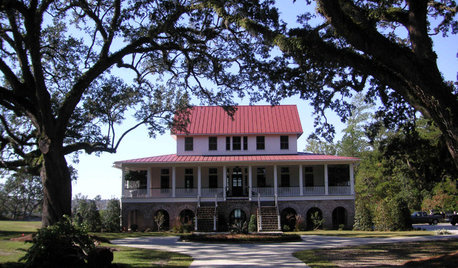
Sixties Southern Style: Inspiration from 'The Help'
Oscar-nominated movie's sets include formal entertaining spaces, front porch breezes and lots of florals
Full Story
ARCHITECTUREHouse-Hunting Help: If You Could Pick Your Home Style ...
Love an open layout? Steer clear of Victorians. Hate stairs? Sidle up to a ranch. Whatever home you're looking for, this guide can help
Full Story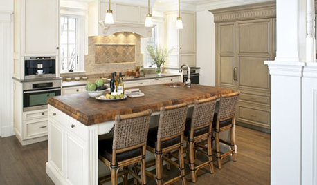
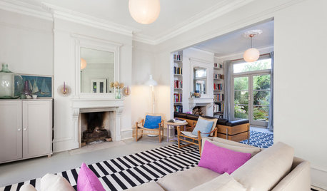
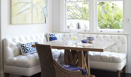
DECORATING GUIDESMy Houzz: Light Emerges in a Dark Victorian House
A designer freshens up her family’s period home by opening rooms to sunlight and decorating it in light, bright colors
Full Story
Pro Corner: Selecting a Style for the Photos in Your Projects
Learn the key architectural and decor features to look for when categorizing your photos by design style
Full Story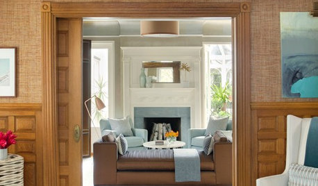
DECORATING GUIDESHouzz Tour: Victorian With a Modern Outlook
Layering in furnishings from style eras up to the present gives a period home’s decor a collected-over-time look
Full Story

jlc102482
User
Related Professionals
Agoura Hills Kitchen & Bathroom Designers · Grafton Kitchen & Bathroom Designers · La Verne Kitchen & Bathroom Designers · North Versailles Kitchen & Bathroom Designers · Ossining Kitchen & Bathroom Designers · Redmond Kitchen & Bathroom Designers · Biloxi Kitchen & Bathroom Remodelers · Cleveland Kitchen & Bathroom Remodelers · Elk Grove Kitchen & Bathroom Remodelers · Honolulu Kitchen & Bathroom Remodelers · Pasadena Kitchen & Bathroom Remodelers · Patterson Kitchen & Bathroom Remodelers · Port Angeles Kitchen & Bathroom Remodelers · River Edge Architects & Building Designers · West Jordan Architects & Building DesignerskterlepOriginal Author
slateberry
old_house_j_i_m
calliope
Debbie Downer
lavender_lass