


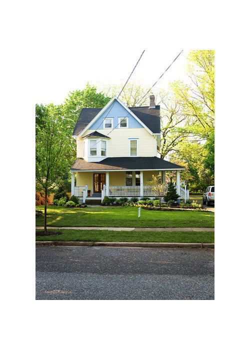
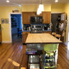
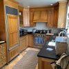
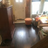
My Money Pit (circa 1888).....and exterior color help
lmt77
14 years ago


Featured Answer
Comments (16)

lesterd
14 years agoRelated Professionals
Hershey Kitchen & Bathroom Designers · Hybla Valley Kitchen & Bathroom Designers · Rancho Mirage Kitchen & Bathroom Designers · Olympia Heights Kitchen & Bathroom Designers · Clovis Kitchen & Bathroom Remodelers · Fort Pierce Kitchen & Bathroom Remodelers · Kuna Kitchen & Bathroom Remodelers · Newberg Kitchen & Bathroom Remodelers · Oceanside Kitchen & Bathroom Remodelers · Pinellas Park Kitchen & Bathroom Remodelers · Sicklerville Kitchen & Bathroom Remodelers · Weymouth Kitchen & Bathroom Remodelers · Joppatowne Kitchen & Bathroom Remodelers · Mountain Top Kitchen & Bathroom Remodelers · San Angelo Architects & Building DesignersRudebekia
14 years agolmt77
14 years agoBilll
14 years agoautumngal
14 years agomom2lilenj
14 years agosombreuil_mongrel
14 years agolmt77
14 years agoigloochic
14 years agoautumngal
14 years agolmt77
14 years agoigloochic
14 years ago
raee_gw zone 5b-6a Ohio
14 years agoraee_gw zone 5b-6a Ohio
14 years agolmt77
14 years ago
Related Stories
SELLING YOUR HOUSE5 Savvy Fixes to Help Your Home Sell
Get the maximum return on your spruce-up dollars by putting your money in the areas buyers care most about
Full Story
SELLING YOUR HOUSESave Money on Home Staging and Still Sell Faster
Spend only where it matters on home staging to keep money in your pocket and buyers lined up
Full Story

ARCHITECTUREHouse-Hunting Help: If You Could Pick Your Home Style ...
Love an open layout? Steer clear of Victorians. Hate stairs? Sidle up to a ranch. Whatever home you're looking for, this guide can help
Full Story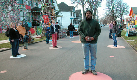
FUN HOUZZDecorated Houses Help Save a Detroit Neighborhood
Art's a start for an inner-city community working to stave off urban blight and kindle a renaissance
Full Story
REMODELING GUIDES8 Tips to Help You Live in Harmony With Your Neighbors
Privacy and space can be hard to find in urban areas, but these ideas can make a difference
Full Story
MOST POPULAR5 Remodels That Make Good Resale Value Sense — and 5 That Don’t
Find out which projects offer the best return on your investment dollars
Full Story
TRADITIONAL ARCHITECTUREHow to Research Your Home's History
Learn what your house looked like in a previous life to make updates that fit — or just for fun
Full Story
SMALL SPACES8 Benefits of Cottage Living
Scale back to dial up your quality of life, save money and more
Full Story
KITCHEN DESIGNGreat Solutions for Low Kitchen Windowsills
Are high modern cabinets getting you down? One of these low-sill workarounds can help
Full StoryMore Discussions

Billl