


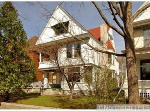
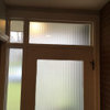
Victorian with jettied 3rd story - too ugly?
Serow225
11 years ago
Sort by:Oldest
Comments (12)
Related Stories
HOUZZ TOURSMy Houzz: Curiosities Tell a Story
An interiors stylist uses her house as a 3D timeline of her tales and travels
Full Story
ARCHITECTUREHouzz Tour: Towering Above London in a 7-Story Home
Maximizing see-forever views, the U.K. couple who converted this water tower are aiming high
Full Story
HOUZZ TOURSMy Houzz: ‘Everything Has a Story’ in This Dallas Family’s Home
Gifts, mementos and artful salvage make a 1960s ranch warm and personal
Full Story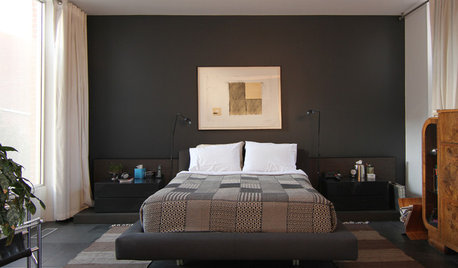
HOUZZ TOURSMy Houzz: Three Stories of Serenity in a Toronto Townhouse
Former school playing fields become a homesite for a Canadian couple with a flair for modern design
Full Story
INSIDE HOUZZTell Us Your Houzz Success Story
Have you used the site to connect with professionals, browse photos and more to make your project run smoother? We want to hear your story
Full Story
ARCHITECTURETell a Story With Design for a More Meaningful Home
Go beyond a home's bones to find the narrative at its heart, for a more rewarding experience
Full Story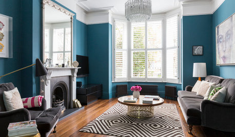
COLORFUL HOMESMy Houzz: A Classic Victorian Home in London Gets a Colorful Makeover
See how this creative couple transformed a traditional four-story home with bold hues and eclectic finds
Full Story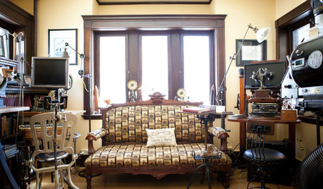
HOUZZ TOURSMy Houzz: Wondrous Steampunk Style for a Massachusetts Victorian
Grab your aviator goggles. This trip through a 1901 home that blends sci-fi and bygone-era imaginings is a wild ride
Full Story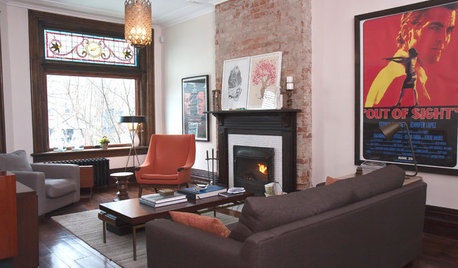
HOUZZ TOURSMy Houzz: An 1890s Victorian in Toronto Goes Modern and Open
Out went the closed-in vibe, but much stayed on in this Canadian home's renovation: stained glass, woodwork and a lot of personality
Full Story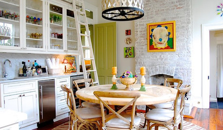
HOUZZ TOURSMy Houzz: Eye Candy Colors Fill an 1800s New Orleans Victorian
Take your fill of teal and pink patent leather, shots of chartreuse and vibrant artwork spanning the rainbow
Full Story
columbusguy1
lazy_gardens
Related Professionals
Kalamazoo Kitchen & Bathroom Designers · Martinsburg Kitchen & Bathroom Designers · Palm Harbor Kitchen & Bathroom Designers · Philadelphia Kitchen & Bathroom Designers · Yorba Linda Kitchen & Bathroom Designers · Eureka Kitchen & Bathroom Remodelers · Franconia Kitchen & Bathroom Remodelers · Green Bay Kitchen & Bathroom Remodelers · Independence Kitchen & Bathroom Remodelers · Niles Kitchen & Bathroom Remodelers · Sioux Falls Kitchen & Bathroom Remodelers · Lawndale Kitchen & Bathroom Remodelers · Gibsonton Kitchen & Bathroom Remodelers · North Chicago Kitchen & Bathroom Remodelers · Eufaula Kitchen & Bathroom RemodelersSerow225Original Author
1935House
Debbie Downer
Serow225Original Author
shanghaimom
old_house_j_i_m
columbusguy1
shanghaimom
worthy
old_house_j_i_m