


kitchen lighting update causing color problem
debrawnelson
13 years ago
Sort by:Oldest
Comments (8)
Related Stories
HOUSEKEEPING10 Problems Your House May Be Trying to Show You
Ignore some of these signs and you may end up with major issues. We tell you which are normal and which are cause for concern
Full Story
REMODELING GUIDESThe Hidden Problems in Old Houses
Before snatching up an old home, get to know what you’re in for by understanding the potential horrors that lurk below the surface
Full Story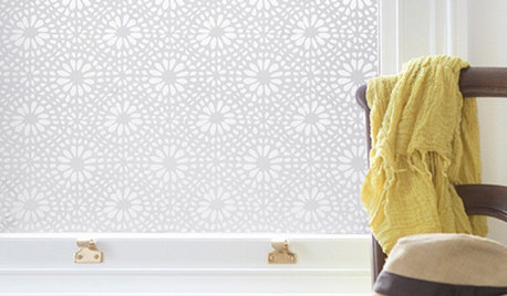
DECORATING GUIDESSolve Privacy Problems With Window Film
Let the light in and keep prying eyes out with an inexpensive and decorative window film you can apply yourself
Full Story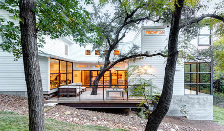
ECLECTIC HOMESHouzz Tour: Problem Solving on a Sloped Lot in Austin
A tricky lot and a big oak tree make building a family’s new home a Texas-size adventure
Full StoryBEFORE AND AFTERSGray Cabinets Update a Texas Kitchen
Julie Shannon spent 3 years planning her kitchen update, choosing a gray palette and finding the materials for a transitional style
Full Story
FARMHOUSESKitchen of the Week: Modern Update for a Historic Farmhouse Kitchen
A renovation honors a 19th-century home’s history while giving farmhouse style a fresh twist
Full StoryRANCH HOMESMy Houzz: Warm and Airy Kitchen Update for a 1980s Ranch House
A dark and cramped kitchen becomes a bright and open heart of the home for two empty nesters in Central California
Full Story
KITCHEN DESIGNKitchen of the Week: Updated French Country Style Centered on a Stove
What to do when you've got a beautiful Lacanche range? Make it the star of your kitchen renovation, for starters
Full Story
KITCHEN DESIGNKitchen of the Week: Elegant Updates for a Serious Cook
High-end appliances and finishes, and a more open layout, give a home chef in California everything she needs
Full Story
BUDGET DECORATINGBudget Decorator: 15 Ways to Update Your Kitchen on a Dime
Give your kitchen a dashing revamp without putting a big hole in your wallet
Full StorySponsored
Central Ohio's Trusted Home Remodeler Specializing in Kitchens & Baths
More Discussions
texasredhead
marcydc
Related Professionals
Decatur Lighting · Shorewood Lighting · Sioux Falls Furniture & Accessories · Clark Furniture & Accessories · Little Chute Furniture & Accessories · Westport Furniture & Accessories · Auburn Decks, Patios & Outdoor Enclosures · Beavercreek Decks, Patios & Outdoor Enclosures · Billerica Decks, Patios & Outdoor Enclosures · Lebanon Decks, Patios & Outdoor Enclosures · Lincolnton Decks, Patios & Outdoor Enclosures · Oak Ridge Decks, Patios & Outdoor Enclosures · Verde Village Decks, Patios & Outdoor Enclosures · West Palm Beach Decks, Patios & Outdoor Enclosures · White Bear Lake Decks, Patios & Outdoor EnclosuresdebrawnelsonOriginal Author
normclc
debrawnelsonOriginal Author
karkitkat
KelinMD
debrawnelsonOriginal Author